Tips on how to make app screenshots and video previews for the App Store and Google Play
When creating app screenshots and video previews, app publishers have a lot of questions. In this article, we will show you how to decide on app store screenshots orientations, quantity, backgrounds, colors, and sizes. We’ll also discuss when it is worth using a video in app metadata and what it should look like.
According to SplitMetrics, less than 2% of users tap read more to see the full app description. Optimizing screenshots can give a 21-24% conversion uplift; app preview videos: 17%. Therefore, it is very important to choose screenshots and videos that will help increase the number of installs. We are going to answer the questions that most developers have when starting ASO.
This article is based on Asodesk and Perfomante’s ultimate guide, where Maria Chernoplyokova shares her tips on optimizing app previews and screenshots for App Store and Google Play. We have updated articles with 2022 requirements and supplemented this guide in accordance with our study on visual ASO trends. Read on to find out how to make your visual optimization more effective.
Contents
Google Play and the App Store screenshot guidelines
How to create App Store preview and Google Play Store videos
Top tips for optimization of Google Play and App Store screenshots and preview

Google Play and the App Store screenshot guidelines
App screenshots: horizontal or vertical?
A 2021 Asodesk study found that about 96% of the top apps use portrait (vertical) screenshots. But, when we look at games, the statistics vary somewhat — around 80% have vertical galleries.
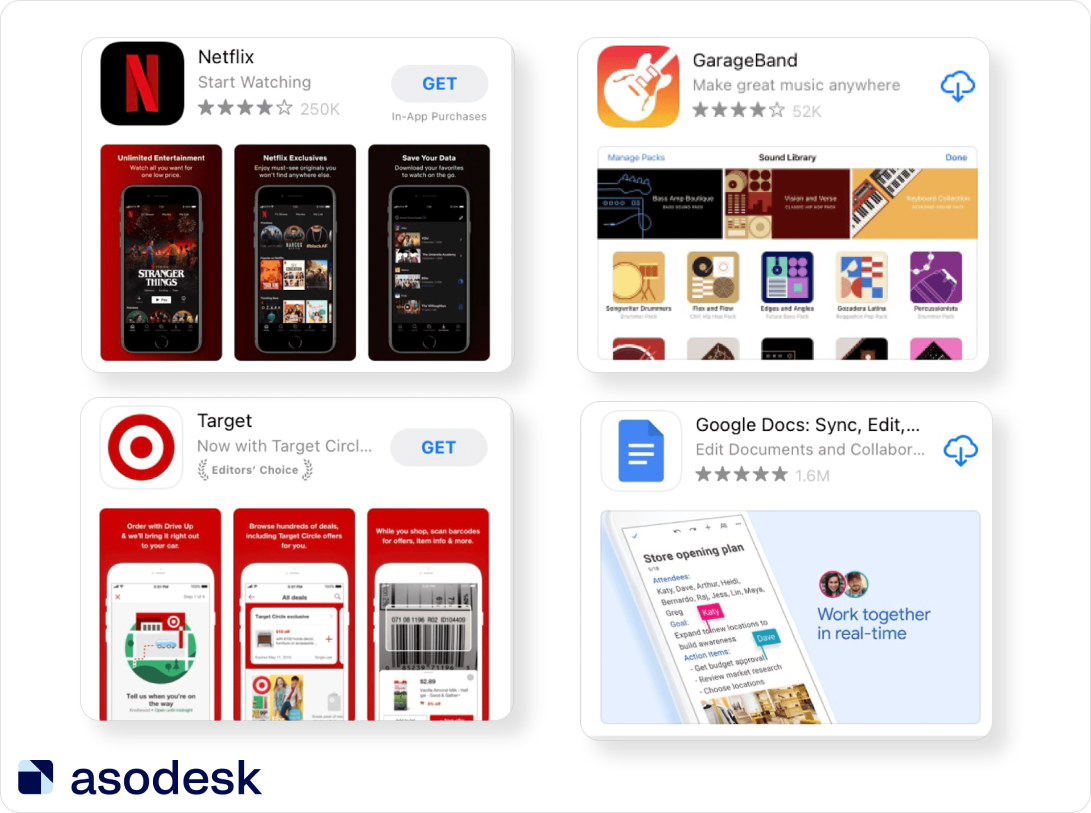
One of the primary goals of screenshots is to demonstrate the superior features of your app compared to competitor apps. Portrait orientation will assist you in offering more information to your target audience. Users can see three portrait screenshots at the same time. If you opt for a landscape orientation, there will be only one screenshot per frame.
Experts also note a higher conversion rate for horizontal screenshots. During the Asodesk live stream in Clubhouse, Artem Tkachuk and Ekaterina Sibirko stated that horizontal screenshots almost always win in tests. Sometimes horizontal screenshots turn out to have higher conversion rates — even for vertical games. Ekaterina Sibirko said that if your competitors’ apps above and below you in the search results have horizontal screenshots, and yours has vertical screenshots, you will be less noticeable in search results and users will be less likely to click on your app.
Before making a decision, conduct A/B testing of the application page with vertical and horizontal screenshots. Compare conversion rates, and then make a choice.
How many screenshots are required for App Store and Google Play
With Google Play you are allowed a maximum of 8 screenshots. In the App Store, 10 is the limit. According to Asodesk, publishers generally tend to use only 5–7 screenshots. Only 12% of publishers make use of the maximum number of screenshots allowed in the App Store. This number is only slightly higher on Google Play, where 18% of publishers use all available screenshots.
The optimal number of screenshots will depend on the specifics of your application. If your app has a lot of features to show, use as many screenshots as possible. If you have a simple application, you can settle on fewer screenshots. For instance, a simple calculator only needs a few screenshots to demonstrate all the main features of the app.
App Store and Google Play Store screenshot requirements
Apple App Store screenshot guidelines
- The Apple allows 3–10 screenshots per app page.
- The good news is that you no longer have to upload screenshots of different sizes for each iPhone or iPad model. The system adapts your images to the sizes of every other iPhone generation. Customized screenshots for 6.5-inch iPhone XS Max and 5.5-inch devices (iPhone 6s Plus, 7 Plus, 8 Plus) are still required. For iPads, you are required to upload screenshots for the 12.9-inch iPad Pro (2nd generation) and 12.9-inch iPad Pro (3rd generation).
- Read about all app screenshot sizes in the App Store specifications.
According to App Store Promotional Artwork Guidelines, if you want your app be featured, you can’t use several types of visual content in your app metadata:
1. Blood, murder or assault.
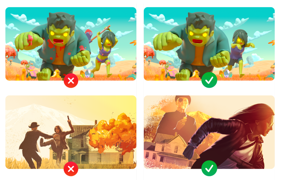
2. Sex, illegal drugs, obscene themes, smoking, alcohol, nudity, or profanity.
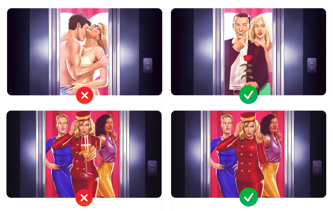
3. Realistic gun
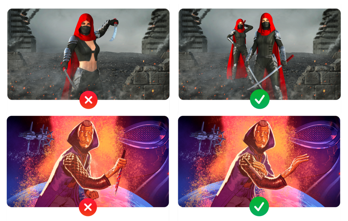
You can’t use guns that look real – only fantasy guns are allowed.
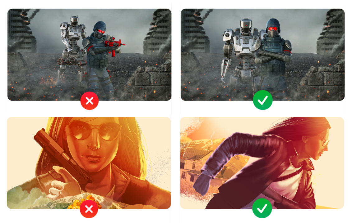
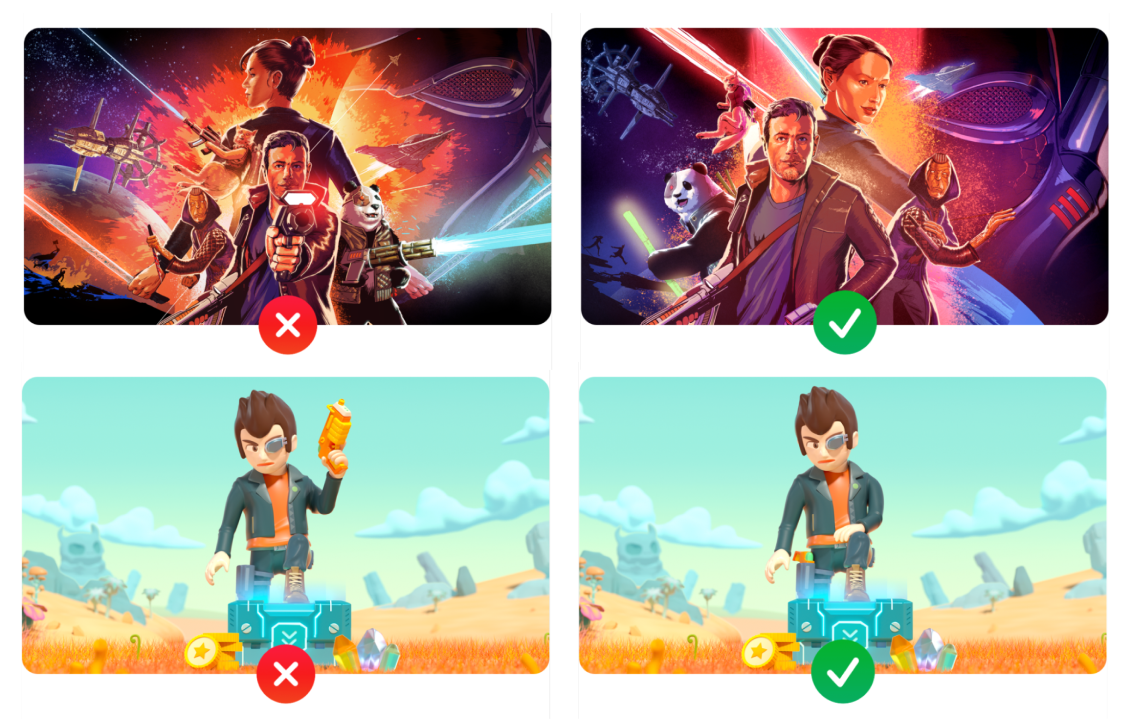
Fantasy guns need to be in a passive position, in a holster, or worn on the back. They must not be aimed towards the user and or firing, and they shouldn’t look glamorized.
Cannon-type weapons also shouldn’t fire.
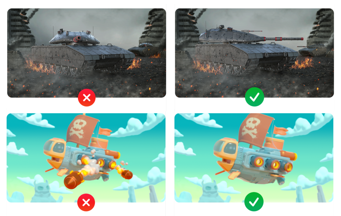
Knives shouldn’t be pointed to users and shouldn’t be in blood.
Google Play Store screenshots requirements
If you want your app to get featured, you should follow these rules:
- App should have at least 4 screenshots with a 16:9 aspect ratio for landscape screenshots (minimum 1920x1080px) and 9:16 for portrait screenshots (minimum 1080x1920px).
- Game should have at least 3 screenshots with landscape or portrait orientation.
- The user should see the real in-app or in-game experience on your screenshots, so you should demonstrate core features on them.
- You should use real footage of the app or game. Don’t include people who use the device (for example, tap on it), unless core features of the app or game are off-device.
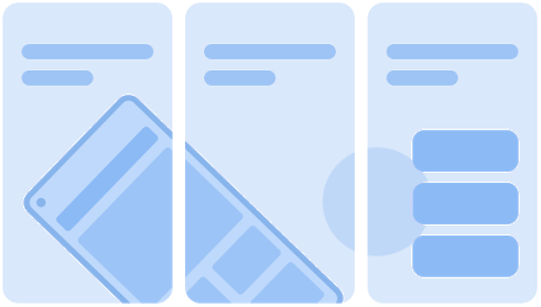
- You can use stylized screenshots that break your UI across several images, but focus on UI at least for the first 3 screenshots.
- Taglines can be used only if they express key app or game characteristics. They shouldn’t cover more than 20% of the screenshot.
- You also shouldn’t use text that is too small, or a background that competes with the text.
- Update time-bound content (such as information about holidays) as soon as it becomes irrelevant.
- Localize your app or game for each target language/audience.
- Don’t add any information about Google Play performance, app rating, price, awards, user testimonials or promotional information to screenshots for the Play Store on the. Don’t use descriptors like “Best,” “#1,” “Top,” “New,” “Discount,” “Sale,” or “Million Downloads”.
- Don’t use calls to action, such as “Install now”, “Play now”.
Be sure to always look out for the latest updates in the App Store and Google Play guidelines and use basic common sense. The screenshots — as well as your app — should not contain upsetting and offensive content. The App Store will reject any screenshots that have realistic guns in them, for example. Fantasy guns need to be in a passive position, in a holster, or worn on the back, while swords and knives must not be aimed towards the user.
How to choose a screenshot background
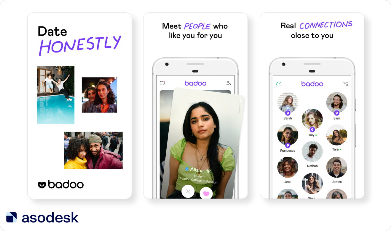
The 2021 report on Visual Optimization trends noted that the top 38% of free apps in the App Store and 42% in Google Play generally choose white as a background color. Bright background colors such as red, yellow, and pink are seldom used. App publishers tend to choose darker, muted shades of blue, black, or green.
However, if you want to stand out from competitors and catch users’ attention, you can consider using brighter background colors. Naturally, the background has to align with your brand identity and color scheme. More importantly, it mustn’t be distracting. So it is preferable to opt for a solid background.
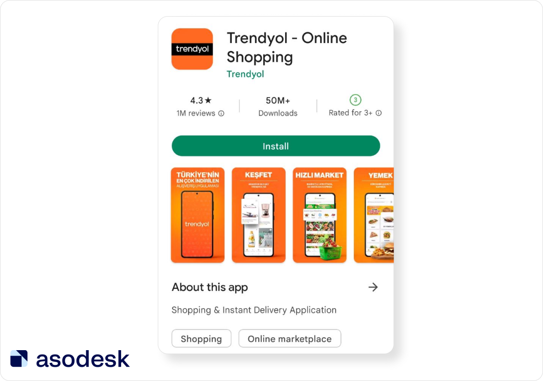
The case is different with the gaming apps — 68% of publishers of top games on the App Store and 72% on Google Play add the game interface on the screenshot without any background. Therefore, gaming app publishers can easily stand out among the competitors by simply editing the screenshots.
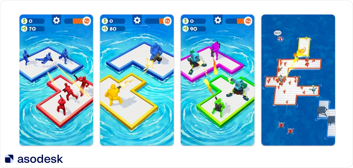
According to SplitMetrics, banner-like and full-screen images without device frames which use 100% of the image space can increase CVR by 36%. So you should test this strategy in your screenshots.
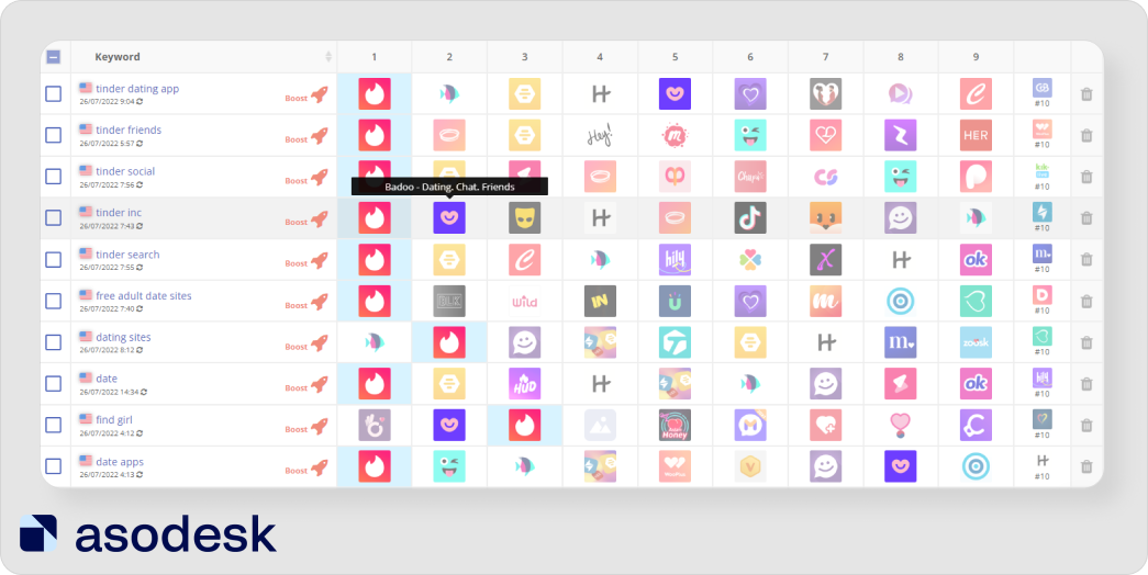
Analyze your competitors and see which screenshot colors they use the most. You need to stand out among them so that your application becomes more noticeable in the search results.
To make analyzing your competitors easier, use Asodesk. The Keyword Chart tool will show the competitors’ rankings for your keywords. This will help you determine which apps you will have to compete with for each keyword.

How to choose font and text color for App Store and Google Play app screenshots
With regard to colors and font, choose the options that work well with your brand identity. The color of the text has to contrast with the background and be legible. The text should be large and easy to read, even on a small device. 48% of the App Store publishers and 56% of Google Play publishers use white as their text color.
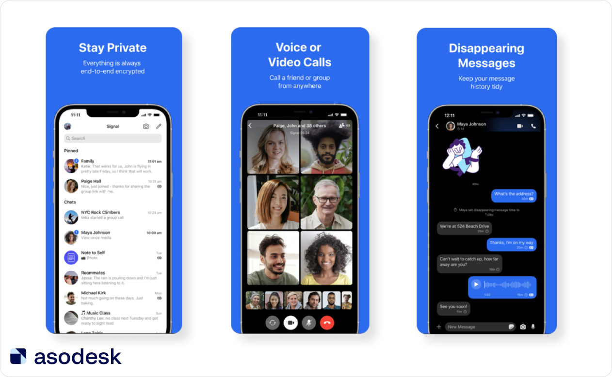
28% of app publishers use black text which is easy to read on light backgrounds.
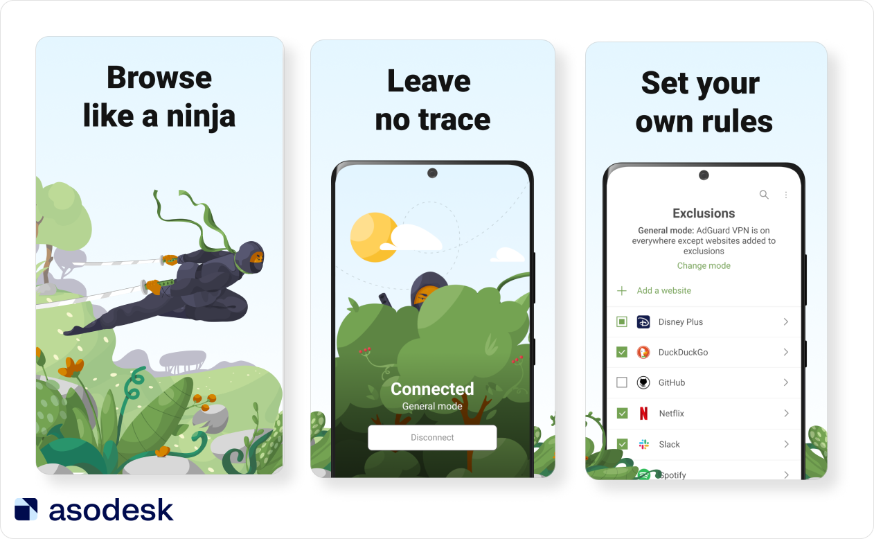
Create a few different options that you can test on various devices. Consistently monitor the main KPIs: number of downloads, conversion rate, etc. Furthermore, don’t rely on your personal taste. Your screenshots have to be pleasant to the eye but it’s recommended that you avoid any artistic extras.
What text should be added to screenshots
Your text has to be legible and visible from the search page. The more words you include, the smaller the font will be. For example, the text on the Amazon Shopping app screenshots is difficult to read from a small device.
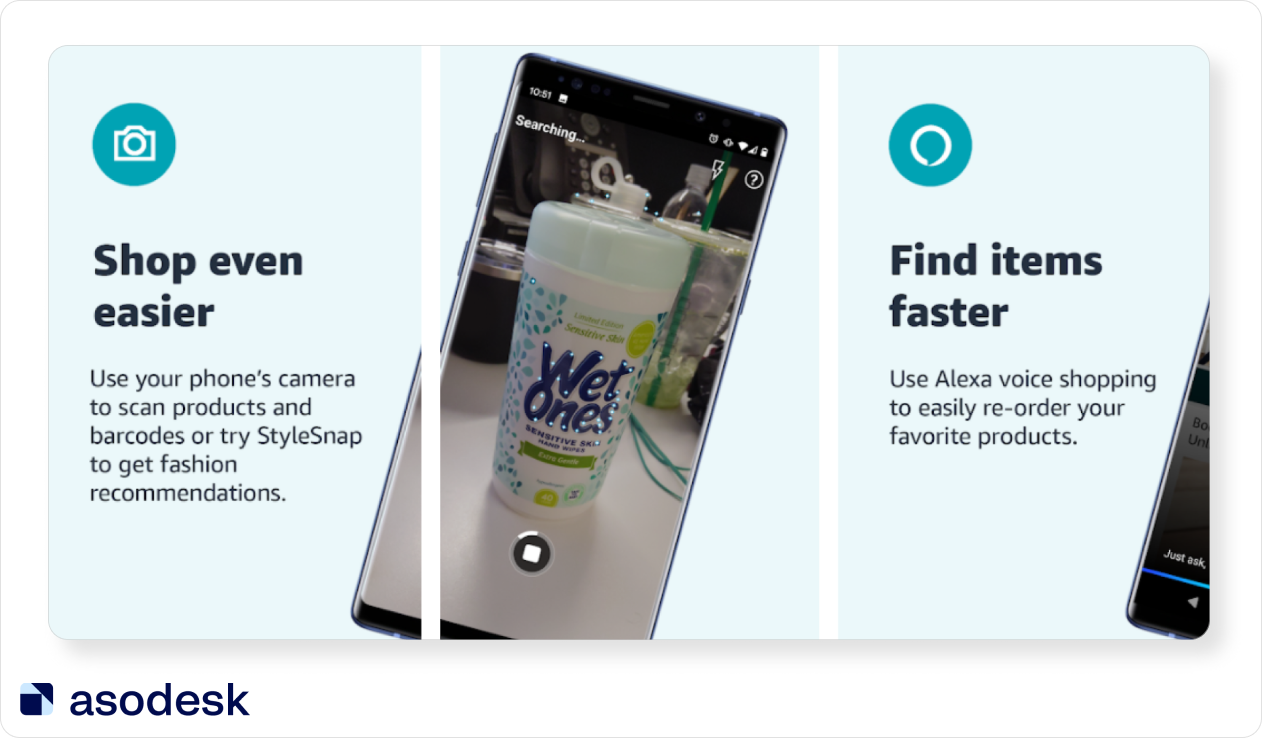
So, it’s preferable to place a few catchy phrases on the screenshot that contrast with the background. When it comes to screenshots, less is definitely more. You can use bold fonts to highlight the most important details or simply make key words or phrases bigger.
The Waze app’s screenshots are a good example. Developers made the font size quite big, so users can easily see all the relevant information.
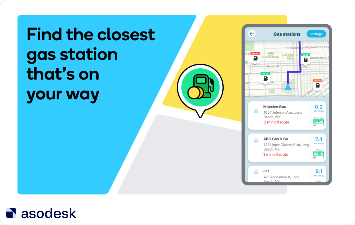
Add popular search queries to screenshots; this will help reassure the user that they need your application.
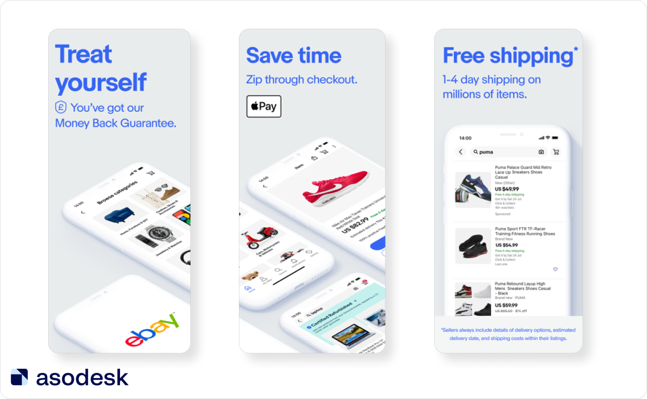
Here is how eBay highlighted essential information on their screenshots with big and bold text. Publishers also added more information with the smaller text.
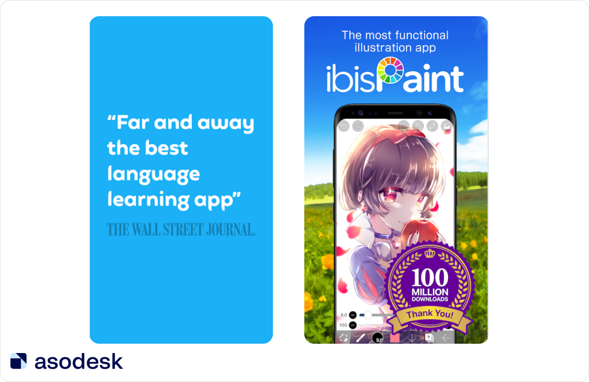
If you would like, you could include a screenshot with any awards and mentions your app may have. Parv Bhargava’s (ASO Consultant at Phiture) report at the App Promotion Summit noted that social proof helps gain users’ trust and affirms the authenticity of your app. By showing the number of app users in the caption, we can take advantage of this innate human characteristic and boost conversion. But be careful when using this approach on Google Play, where you can be banned if you include of awards on screenshots.
By the way, you can read more about the top reports from the App Promotion Summit in this Asodesk article.
Constantly emphasize the things that have changed in your app. If, for example, you have created a new feature or updated the app, include this on one of the first screenshots.
It is important that the text on screenshots is easy to read. Highlight your app’s best features, social proof, and app updates, but be careful with rewards on Google Play to avoid getting banned.
How to make screenshots for the App Store and Google Play
These services will help you generate screenshots for App Store and Google Play without the assistance of a designer:
Screenshots Pro helps to create panoramic screenshots for iOS and Android app pages in just a few minutes. The service has pre-made templates, localization, comprehensive customization features, the option to download custom fonts, and the API to automate screenshot updates.
Canva is one of the most user-friendly services out there that can help you make vibrant images.
AppLaunchpad generates screenshots right from the app.
DaVinci Apps also specializes in screenshots and offers a vast number of predesigned templates.
How to create App Store preview and Google Play Store videos
An Asodesk’s report found that only 10% of App Store publishers use videos. At 28%, Google Play publishers use videos roughly 3 times more frequently.
Lina Danilchik recommends conducting A/B tests before adding videos to your page. Experiments on SplitMetrics have revealed that videos often perform worse than screenshots.
Add videos only if you have sufficient content and functions within the app. Promo videos are recommended for games, photo and video editors, streaming services, online shopping, and food delivery apps.
Portrait vs. Landscape Videos — Which One Should You Use
On the App Store, your choice should depend on the orientation of the app itself. On Google Play, however, it is recommended to create the video in landscape even if the app is vertical. However, you should note that your app preview video for Google Play will be uploaded to YouTube.
Landscape videos are preferable on YouTube as they look better and more professional. Furthermore, if your video has a horizontal orientation, you can enlarge the text and it will be easier to zoom in and highlight some of the app’s features. This is simply because you have more “space” in landscape. You should always test both options and monitor the KPIs to establish which preview is performing better.
App Store and Google Play videos requirements
App Store
- You are allowed to add up to 3 videos.
- Videos are displayed above the screenshots on the app page.
- Your video will autoplay in mute in the search results.
- The app preview must be 15–30 seconds in length.
- The maximum file size is 500 MB.
- The accepted file formats are .mov, .mp4, and .m4v.
- After the upload, the video can take up to 24 hours to process.
- Lastly, all videos for the App Store need to be manually approved by Apple. And there are several guidelines that you have to follow. For example, you are only allowed to use captured footage of the app itself.
- App previews should be for all users older than 4. That’s why you can’t use explicit content, violence, adult themes, and profanity on preview videos.
- You are only allowed to use captured footage of the app itself. You can’t show how people use your app over their shoulder or tapping on the screen.
- Don’t use behind the scenes video of the app development.
- If you use film, music and any trademark character for your app, make sure that you have licensing rights to do so for all territories.
All app store preview videos need to be manually approved by Apple. Read the guidelines that you have to follow.
Apple recommends using QuickTime and iMovie to edit your footage.
Google Play
- You are only allowed one promo video.
- It must be between 30 seconds and 2 minutes long.
- Your promo video may autoplay inline with muted audio up to 30 seconds depending on the user device, setting, network connection, and surface area. Whenever your video does not autoplay, a play button is overlaid on your feature graphic.
- You will have to create a good-quality, landscape-oriented video. The aspect ratio for YouTube videos is 16:9. The recommended dimensions are: 426 x 240 (240p); 640 x 360 (360p); 854 x 480 (480p); 1280 x 720 (720p); 1920 x 1080 (1080p); 2560 x 1440 (1440p); 3840 x 2160 (2160p).
- No less than 80% of your video should contain the personal user experience.
- You should display the actual user’s experience in the first ten seconds.
- Don’t show how people use the device with your app (for example, by tapping on screen). Unless the game process occurs outside the device.
- As for screenshots, your video can’t contain Google Play performance, rankings, price, user testimonials, and promotional information. You shouldn’t use phrases such as “Best”, “№1”, “New”, “Discount”. But you can add the “Best of” and other awards from Google Play.
Read about all Google Play rules on preview.
Limit the branding elements and focus on the demonstration of the app’s features. Don’t add people interacting with the app on the video (for example, touching the screen). You can only do this when the main gaming process or the app is used outside the device. You can highlight the areas that you want the user to pay attention to.
Video length
On the App Store, every video can only be up to 30 seconds long. Google Play recommends making videos short — only the first 30 seconds are played automatically. The preview has to appeal to the user from the first few seconds. This means you don’t have any time to spare, so put the most interesting and useful information at the beginning of the video and be creative. Your video should not include any upsetting or offensive content.
Video sound
69% of users watch videos with the sound off in public places. However, 80% of viewers are more likely to watch the entire video if captions are available. So be sure to add text to your preview video. Everything should be understandable without sound.
But that does not mean that you have to neglect the narration or background music (check that there is no copyright violation). The captions must be legible and should not change too quickly — the users need enough time to read all the information.
Top tips for optimization of Google Play and App Store screenshots and preview
- Conduct A/B testing. You never know which option will bring the highest conversion rate until you test it. Try different colors and orientations, and compare videos and screenshots to find the most effective solution.
- Analyze your competitors. You need to explore the designs of other application pages that are closest to yours in the search results. This will help you choose the right design. Otherwise, your application will get lost among similar competitor apps in the search results.
- Add search queries, new app features, and social proof to the app screenshots. For the user, it is easier to read the text in the picture than in the app description. That’s why you should always highlight important information.
- Think about user comfort first. Your task is to tell the user as much about the app as possible. Therefore, the images in the screenshots should be clear, the text easy to read, and the video should have subtitles.
We hope that our article will help you to improve app screenshots and videos for your app. Subscribe to our newsletter and get ASO news digests and our articles of the month.
Do you know if your app needs App Store Optimization (ASO)? You can find the answer in our comprehensive and large-scale market research on search traffic in the App Store. It will help you to understand whether you should invest in ASO and what results you can expect. This is a must-read for anyone who wants to improve their app promotion strategy.

