
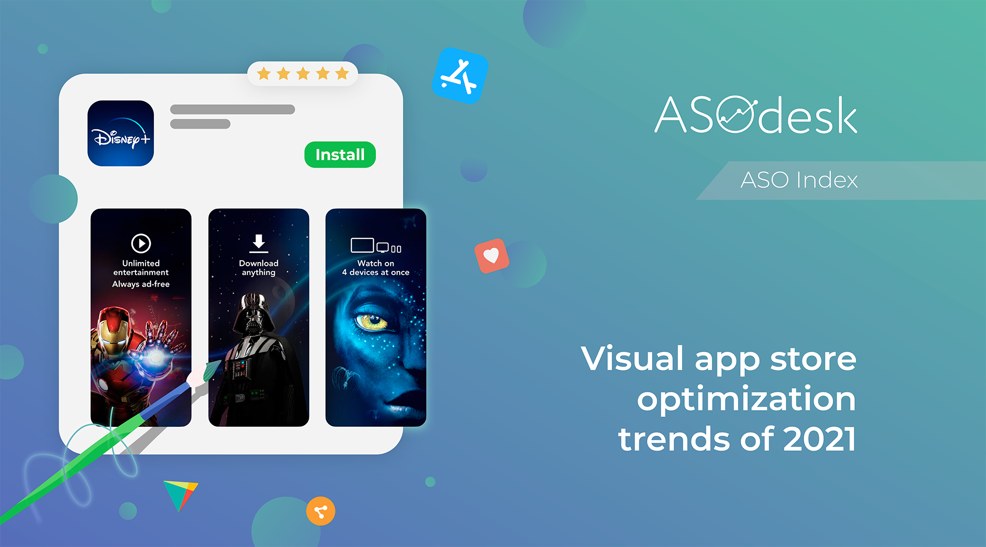
Visual app store optimization trends of 2021
Good design of the app page in the App Store and Google Play increases the install conversion by 17-24%. Therefore, it is important for app publishers to test different design options and choose the most effective ones. You should pay attention to the visual optimization trends that publishers of popular applications follow.
In this article, we analyzed the icons, screenshots, and videos of the top 100 free apps of the App Store and Google Play in the US, and noted the visual ASO trends of 2021. We looked at color, graphics, and composition used by popular publishers.
Thomas Petit (Application Growth Consultant), Daria Pavlyuk (ZiMAD), Lina Danilchik (Splitmetrics) also talked about visual optimization trends in 2021. We hope this article will help you find insights for page design and make your application more noticeable amongst the competition.
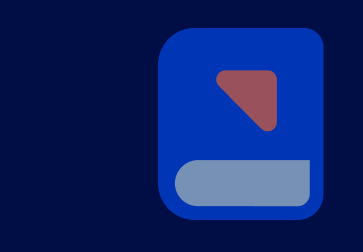
Icon design
In the top apps of the App Store and Google Play, you can mainly find big market players. They place a logo or brand name on the icon, which often does not show the main features of the application, but is associated with a well-known company.
Icon design evaluation parameters:
- Background color
- Image on the icon
- Image color
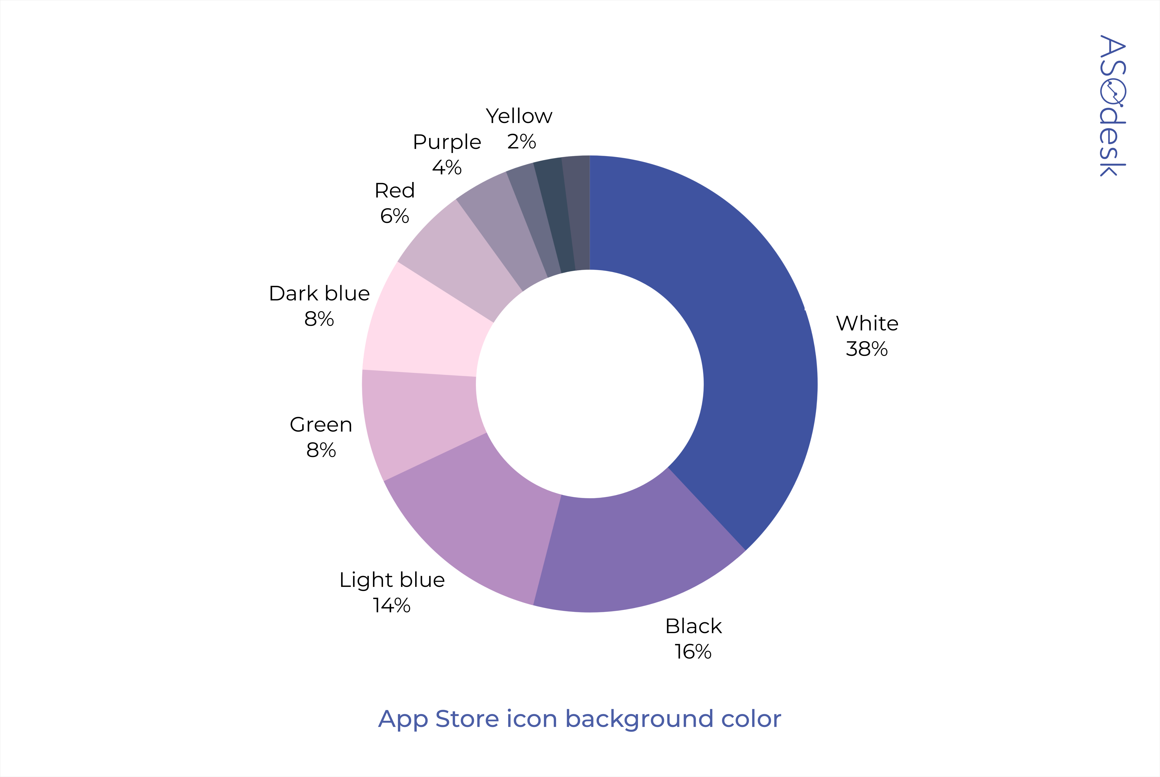
Icon background color
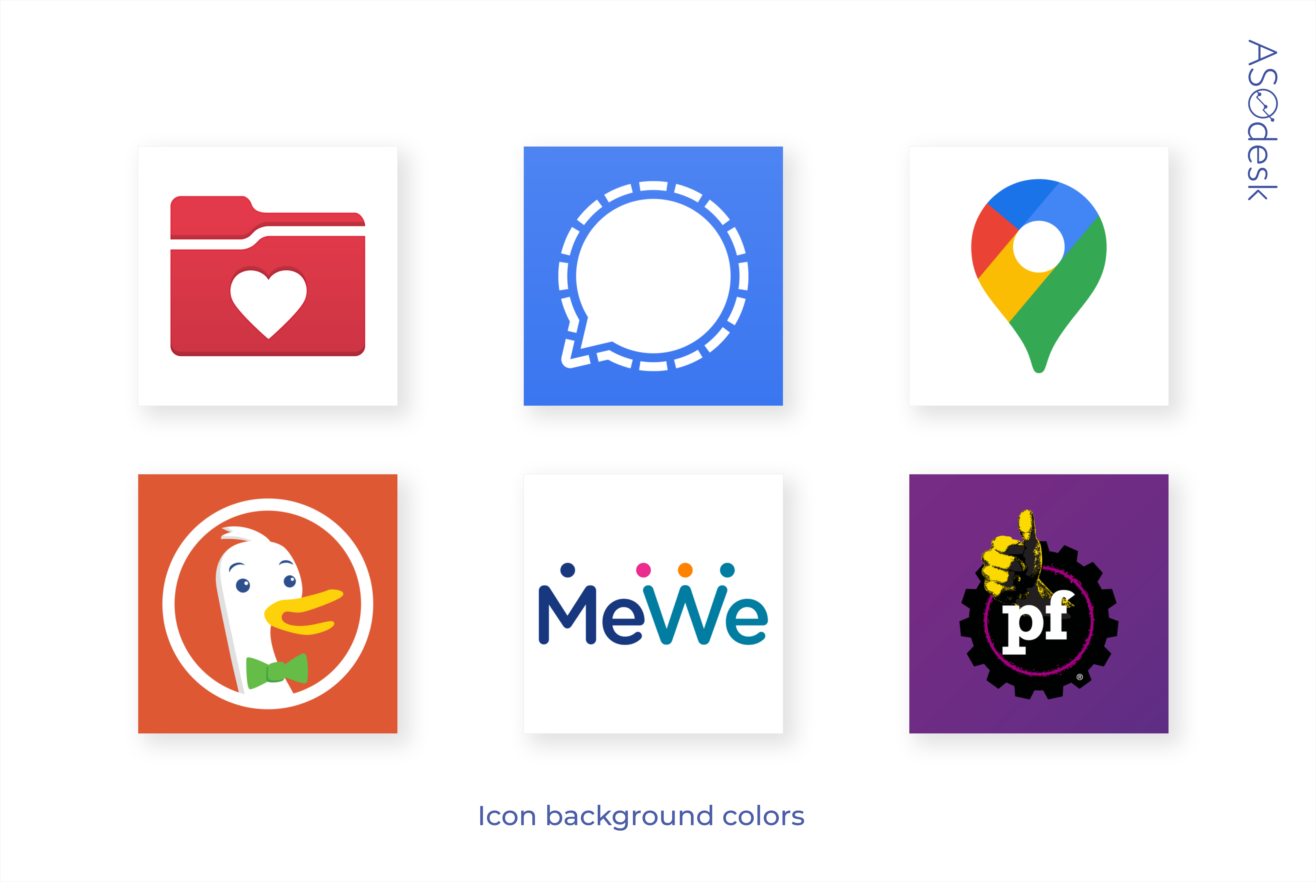
Most of the icons have a minimalistic design. We analyzed the background colors of the top apps in the App Store and Google Play.
The most popular background color in both stores is white. It is used by 38% of app publishers on the App Store.
42% of publishers on Google Play use white color.
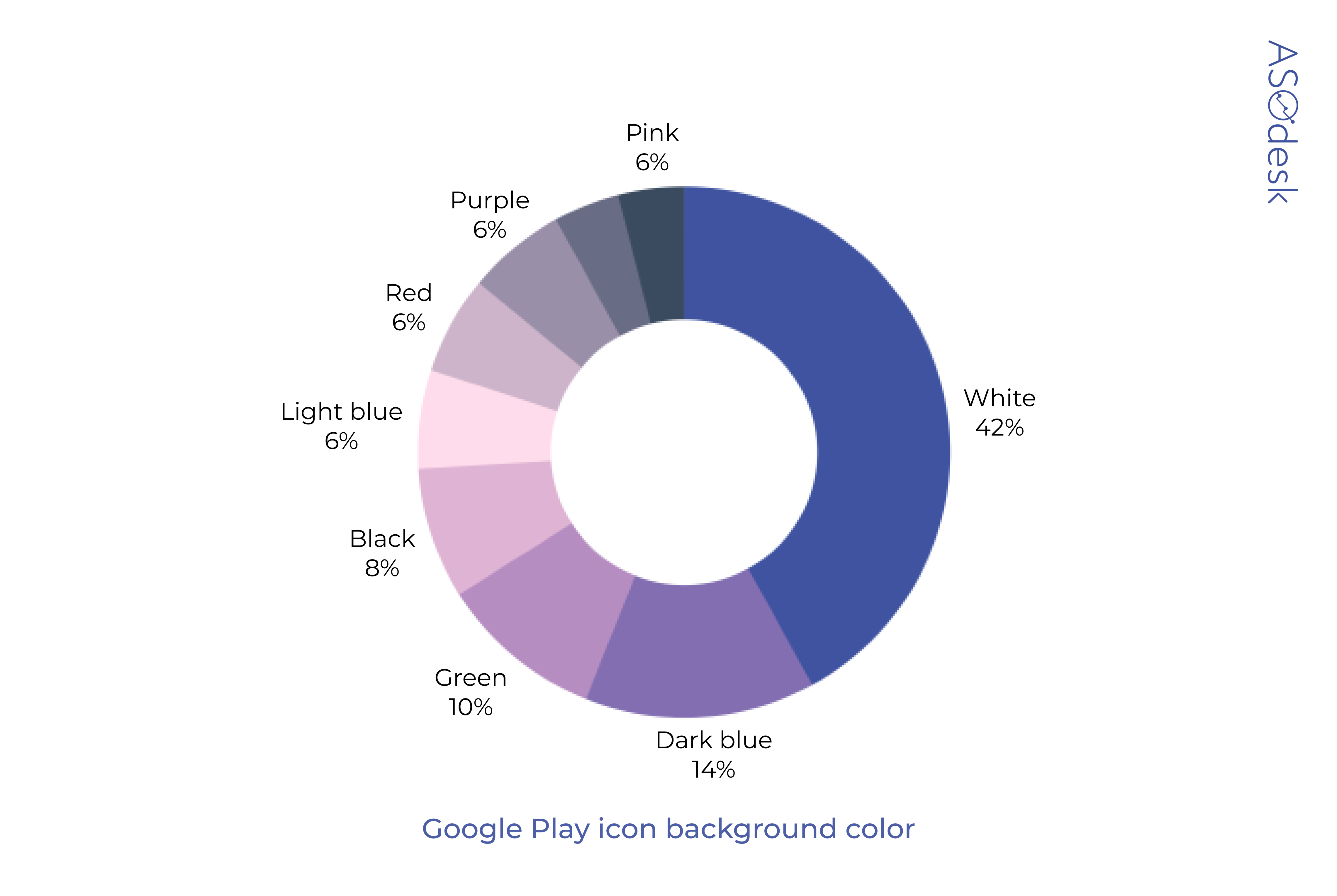
Bright background colors such as red, yellow, and pink are used rarely. App publishers choose darker, muted shades of blue, black, or green. 14% of App Store publishers also use light blue.
The image on the icon

We analyzed the images on the icons and found that text is used by only a quarter of the developers. It is much more common to use a minimalistic logo, which, at first glance, makes the user recognize a well-known brand.

However, users are more likely to know the brand name than its logo. The logo is best used only if the app belongs to a strong brand and is known by the majority of users. Such applications, for example, include Instagram, Twitter, and Facebook.
If your application is not yet such a strong brand and you need keyword optimization, we recommend placing the brand name on the icon. This way you can also save characters in the title of the application. Let us remind you that the title is the most important ranking factor, so the remaining characters can be used to add important keywords.
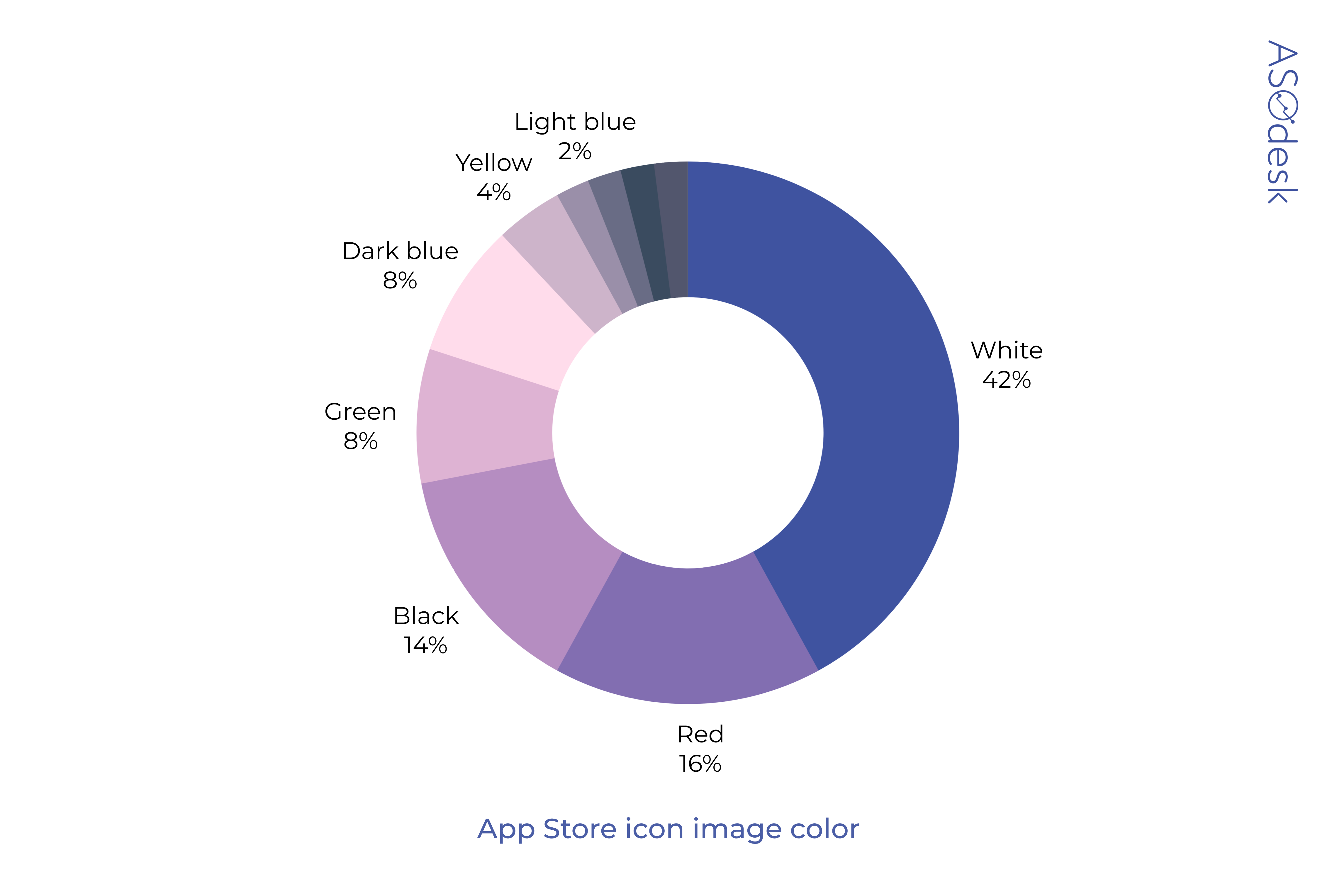
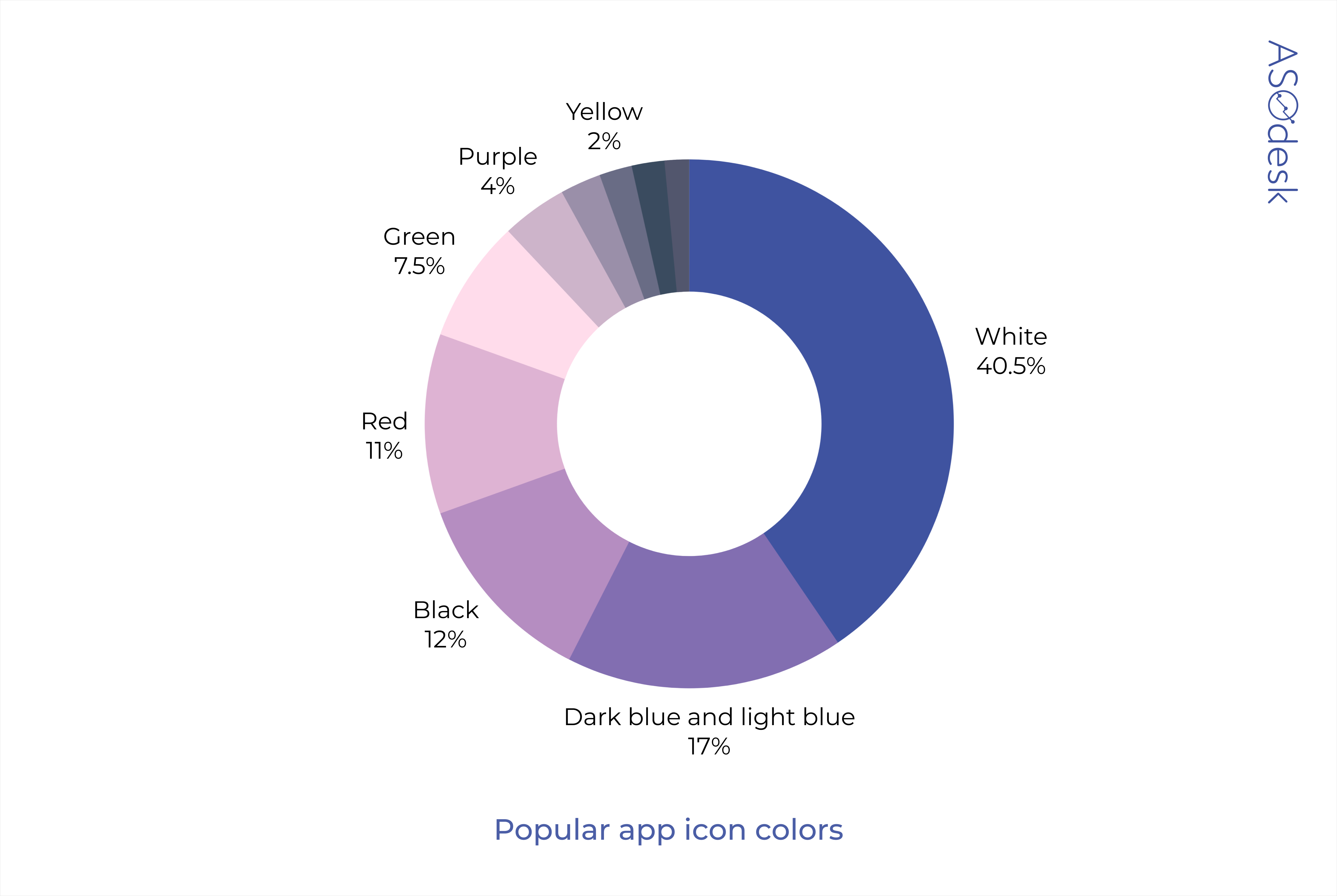
Icon image color
White remains the most popular color for images on the App Store and Google Play icons. It is used by 42% of publishers on the App Store and 40% of publishers on Google Play. White can also be combined with any other colors and shades. This allows brands to use their logos in the form of an image or text, consisting of one or more colors.
In the App Store, red, black, and green images are common.
On Google Play red, black and light blue are common.

Images of orange, purple, pink, and yellow in icons are rare. Consider using these colors in your app icon as they will stand out more.
We combined the App Store and Google Play data on background colors and icon images to create a pivot chart. The most popular colors in icon design — after white — are black, red, green, dark blue, and light blue.
Take a look at app icons from the top 10 in the App Store and Google Play and consider which icons will grab your attention first. Similar stylistic solutions can be used in the design of your application icons.
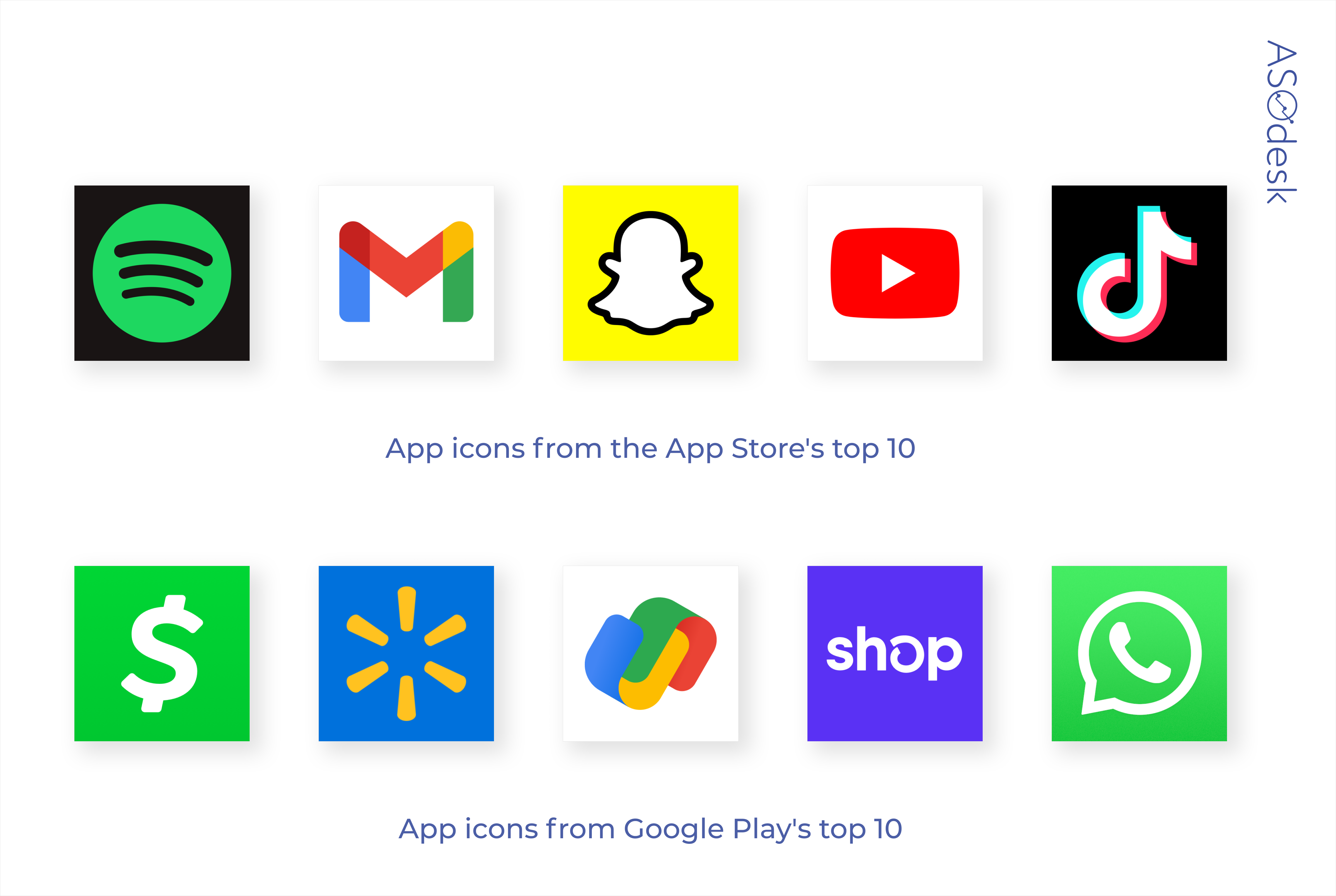
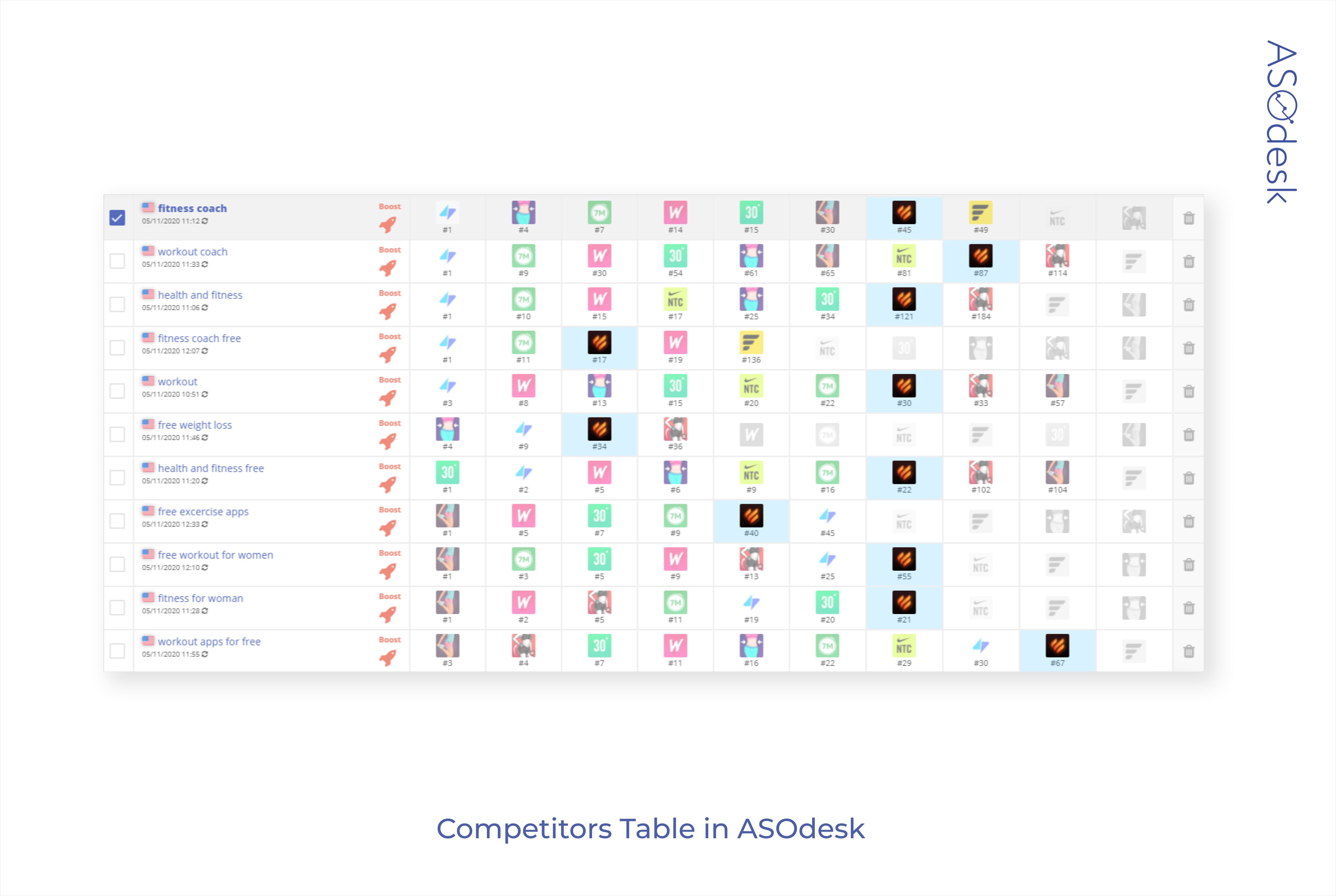
When creating an icon, it is important not only to learn about trends in visual optimization, but also to look at the icon design of competitors occupying similar positions in the search results, since your application needs to stand out among them.
The Competitors Table in ASOdesk’s Keyword Charts tool can help with that. This tool makes it possible to quickly compare application icons that can be found in the search using your keywords.

Lina Danilchik, Marketing and PR Manager at SplitMetrics

I expect the following app icon trends in 2021:
- Minimalism.
- Use of geometric shapes.
- Use of elements at an unusual angle. These elements attract attention; they are an incentive to which the human brain responds. Such incentives also include color (a bright color against more neutral ones) and size (objects of different sizes placed next to each other).
The icon should not only follow design trends, but also differ from competitors, attract the user’s attention, and also convey the main information about your application. It is important that the icon responds to trends, but it also needs to stand out and be informative.
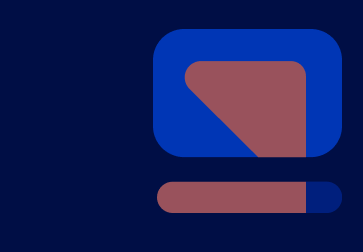
Screenshots design
Developing screenshots of mobile apps often takes more time than game screenshots. To attract users, app publishers focus not on a bright or attractive interface, but on useful features of the application.
Screenshot evaluation parameters:
- Background color or presence of app interface
- The presence of text and its color
- Presence of the device
- Screenshot format and composition
- Presence of additional graphics and editing
- Number of screenshots
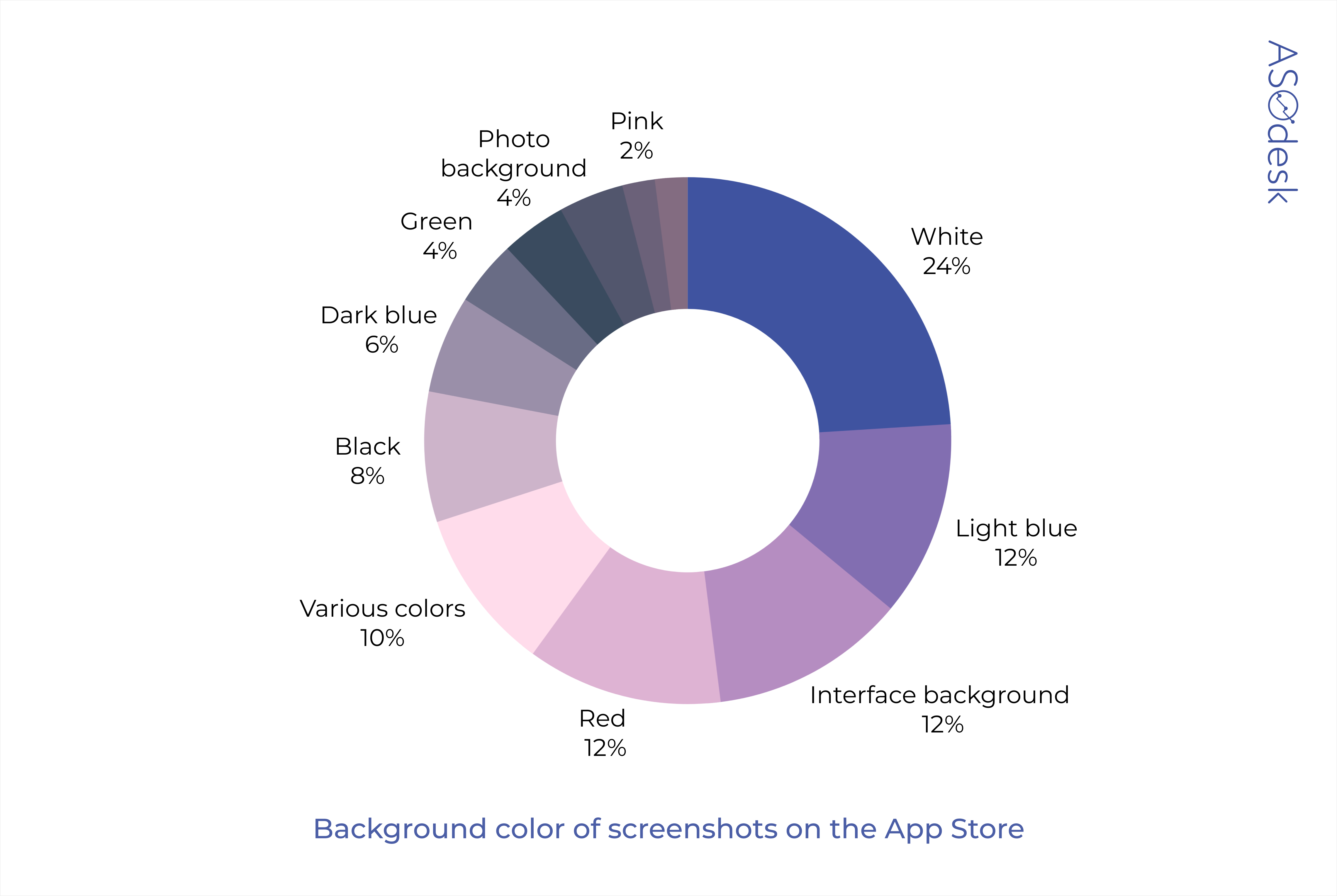
Screenshot background color
We analyzed the background colors of screenshots in app stores. The most popular background colors for screenshots in the App Store are white (24%), light blue (12%), and red (12%).
On Google Play, 20% of publishers use white, 16% use dark blue, and 10% use purple.

White is the most popular background color of screenshots. 12% of App Store and Google Play publishers also prefer to leave screenshots without backgrounds and post app screen grabs as screenshots.
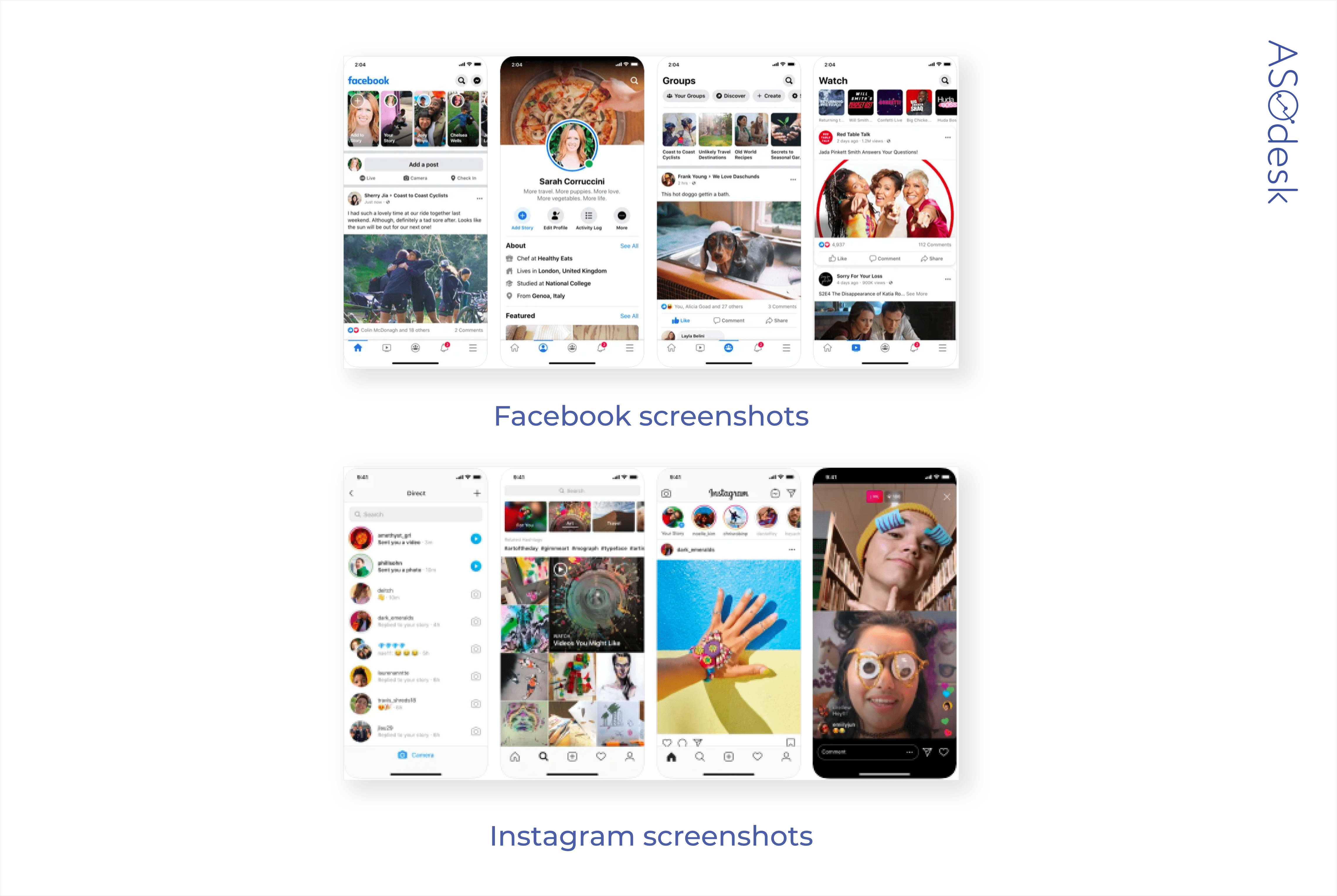
For example, Facebook has taken this very minimalistic approach to screenshot design for its top apps.

Daria Pavlyuk, Head of ASO, ZiMAD
Minimalism became a trend of the screenshot design a long time ago. Perhaps this year it will either reach its peak or give way to something completely different. Especially for Google Play, where developers have more creative freedom on the app page.
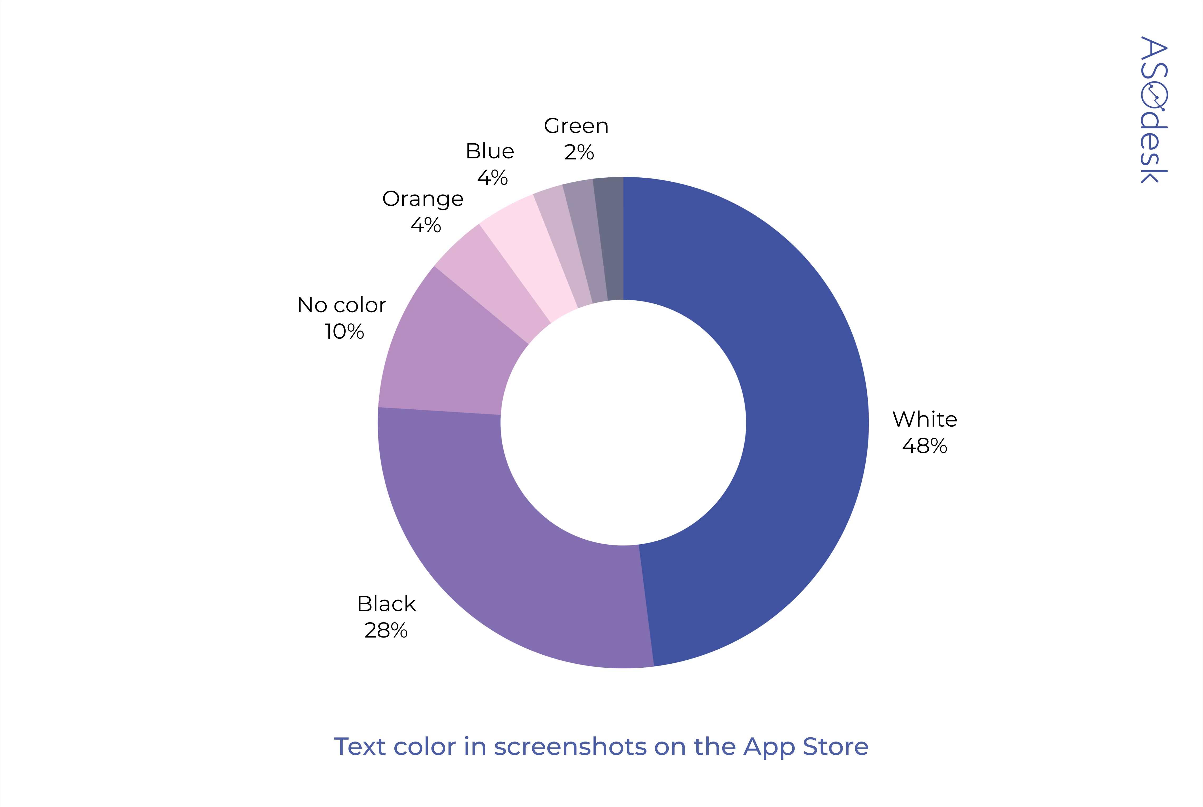
Screenshot text color
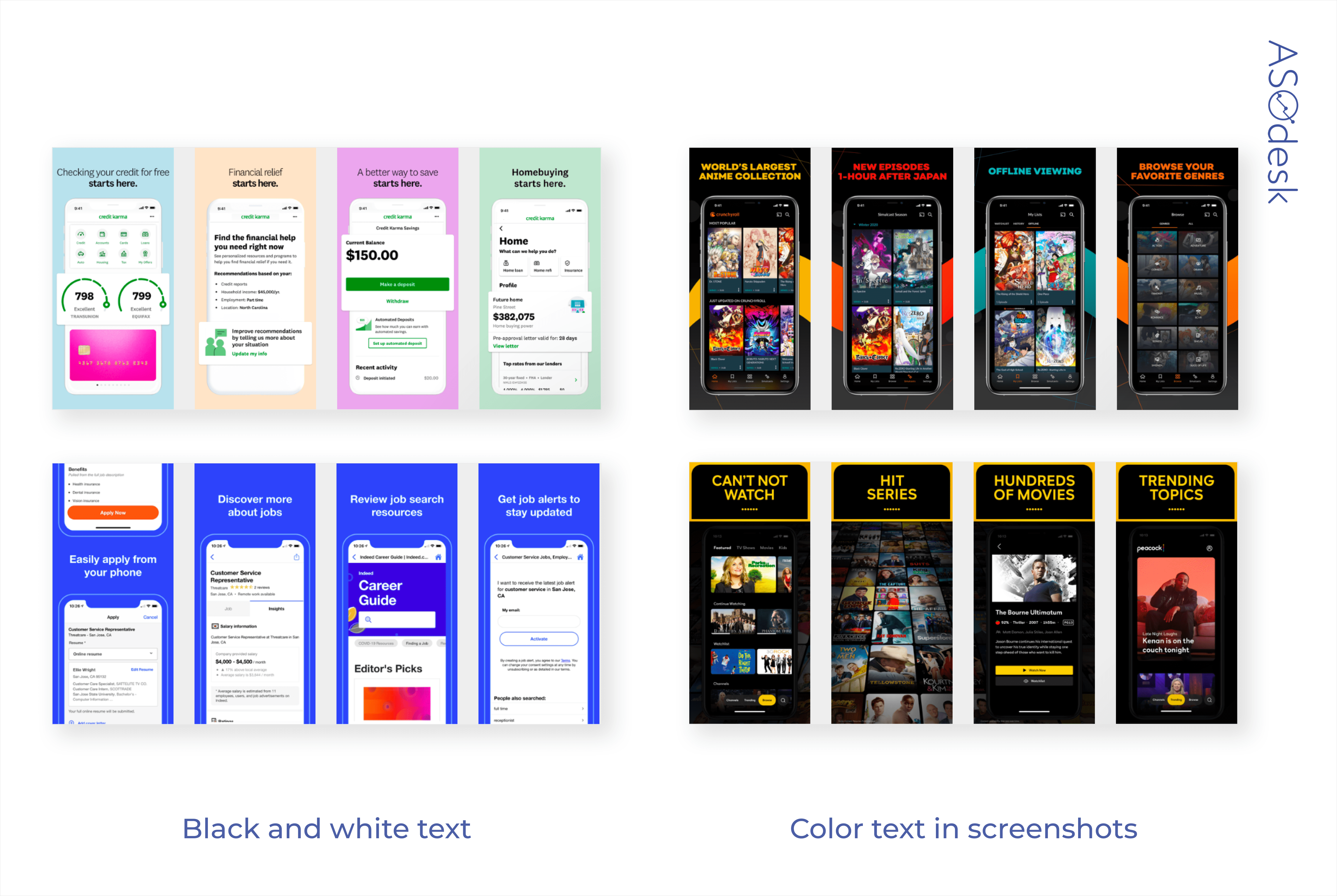
As far as text on the screenshots in the App Store and Google Play goes, a large majority uses black and white. Light colors such as green, light blue, and yellow are used rarely. Apps for which publishers choose to leave screenshots unedited generally do not use additional text.

It is important that the text in the screenshots can be easily read, not only when going to the application page, but also in the search. The font should be large and contrast with the background. Images should contain as little text as possible.
To make sure you have the correct text for your app screenshots, check if you can read text on a device with a small screen.
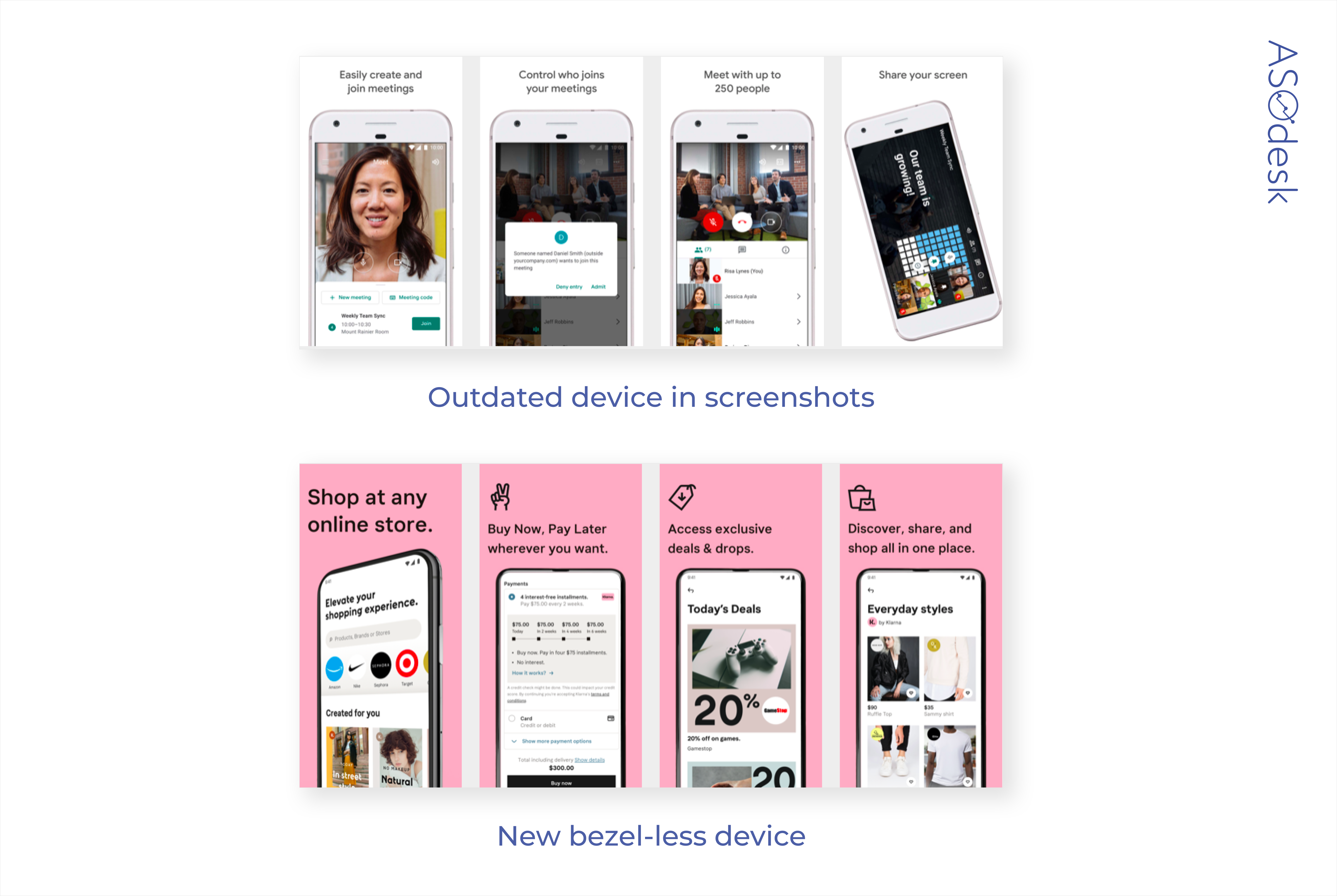
Presence of the device
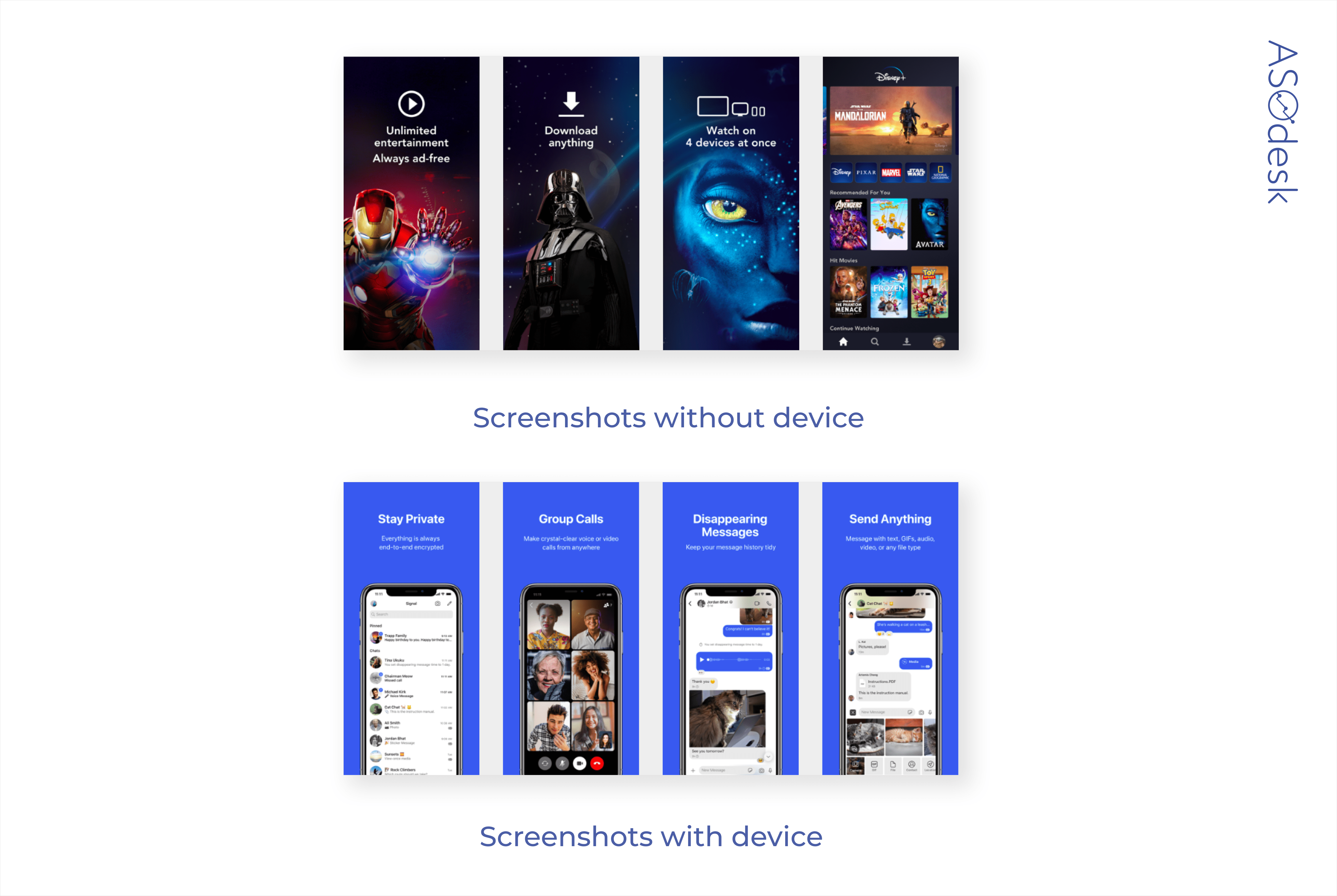
As a rule, screenshots depict a device with an application interface. The device is on 82% of application pages in the App Store and Google Play.
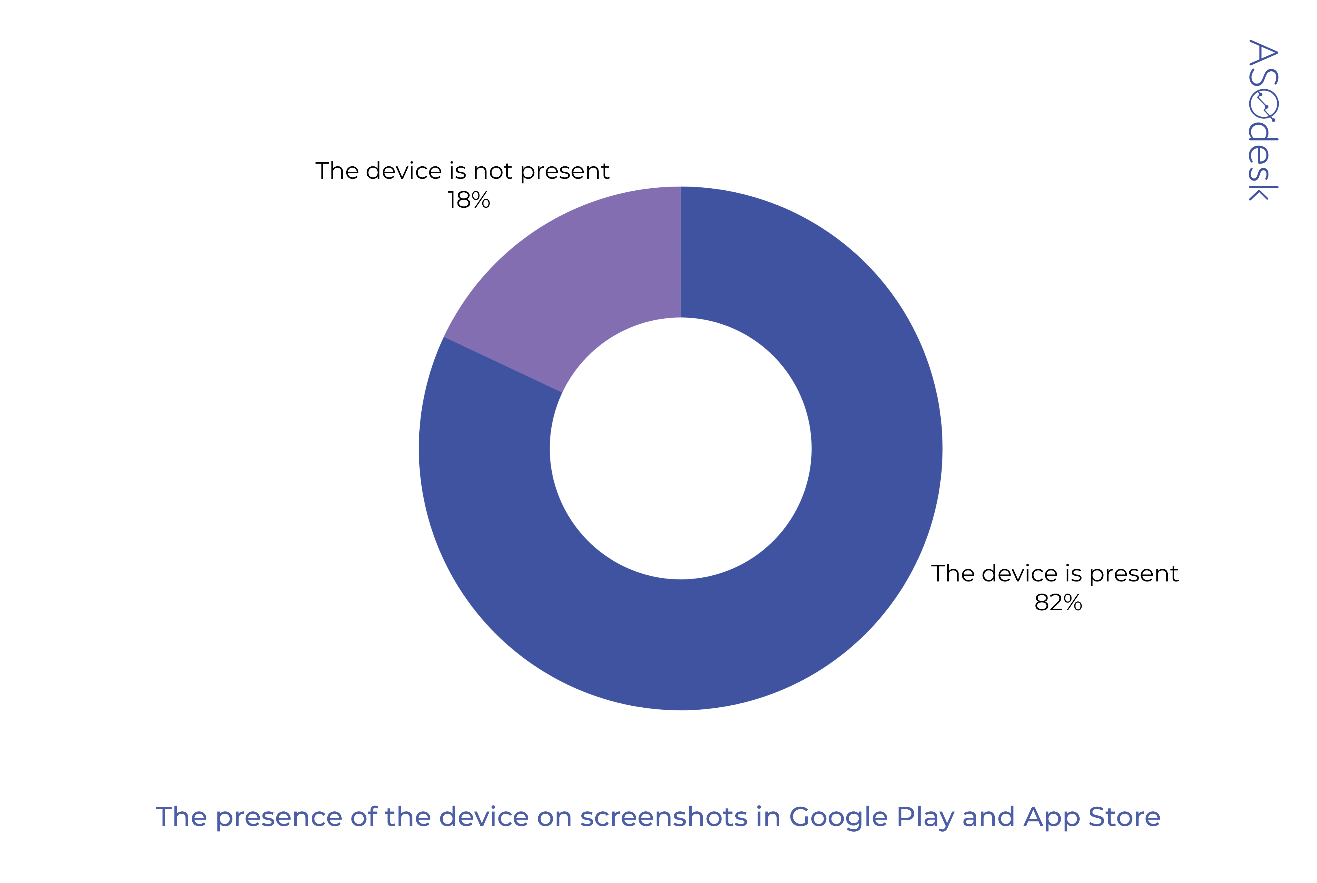
Placing a device image complicates the process of creating screenshots. For example, in the App Store, you need to put a device that fits the screen size 5.5” or 6.5” on the screenshot. On Google Play, it’s important to remember to swap out old devices with large bezel for new, almost bezel-less ones.
Format and composition

Vertical and horizontal screenshot formats are available to app publishers. Most developers choose a vertical orientation, because it allows you to show 3 screenshots at once in the search results.
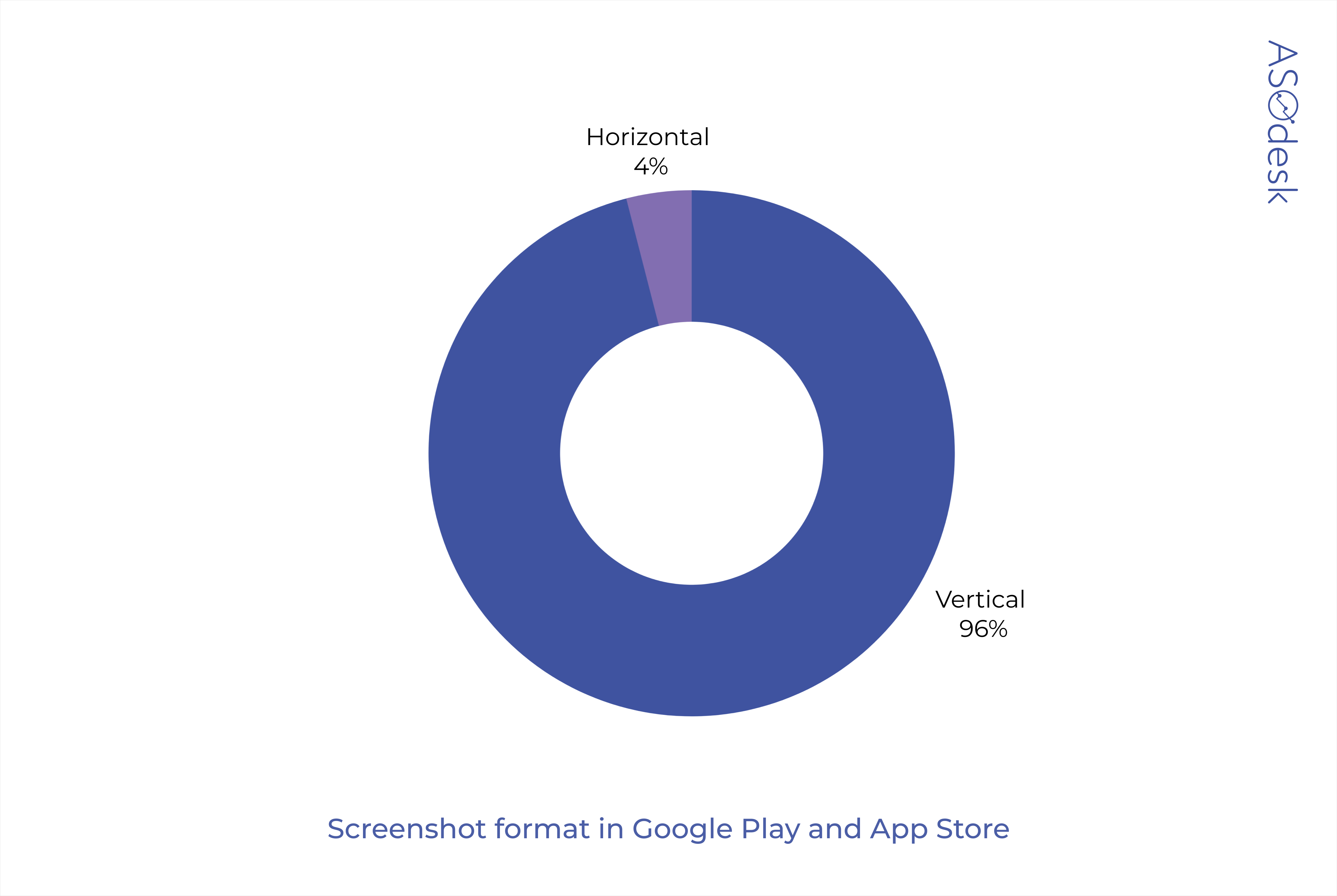
When choosing horizontal orientation, only one screenshot will be displayed in the search. This is often not enough to show all the relevant information about product benefits and encourage users to download the application.

Thomas Petit, @thomasbcn, world-renowned mobile marketing thought leader and independent app growth consultant
I wish the “diagonal” screenshot trend will go away: they take unnecessary space and are hard to read for users.
Some believe that a panoramic composition may prompt the user to view more screenshots.

We compared screenshots of top apps and found out that only a third of App Store and Google Play publishers use this format.
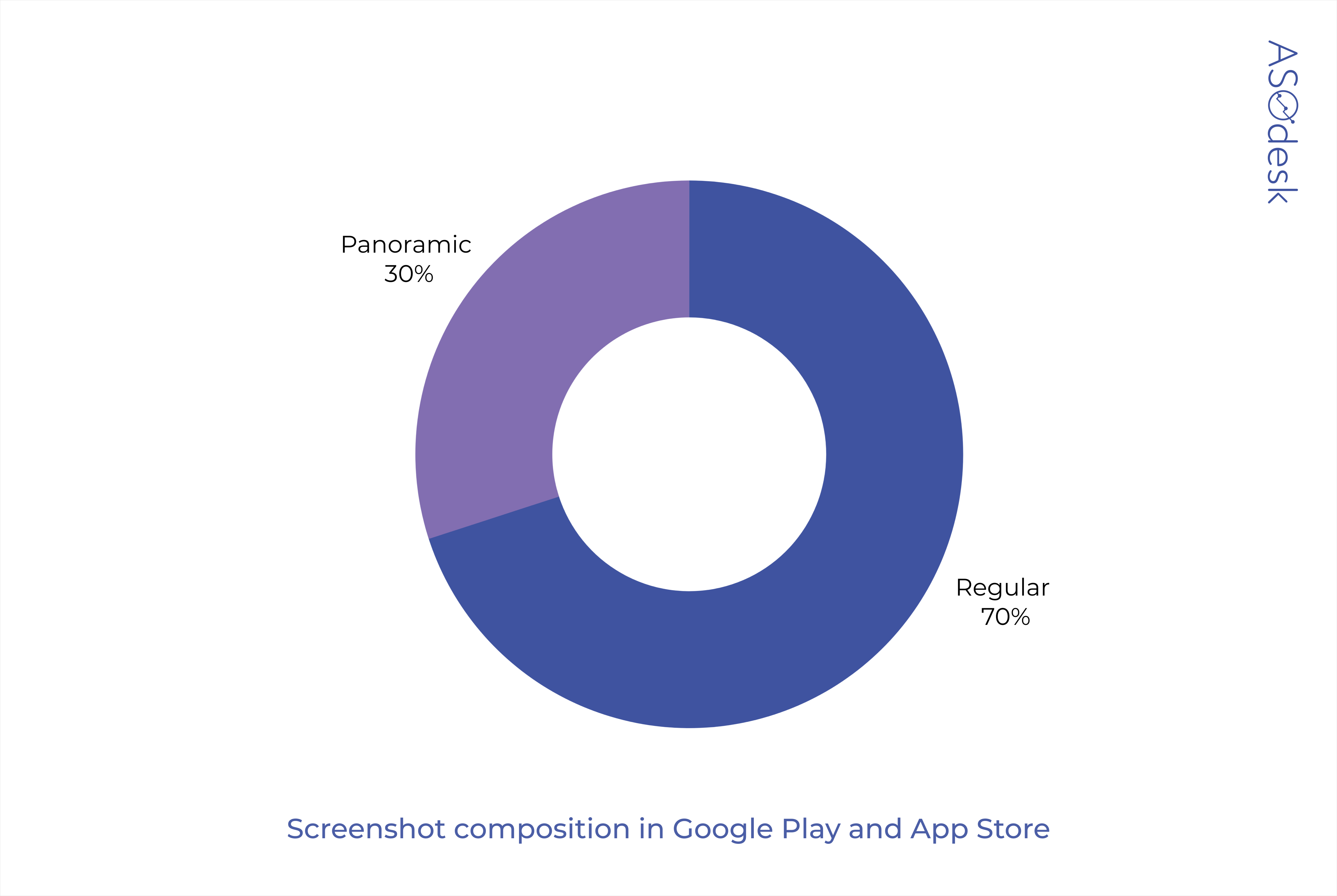
This may be due to the fact that on some screen sizes, the panorama falls apart, not forming the whole picture intended by the publisher.
This problem is especially relevant for app publishers on Google Play. While iPhones only have a certain variety of screen sizes, screens of Android smartphones can have almost any size and aspect ratio. There is no way to make panoramic screenshots for Google Play look great on all Android smartphones.
The first three screenshots are the most important, the user sees them first when exploring the app page. Place information about the most important features on them to increase your install conversion rate. When choosing the orientation of screenshots, consider the main orientation of the app so as not to confuse users. Test screenshots, their sequence, and composition to find the most effective option.
Additional graphics and editing
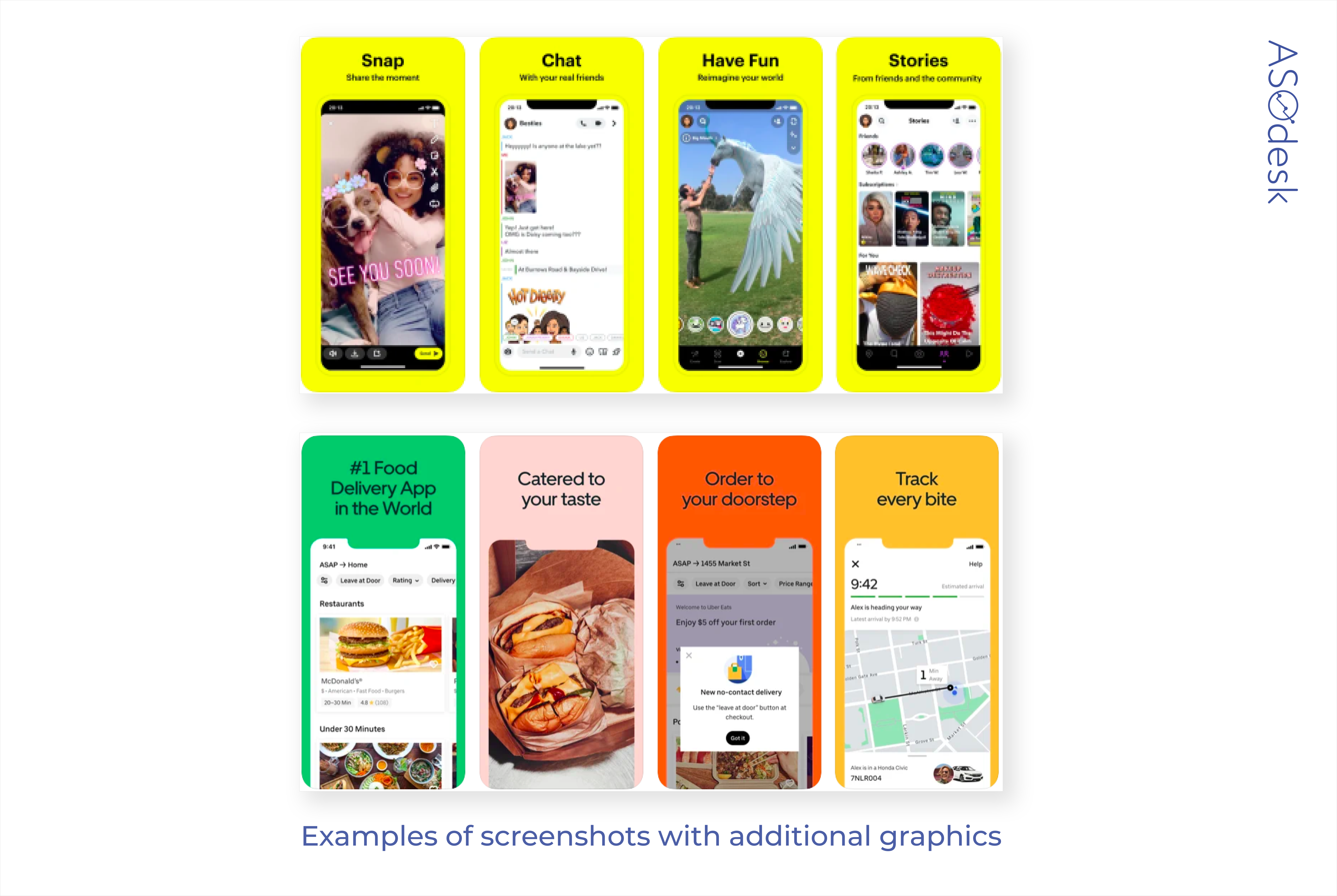
In addition to the interface, screenshots often include additional images or photos of people, animals, or food. Such images are used to evoke positive emotions in the user and to establish an emotional connection between the viewer and the application. These images are especially relevant for social networks, messengers and video chats, food delivery, and retail apps.
During our research, we found that 82% of publishers use additional images in screenshots.

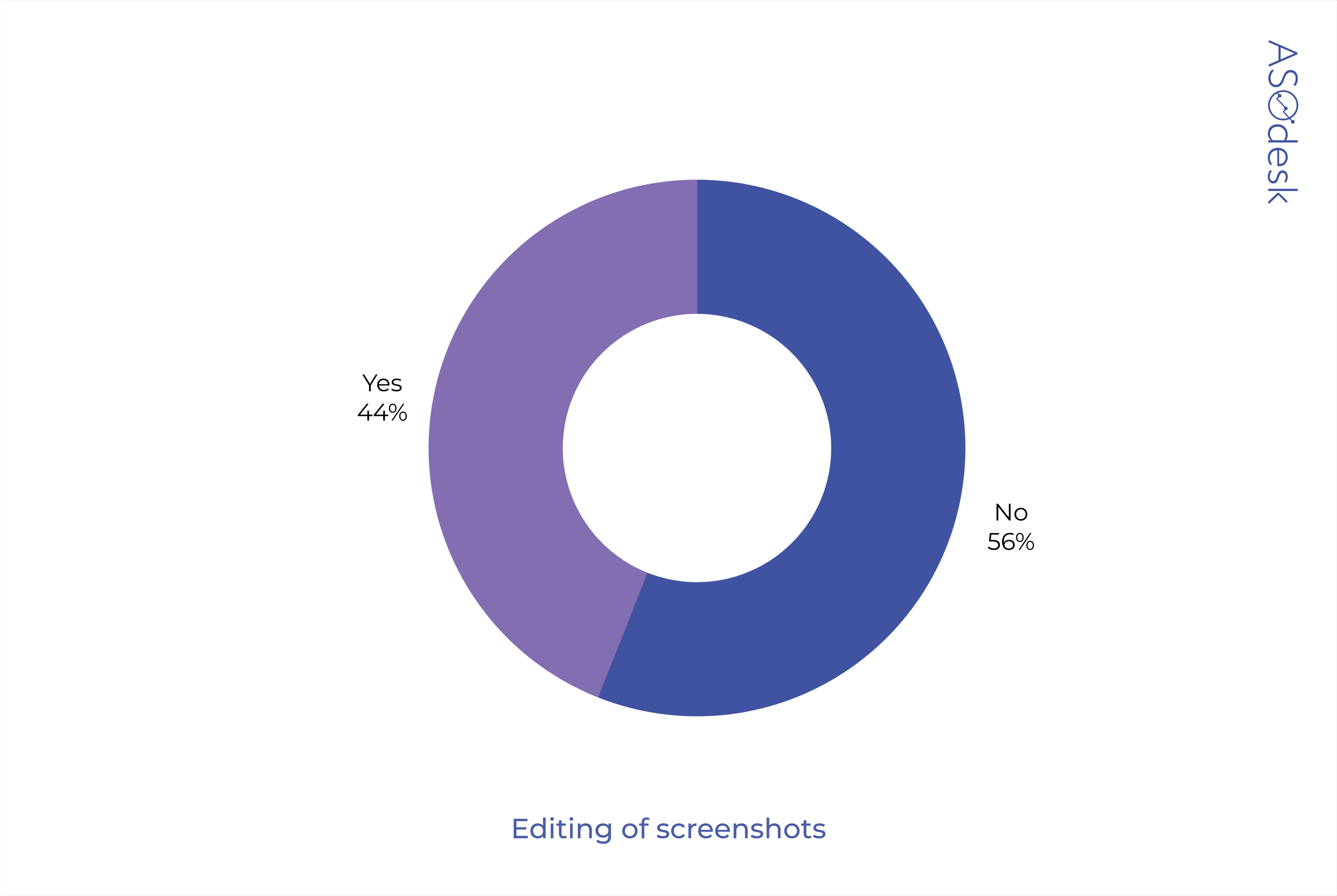
Editing screenshots allows you to highlight important elements of the application and draw the user’s attention to them. Important features or parts of the app screen can be marked out by changing their size, adding arrows, or encircling them.
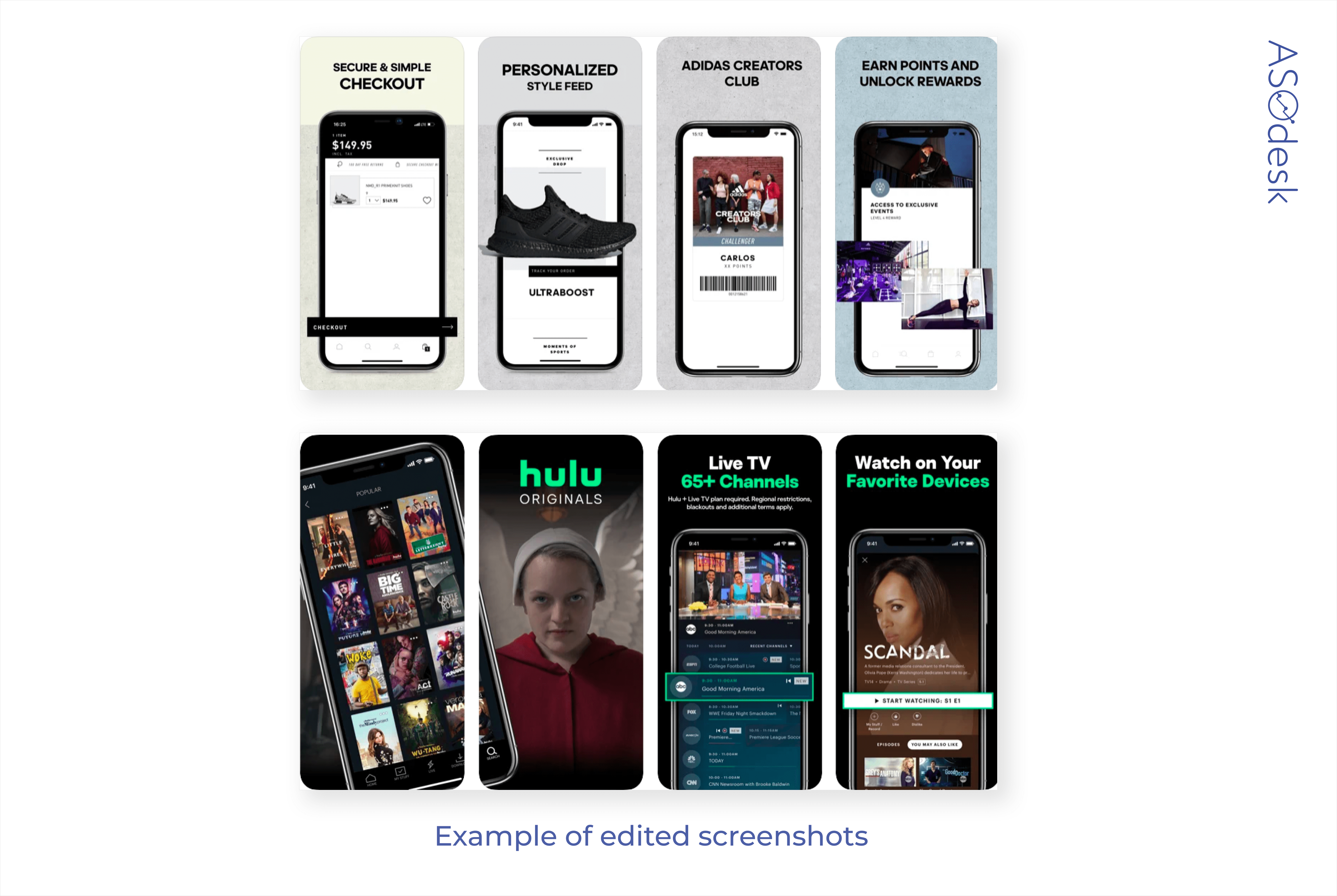
44% of publishers in the App Store and Google Play edit their screenshots.
Thomas Petit, @thomasbcn, world-renowned mobile marketing thought leader and independent app growth consultant
Publishers are slowly transitioning away from the classic format with a device and short text on top and I’m expecting to see more and more creativity in screenshot content. I would even suggest stopping calling them “screenshots”; they’re more of a banner where there is space to showcase your USP in many ways.
A growing trend is the “zooming lens” effect to highlight a particular part of the in-app screenshot.
Lina Danilchik, Marketing and PR Manager at SplitMetrics
Screenshot trends will come from other areas of design. App publishers will do A/B testing of all sorts of ideas to find the very best combination of screenshots that will help optimize the conversion.
I identified the following trends in screenshot design:
- Large elements and captions on screenshots that can be read from afar.
- The best features of the app are reflected in the first three screenshots.
- Enlarged elements of the application interface.
- Slanted elements that are stretched over multiple screenshots. For example, an image of a slanted smartphone with an open app on its screen.
- Bright and contrasting colors: yellow background, black font color of signatures.
Use additional graphics and photographs to show how the app can be used in real life, convey the mood, and create certain associations with the app. Edit screenshots and highlight those features that might motivate the user to download the app.
Number of screenshots
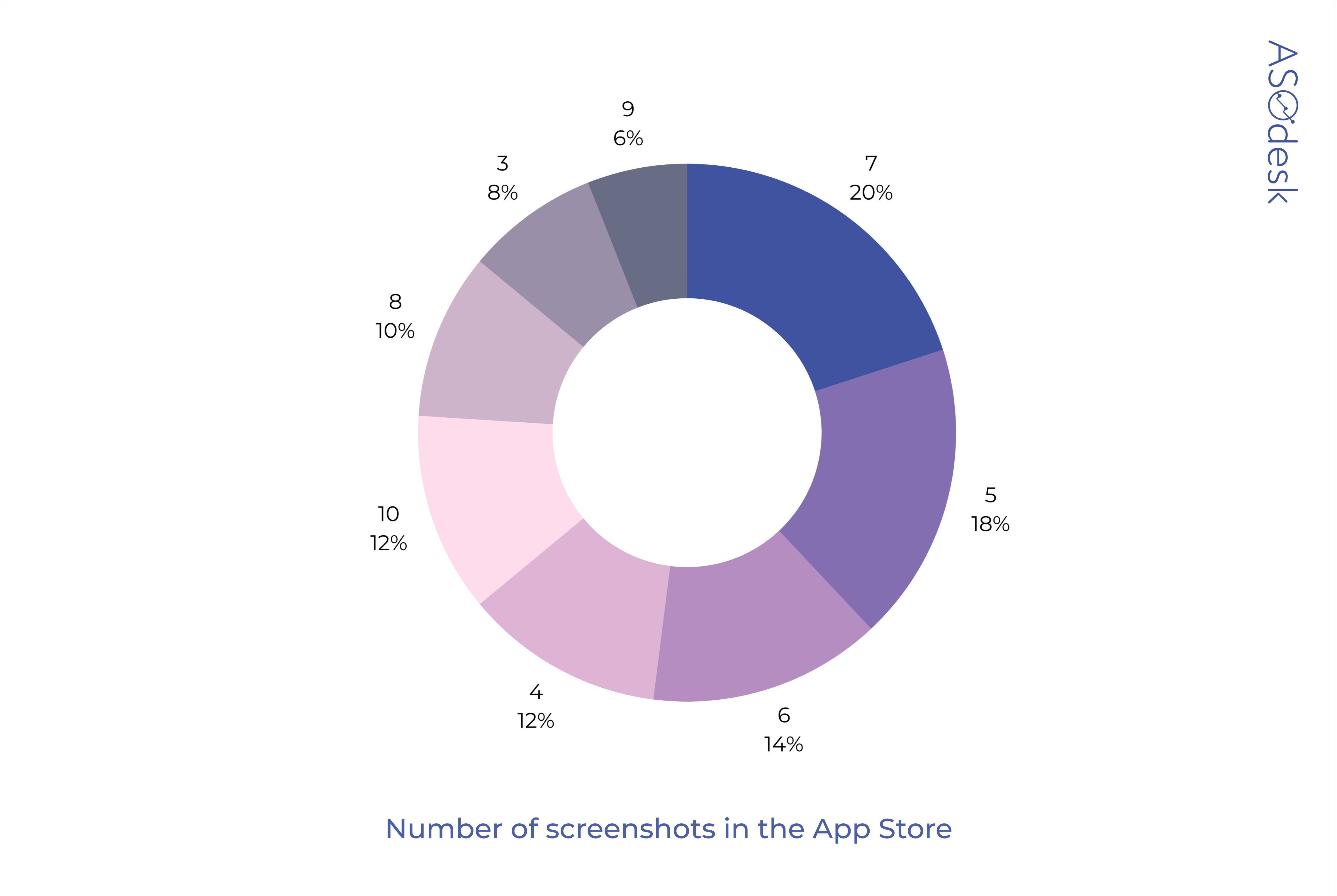
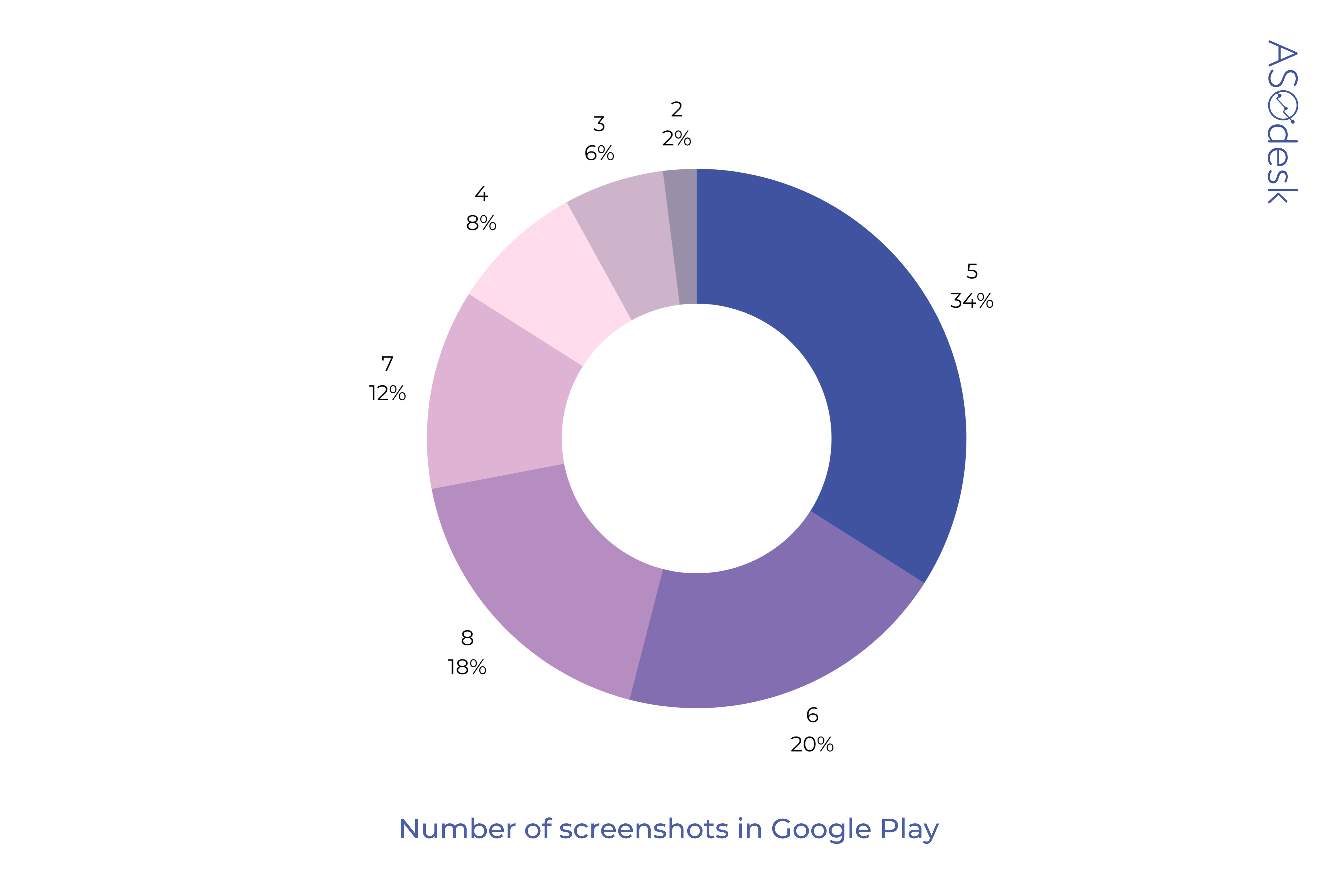
There are 10 screenshots available for publication in the App Store, and 8 in Google Play. However, publishers usually prefer to use only 5–7 screenshots.
Only 12% of publishers use the maximum number of screenshots in the App Store.
18% of publishers use all available screenshots on Google Play.
Use all available screenshots, so that you can demonstrate all possible features of the application. Think about the competitive advantages of your app and highlight them in the screenshots.
Lina Danilchik, Marketing and PR Manager at SplitMetrics
Any change in screenshots can affect the install conversion: their orientation, sequence, and captions on them. Also, numerous tests by SplitMetrics show that localization can be of great importance — localization implies adding elements to screenshots based on the mentality of certain countries and regions. Same for the icons. It is important that screenshots look good both in regular mode and in Dark Mode, which appeared in 2020 and is already loved by many users.
Thomas Petit, @thomasbcn, world-renowned mobile marketing thought leader and independent app growth consultant
Any change on the screenshots, even the most subtle, can have a big impact on conversion rates. Be careful: that impact can be either positive or negative and tend to vary wildly from app to app. So as with anything ASO, keep testing and measuring.
Consider how screenshots will look on devices of different sizes, and use the appropriate length, size, and color of text so that it reads quickly and easily — even on small screens. Finally, remember to keep your screenshots up to date and update them as the interface changes.
We regularly share tips on ASO and mobile app marketing, as well as talk about the latest news from the App Store and Google Play. Sign up for our newsletter to receive insightful Asodesk articles!
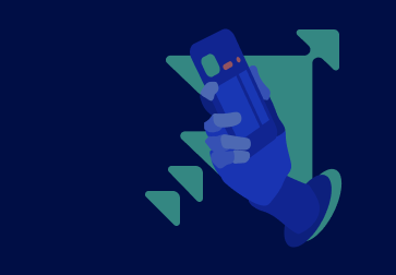
Creating an app preview video
App preview videos are more common for promoting games than apps. Only one video can be added to Google Play, while the App Store allows you to have three. But the video format on Google Play is freer than on the App Store: Android app publishers can publish not just the interface preview, but even films with special effects and real people.
App Store and Google Play page design evaluation parameters:
- The number of video pages versus screenshot pages.
- Sound, text, and video format.
Number of pages with an app preview video
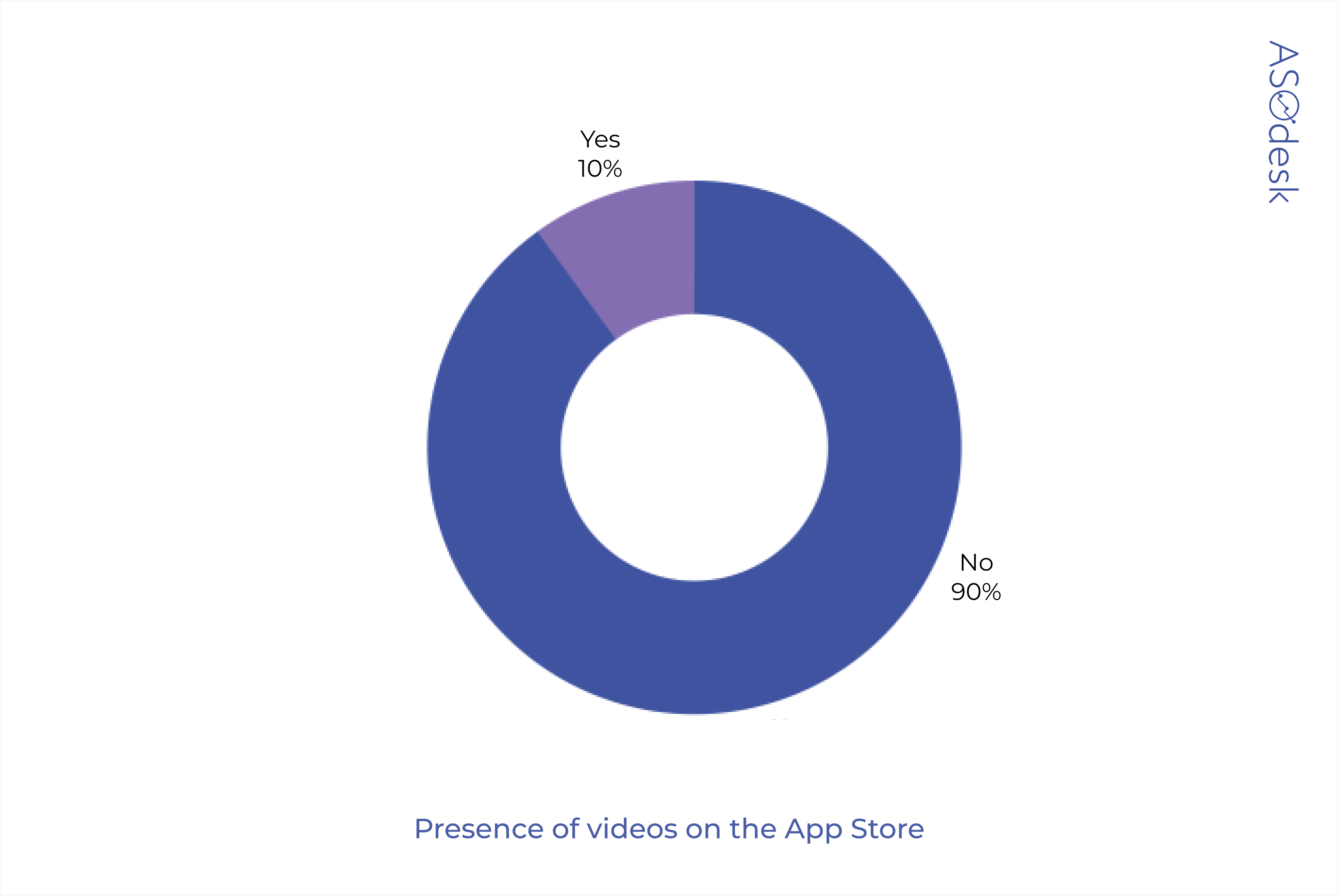
Most app publishers do not use the video format and are limited to screenshots.
Only 10% of App Store publishers use videos.
Google Play publishers use videos 3 times more often — it’s 28%.

On both platforms, developers often publish no more than one video.
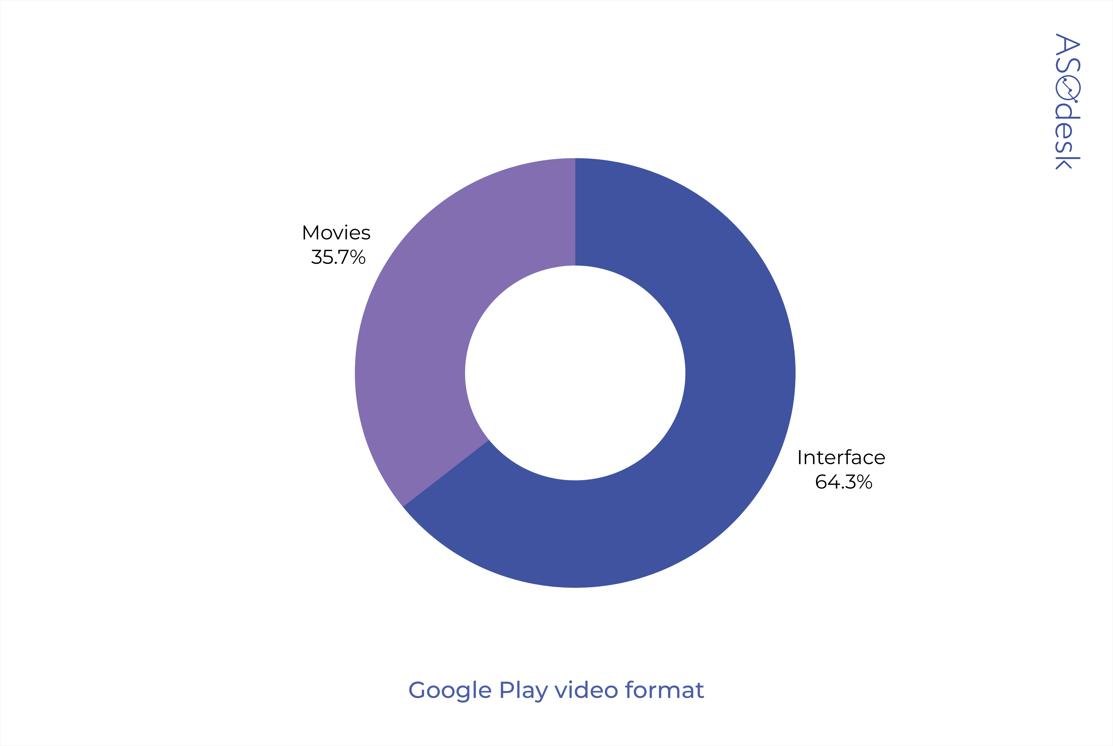
Sound, text, and video format
Most app publishers add audio and text to their videos. Most often, subtitles are added so that the user who has muted the sound can read all the necessary information.
The free video format on Google Play allows you to show not only the app interface, but also its use in real life.
For example, on the Zoom page on Google Play, you can find a video showing how the app helps you have meetings between different offices.
In the App Store, video can only show the app interface.
Thomas Petit, @thomasbcn, world-renowned mobile marketing thought leader and independent app growth consultant
In Google, we saw changes last year in how videos get integrated into the Play Store (finally not forcing you to switch to Youtube anymore). Autoplays got rolled back at some point in 2020 but could come back at some point this year.
Lina Danilchik, Marketing and PR Manager at SplitMetrics
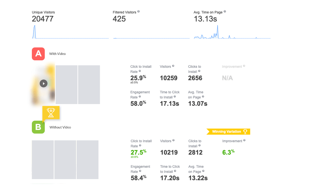
Before adding a video to your page in the app store instead of screenshots, you should test this option. Experiments on the SplitMetrics platform have shown that videos can negatively impact the conversion rate. This has also been confirmed by our clients.
When creating a video, do not forget about audio and subtitles — this can help to focus the user’s attention on the most important details.
Be sure to do A/B testing and compare how the install conversion rate will differ for a page with a video and a page with screenshots.
How top app publishers design pages
- Minimalistic design of icons and screenshots.
- Visual elements, logos, colors, and fonts are applied in accordance with the brand book.
- White is popular for backgrounds, fonts, and icon images.
- Most of the icons are made in blue, black, or red colors. The least commonly used colors are orange, purple, pink, and yellow.
- Publishers prefer editing images, rather than just uploading screenshots of the interface.
- Vertical screenshots are much more common than horizontal ones.
- An average of 5–7 screenshots is uploaded to the application page.
- Most publishers prefer not to use video previews.
Do not try to apply all the listed design options to your application, because sometimes it is worth looking at trends and finding unique solutions that will help you stand out among the competitors.
Checklist for visual app optimization
- Do your research on the apps that come up next to your app in the search results and consider how you can stand out among them.
- Make the visual elements of the app page more informative. Take trends into account, but at the same time try to be different from competitors.
- The application page and the ads that the user clicks on must be designed in the same style. This will create a consolidated image and brand associations for the user.
- Adapt visual elements for different countries and cultures.
- Use the icon to convey the most important information about the application and its purpose.
- Place the brand name on the icon so that you have extra characters available in the name for adding effective keywords.
- The orientation of the screenshots should match the main orientation of the application.
- Use vertical screenshots to share more information about the app with the user.
- In the first three screenshots, include information about the important advantages of the application that differentiates you from the competitors.
- The text in the screenshots should be simple and readable even on small screens, and the font should be large and contrasting.
- Add emotional images to screenshots to get the user’s attention.
- Highlight important UI elements in the screenshots. The most important features of the app should be presented in the first three screenshots.
- Consider using panoramic screenshots. They can motivate the user to view all images.
- Be sure to do A/B testing before adding video to your app page. Make your video interesting and high-quality; add subtitles and audio.
- Listen to expert advice. Lina Danilchik (Splitmetrics) believes that in 2021 the trends in icon design will be geometric shapes, minimalism, and slanted elements. Screenshot design trends will be slanted and enlarged elements, bright and contrasting colors.
- Don’t follow trends and your own preferences blindly. Run A/B tests and look at the conversion rates of pages with a different set of visual elements. Only this way will you find the design that will prompt the best response from users.


