Gaming app page visual optimization trends of 2021
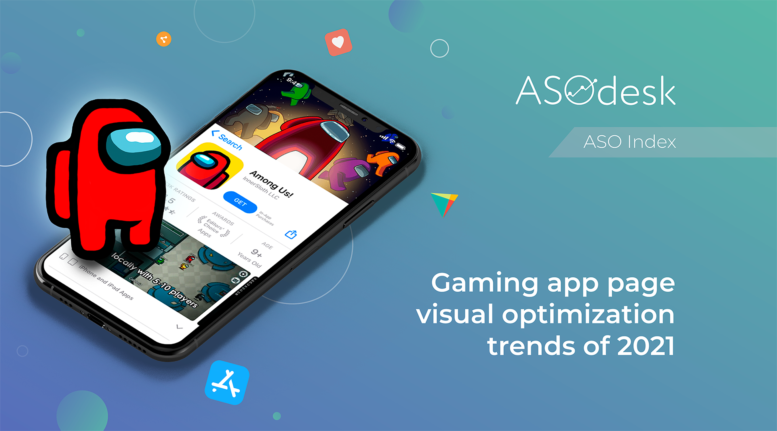
To stand out from the competition and become more noticeable in search results, publishers need to actively work on gaming app page design in the app stores. ASOdesk continues the cycle of research on visual optimization in the App Store and Google Play. We have already talked about regular app pages previously, but now let’s look at gaming app visual optimization trends.
We analyzed the icons, screenshots, and video designs of 100 free games from the top of the App Store and Google Play in the USA. Peter Fodor (AppAgent), Lina Danilchik (SplitMetrics) and Daria Pavlyuk (ZiMAD) spoke about gaming app design trends in 2021. In this study, you will find statistics on page design options and visual optimization ideas for your projects.
Icon design
While regular app icons are usually minimalistic, game icons, on the other hand, attract users with vibrant colors, graphics, and characters.
Icon design evaluation parameters:
- Main icon color
- Image on the icon
- Presence of text
Icon color
It is impossible to point out a specific background and main image colors on the icon due to the abundance of design options. But we have identified the dominant colors that are most common.
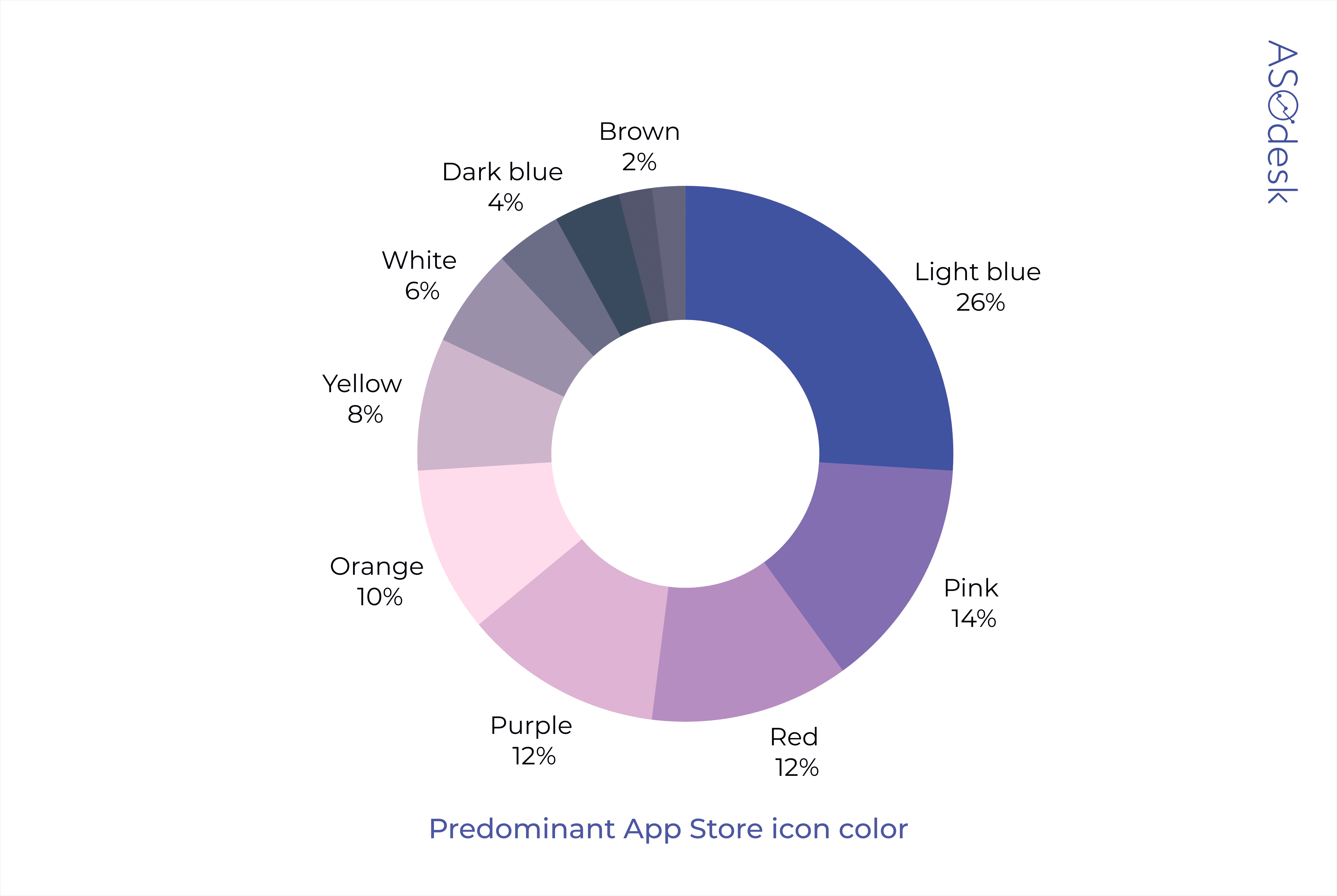
The most popular color for icon design is light blue, used by 26% of publishers in the App Store. Slightly more than a third of applications are designed in the variations of red: from pink to orange. 12% of publishers use purple.
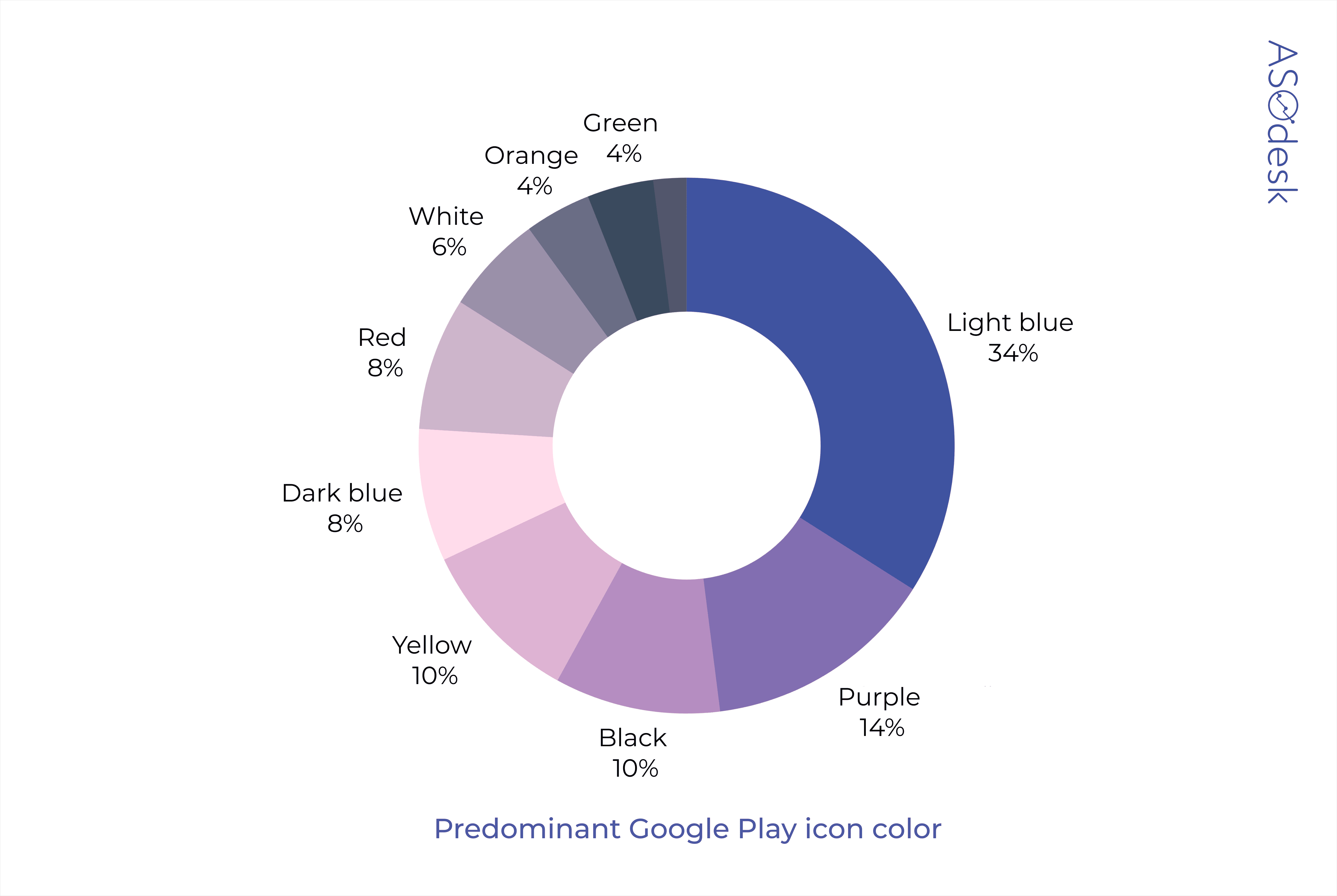
On Google Play, light blue is used even more often — in 34% of applications. Red is not so common; publishers prefer to use darker colors such as purple (14%), black (10%), and dark blue (8%). 10% of application icons are designed in yellow.
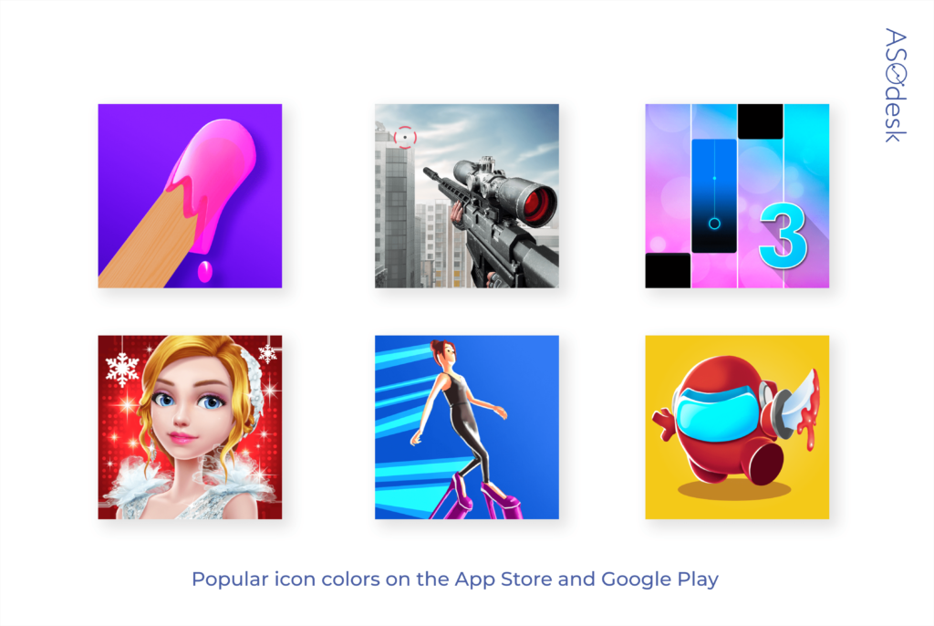
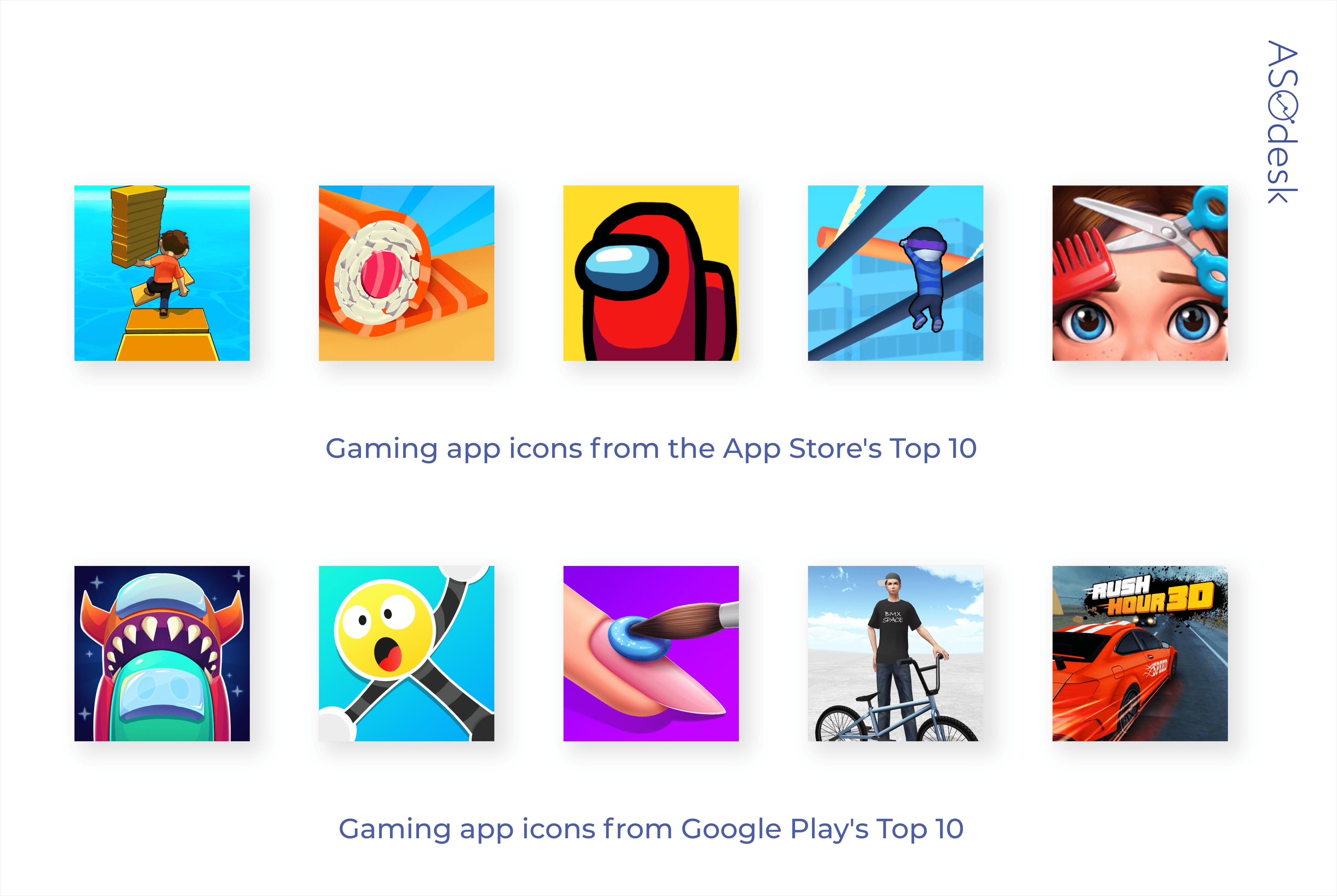
Take a look at gaming app icons from the top 10 apps in the App Store and Google Play and choose the ones that grabbed your attention right away. Similar colors and styles can be adapted to suit your application.
Study the competitors that come up next to you in search results and choose the color that will help you stand out from them. The Competitors Table in ASOdesk’s Keyword Charts tool can help with that. The tool makes it possible to quickly compare application icons that can be found in search using your keywords.

Green, brown, and white are rare colors, which means they can help you become more noticeable in the search results. Consider applying these colors to your applications.
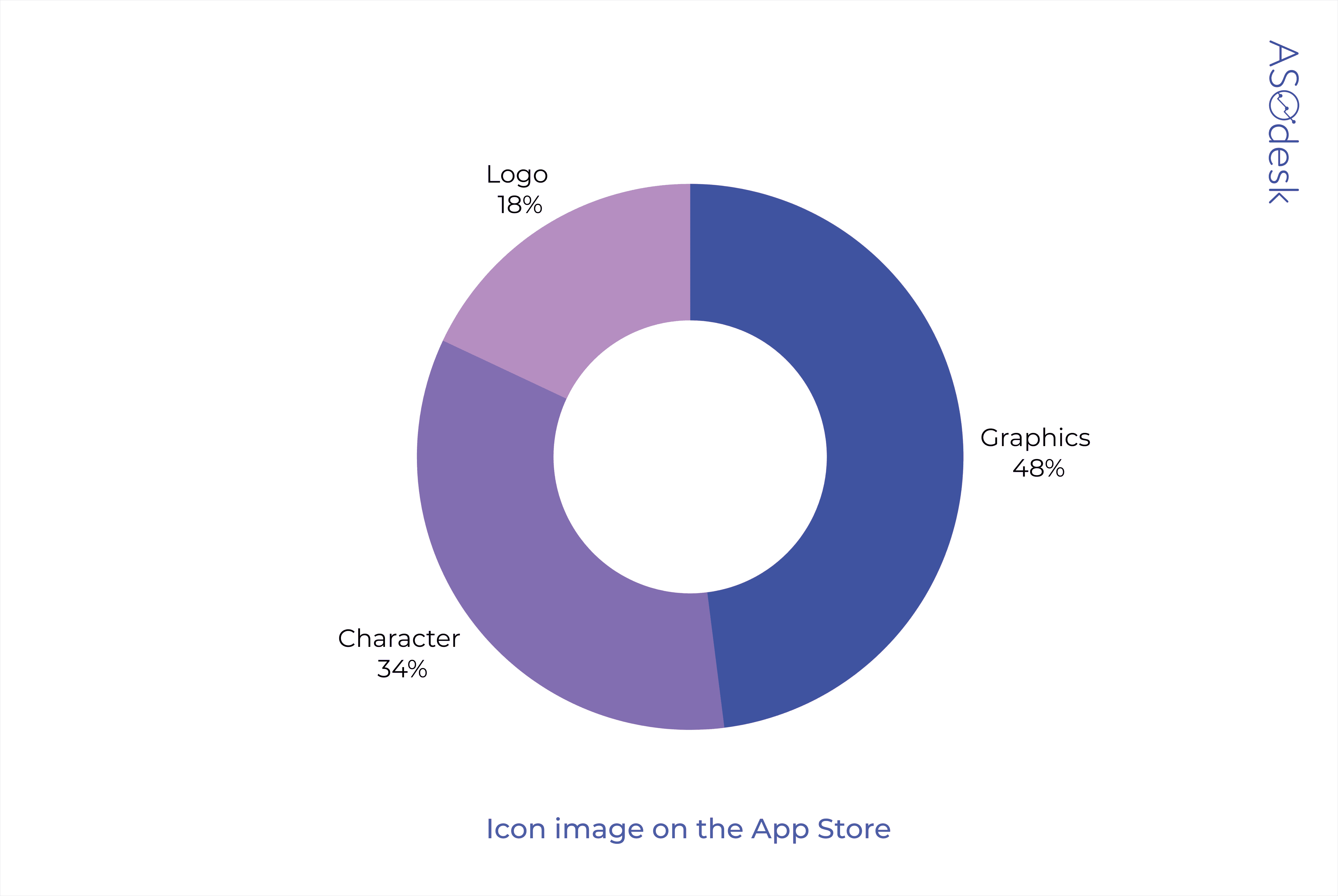
Icon image
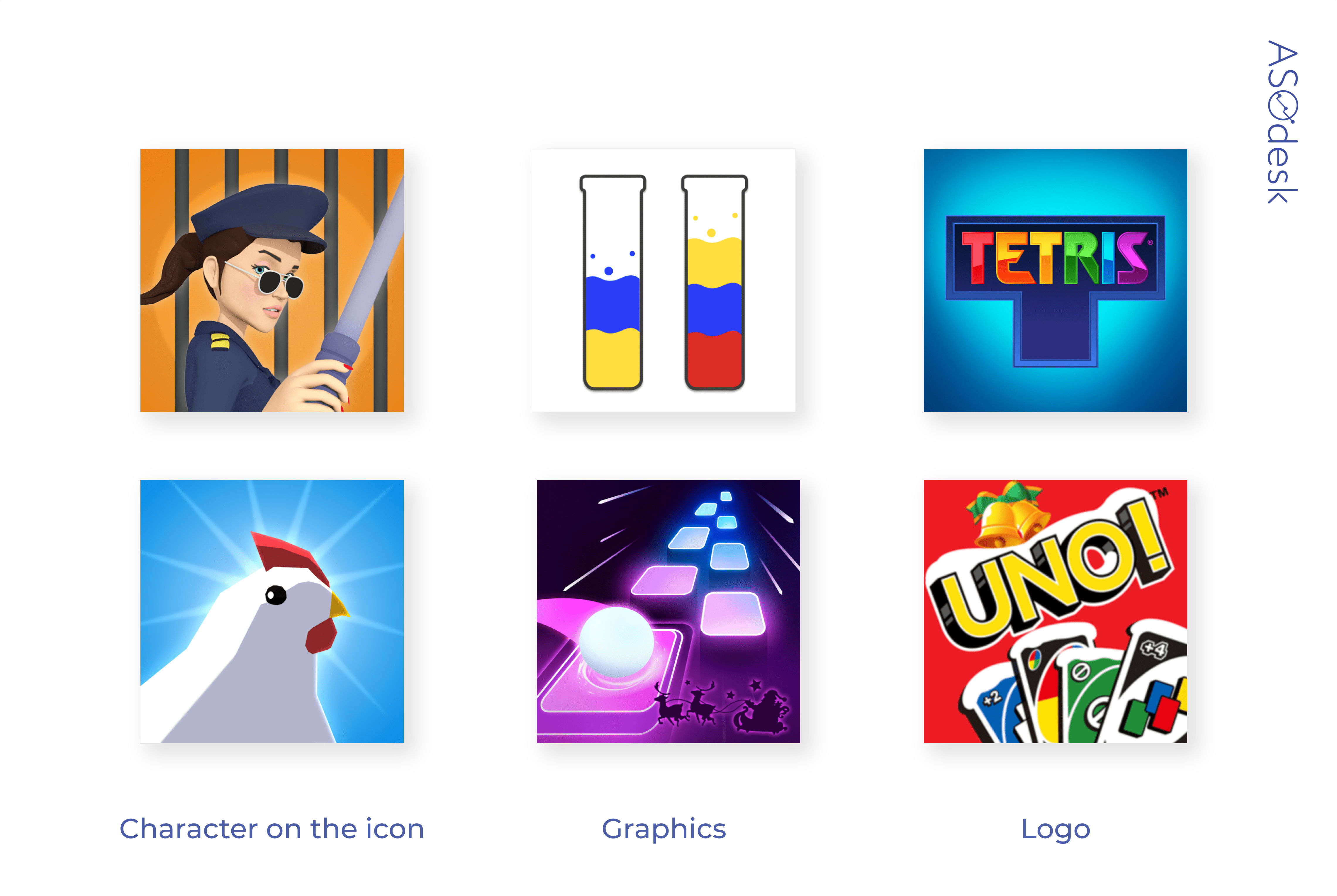
We analyzed icon images to find out how many publishers are using logos, characters, or graphics.
Only well-known game publishers can afford to use a logo on the icon. In the App Store, only 18% of icons have logos. 48% of publishers use game graphics.
On Google Play, top publishers don’t use logos on icons at all. Unlike the App Store, Google Play has quite a lot of icons with a character on them: 76% of publishers use them.
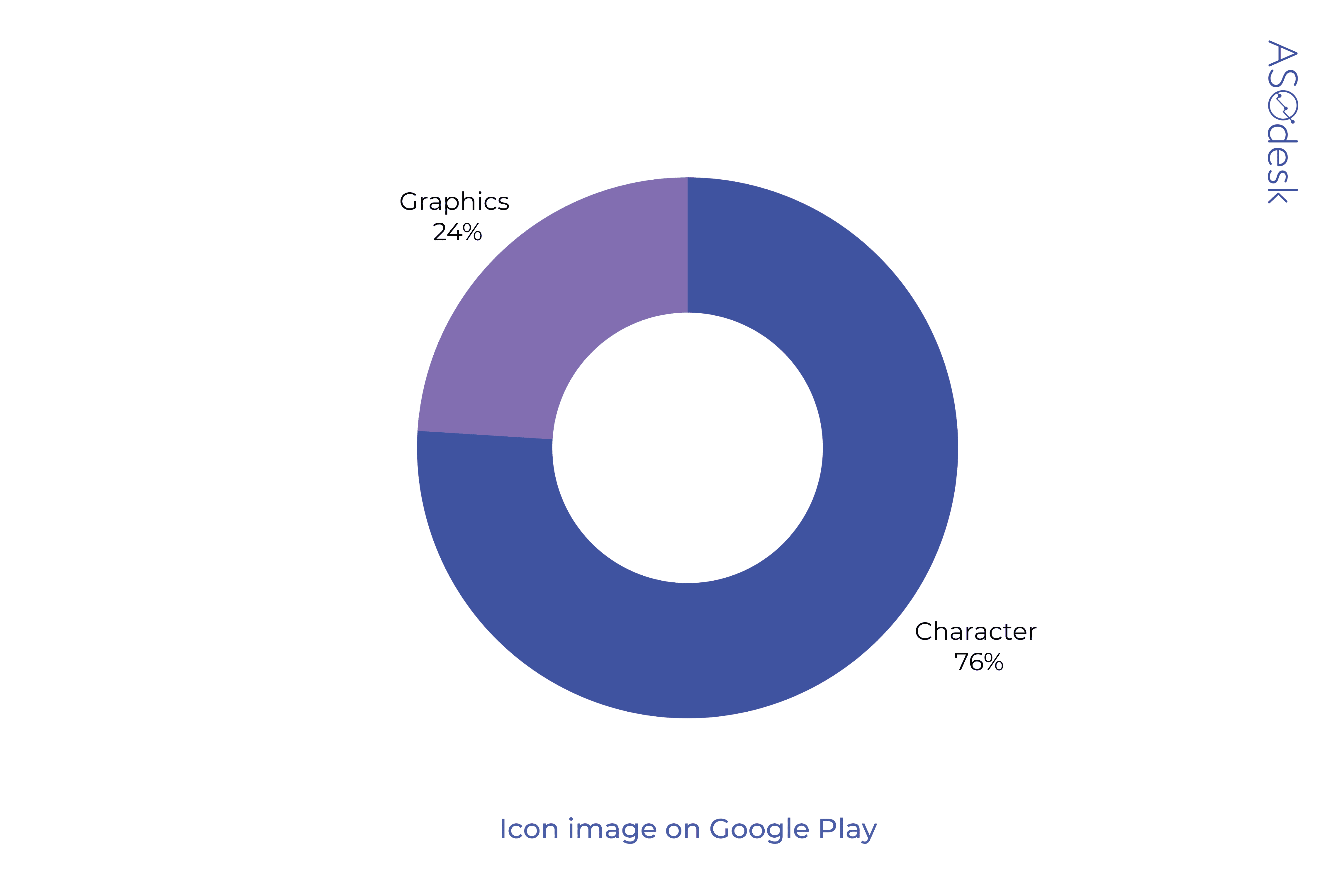
More often the icons contain the game interface or characters. Compared to previous research, the use of characters has grown by 10% on the App Store and by 28.5% on Google Play.
If the game has a main character, you should increase their recognition and use their image on the icon. With the help of the main character, you can convey the mood of the game and evoke a more emotional response from potential users.
Remember that the icon should also show the essence of the game. After all, users scroll through the search results quickly and the developer has only a few seconds to catch their interest.

Daria Pavlyuk, Head of ASO, ZiMAD

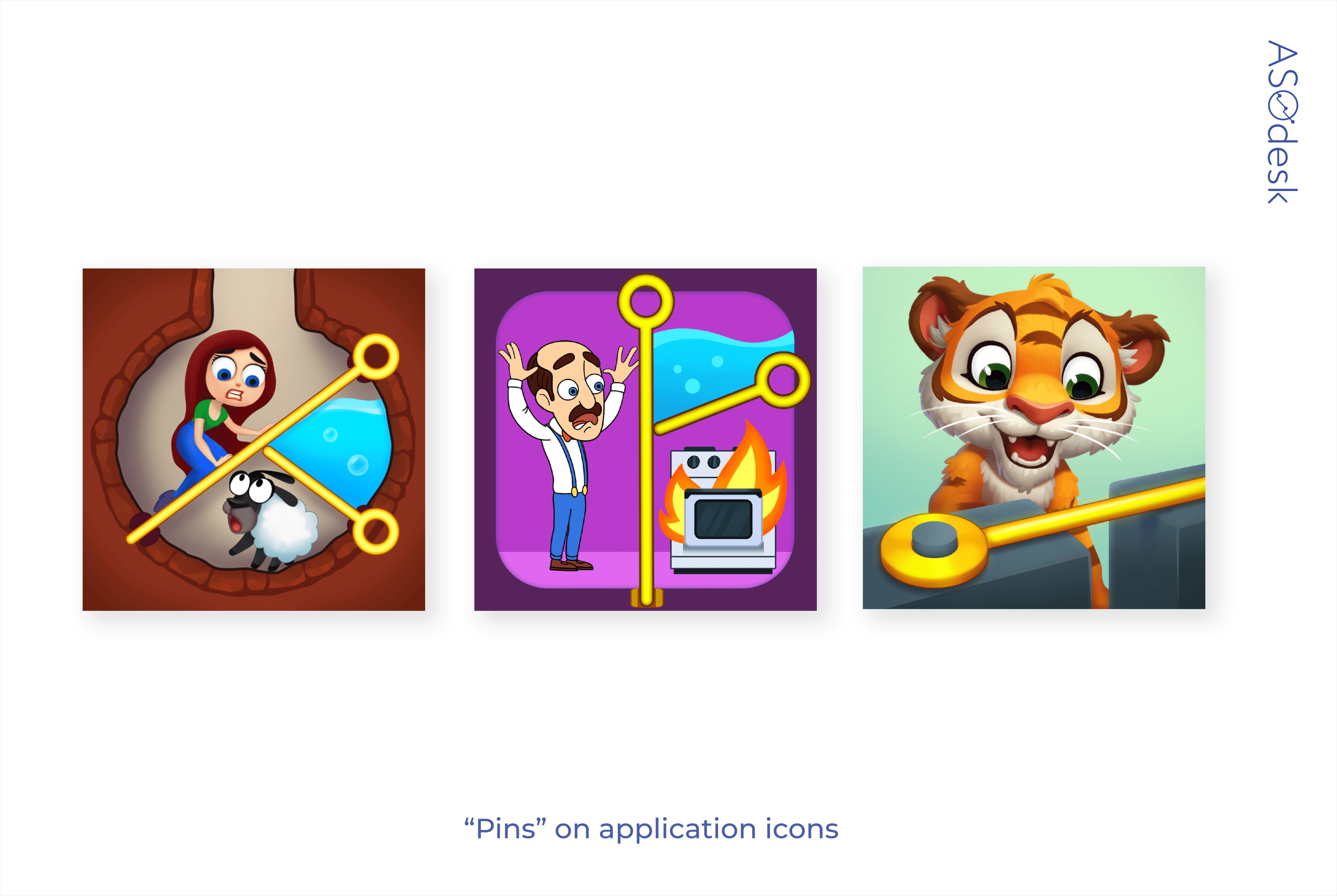
The visual part of an app’s page is starting to rely heavily on the creative initiatives promoted in ads. In the past year, it has become popular to use “pins” on icons and screenshots. You need to move the pin to release or save the game character. I think it is worth continuing to follow this trend this year.

Peter Fodor, the Founder & CEO of AppAgent
The trends are set from time to time by successful games. Just remember the shouting barbarian from Clash of Clans that triggered hundreds of similar drooling mouths. A new rising star might trigger a similar wave but keep in mind that copy-pasting won’t make your product different and attractive.
Explore trends but don’t rush to follow your competitors. Make sure that the images on your app icon, screenshots, and ads demonstrate the gameplay well. Otherwise, users will realize that the screenshots do not correspond to the game and that might cause a scandal, just as it happened to Homescapes and Gardenscapes.
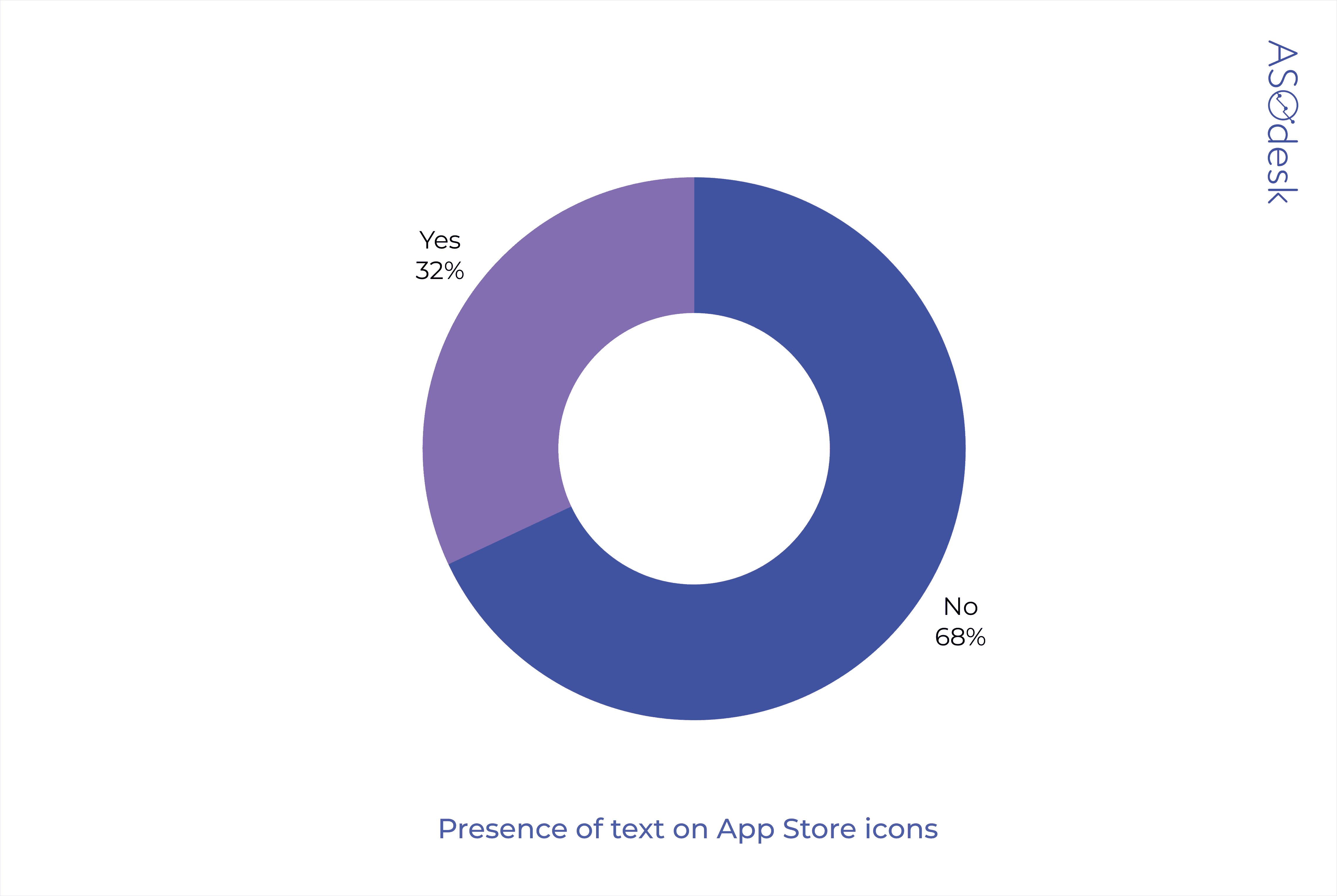
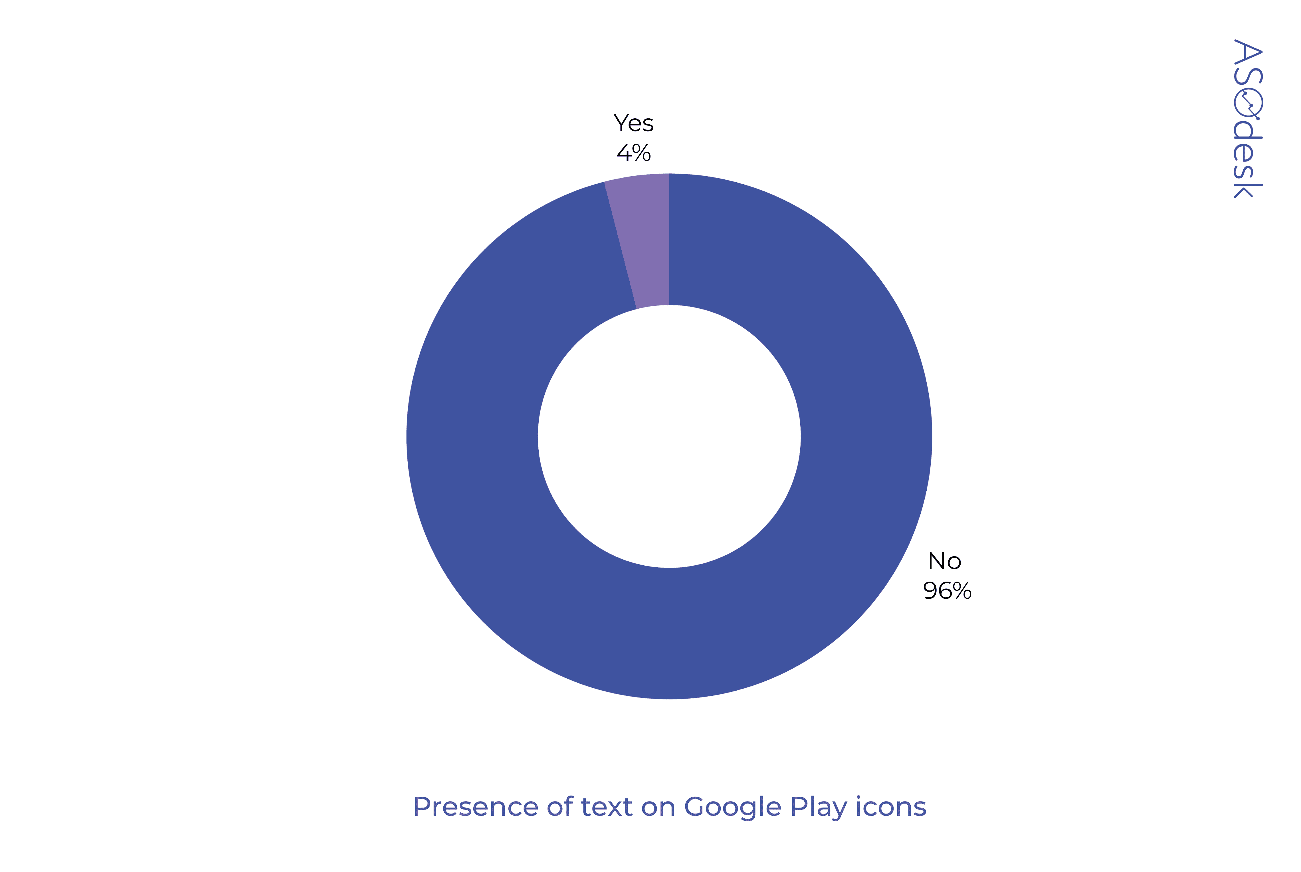
Presence of text
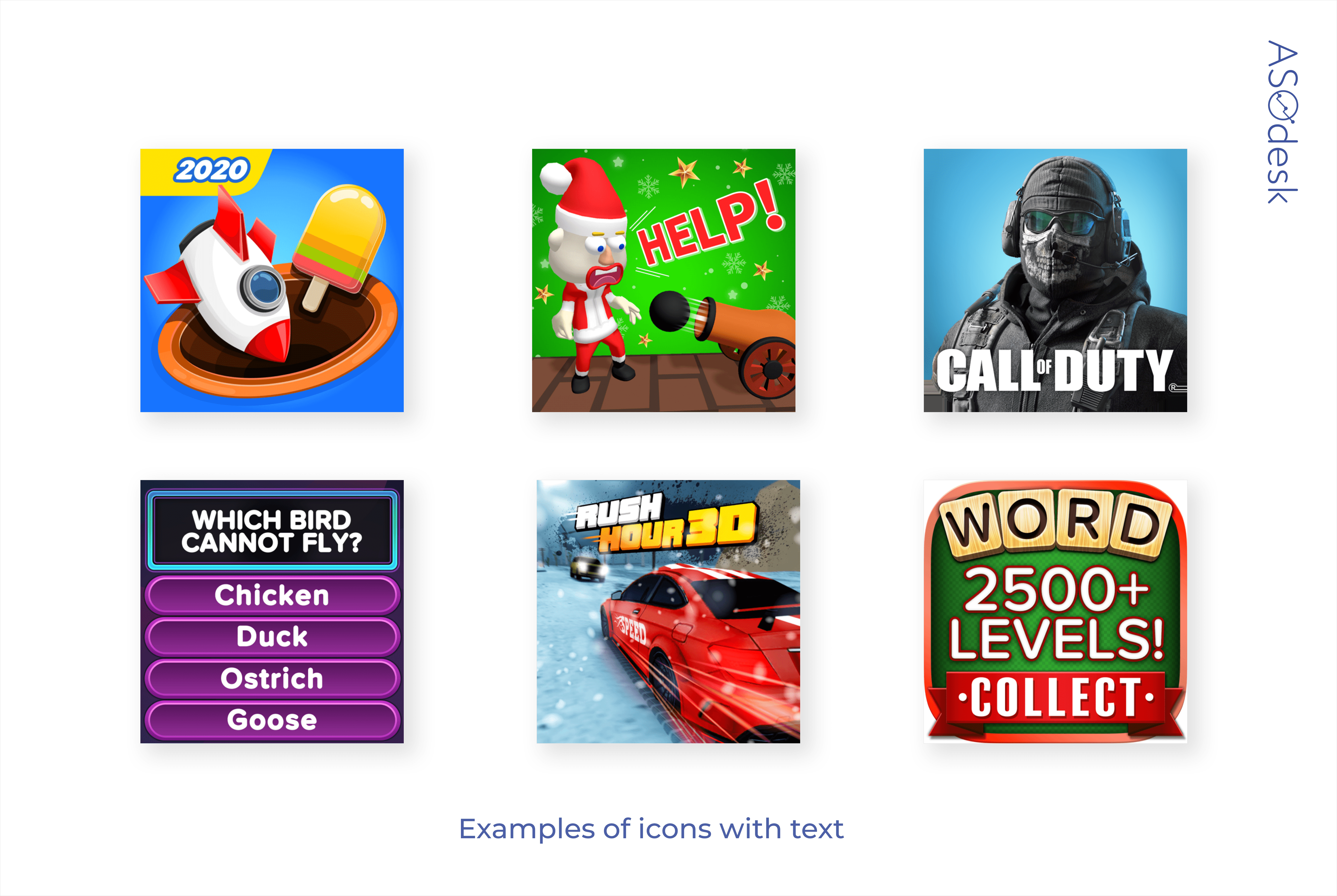
The text most often acts as the game name or as a part of the logo. The numbers on the icon are either a part of the game or represent the year. Sometimes the additional text is used; it is supposed to catch the user’s interest. For example, the word “Help” motivates the user to download the game and help the hero.
In the App Store, a third of developers put text on their icons.
On Google Play, text can be found only on 4% of icons.

Lina Danilchik, Marketing and PR Manager at SplitMetrics
I expect the following gaming app icon design trends:
- Playing on contrasts. For example, a character image or shadow in gray on a bright purplish-red background.
- Brand names featured on icons. If the app publisher is well-known, players will see a familiar name that they have already seen in the title of a previously installed game. Then the user will be more inclined to try another game from this brand.

Don’t follow trends blindly. Remember that your game should stand out from the competition. Developers use green, white, and brown icons the least. These colors can help you stand out in search results. Test icon options with the text that motivates the user to download the game, and without the text. But make sure the icon text is easy to read on any device.
Screenshot design
The vast majority of publishers prefer to leave screenshots without any post-editing and simply publish screenshots of the game screens. This is how games differ from regular applications whose developers are more likely to edit the screenshots.
Screenshot evaluation parameters:
- Background color or presence of app interface
- Presence and color of text
- Presence of the device
- Orientation and composition
- Number of screenshots
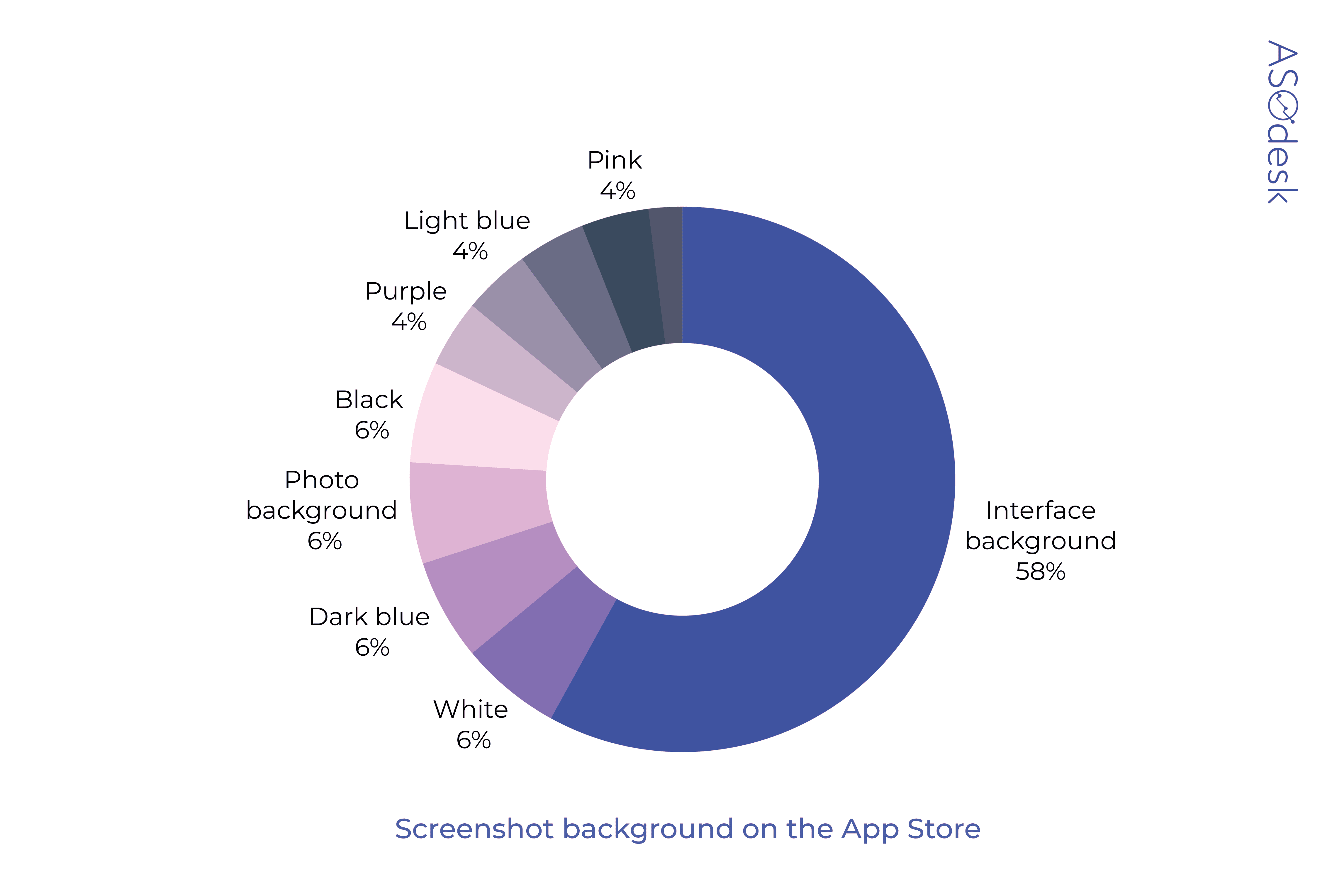
Screenshot background color
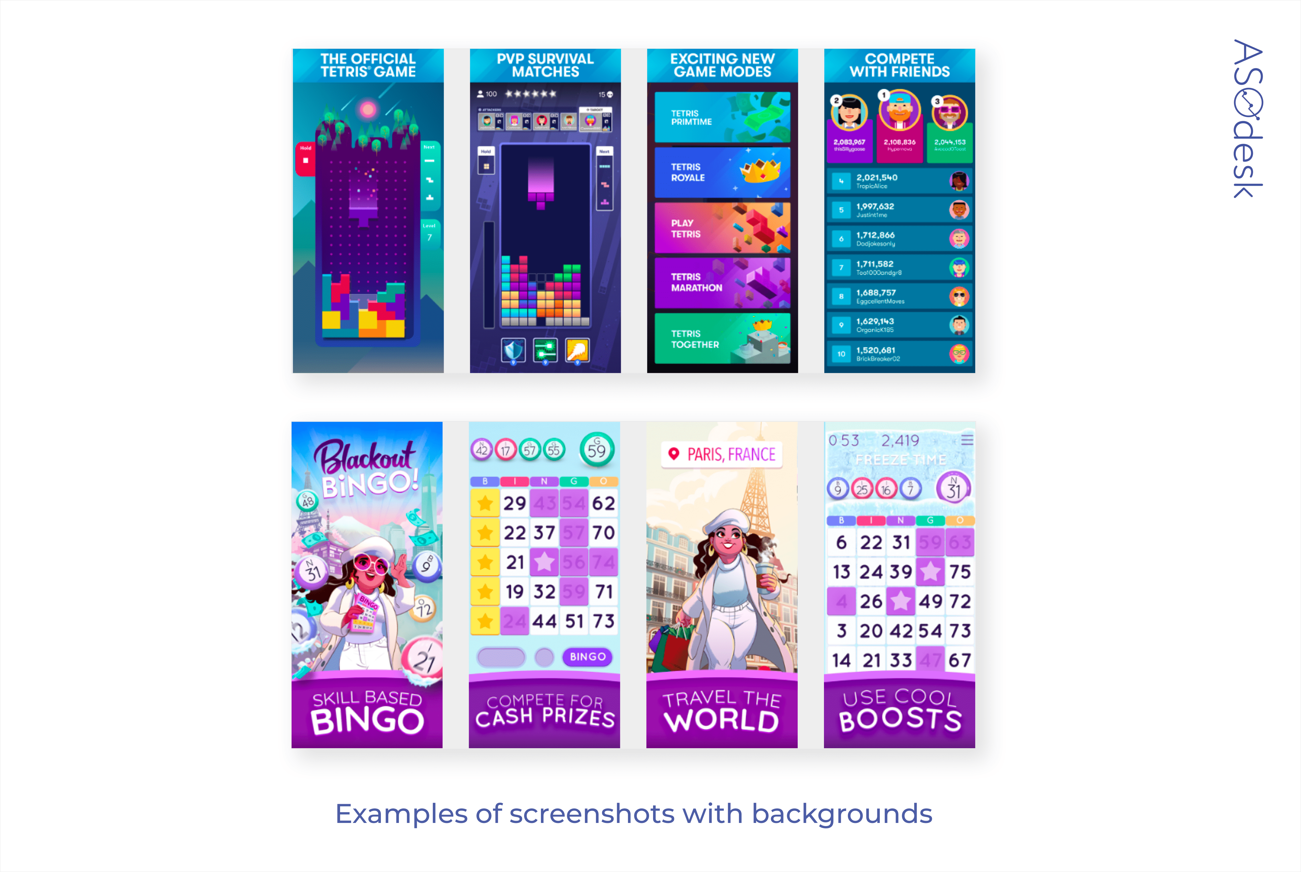
Compared to regular applications, the background of game screenshots takes up a small part of the screen. It is mainly used as a background for text, which is put over the screenshot of the interface.
In the App Store, 58% of developers put the interface on screenshots, and 42% use different colors. Dark blue and white are the colors most commonly used by app publishers.
Only 28% of Google Play developers use color as a background substrate, the remaining 72% add an interface. 6% of publishers use yellow, purple, and white.
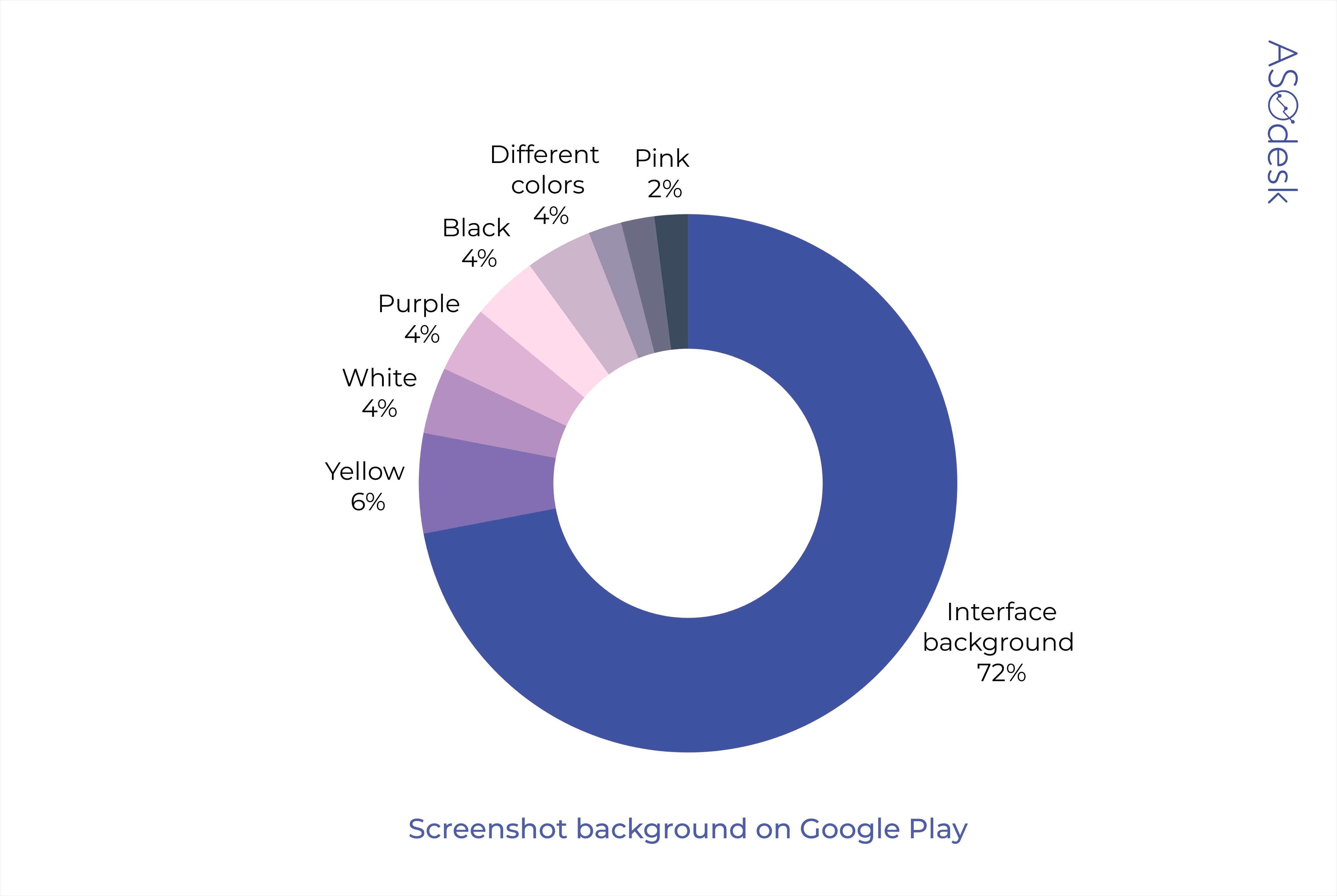
White, black, and purple background colors are the most popular.
Using the background as a substrate for the text allows you, additionally, to highlight important information that the publisher wants to convey. We recommend experimenting with the background instead of only putting the interface on your screenshots. This will make you stand out from your competitors.
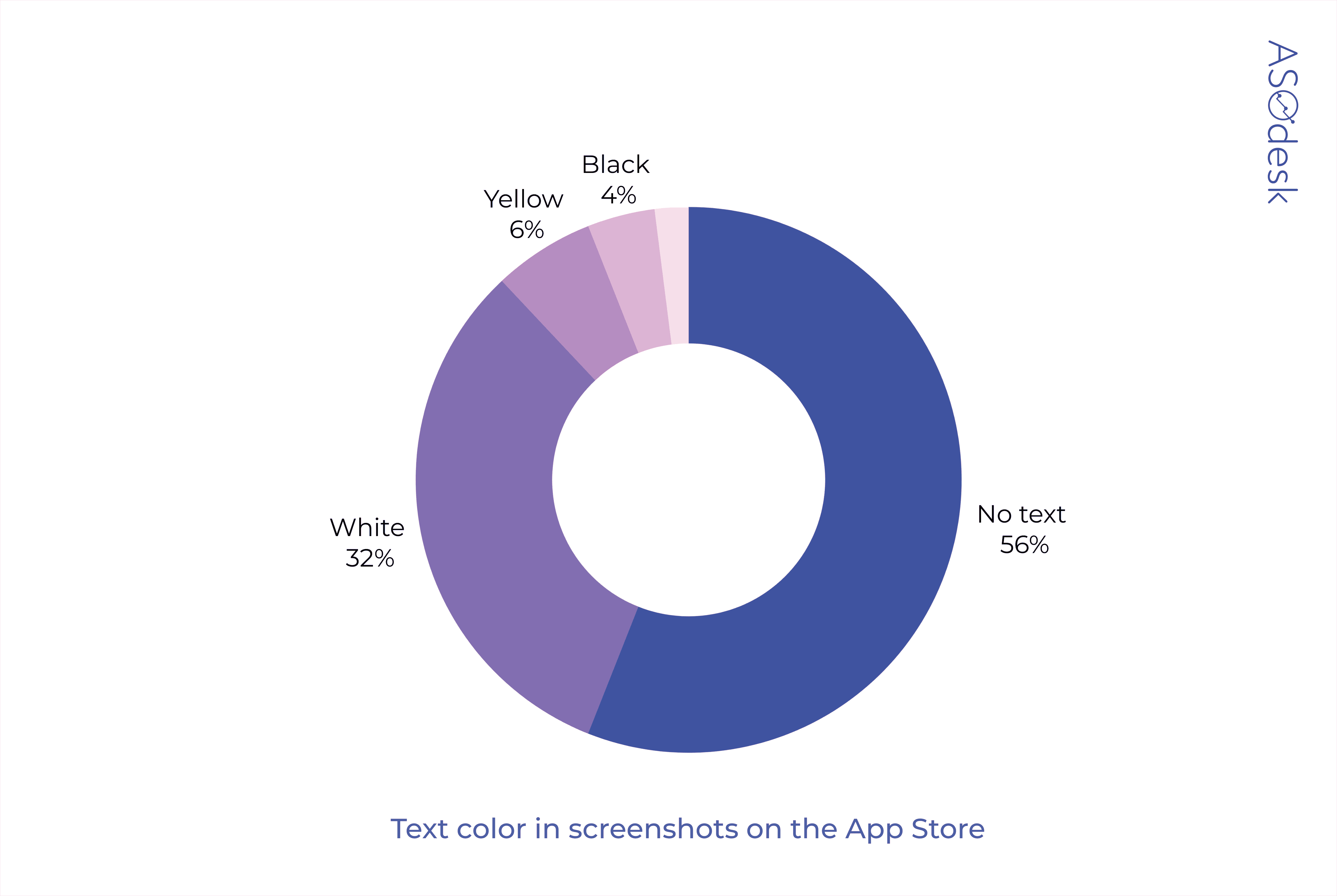
Text color
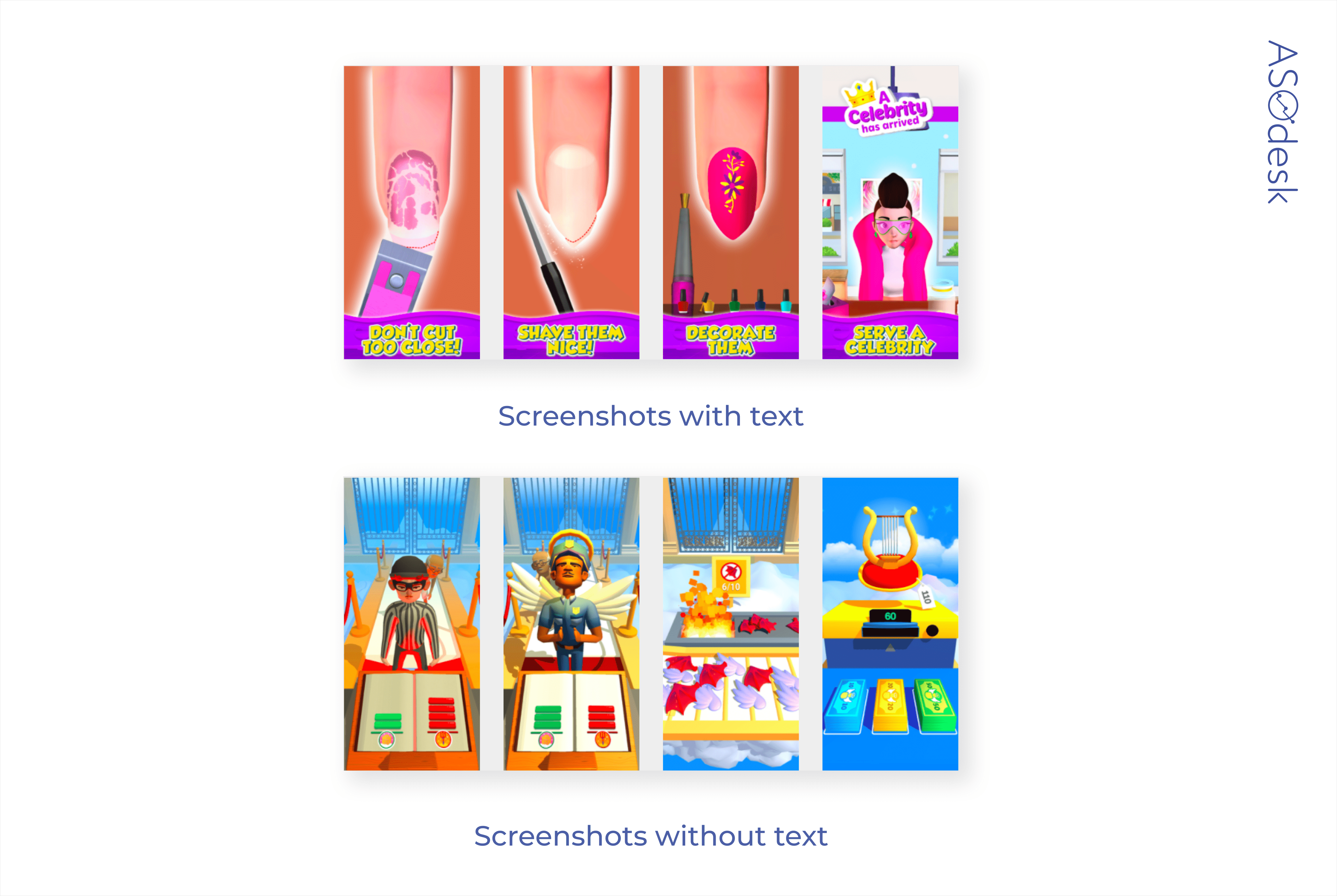
Publishers rarely add text to the screenshots. If text is present, it is most often white and placed on a bright contrasting background. You can also find text in yellow and black.
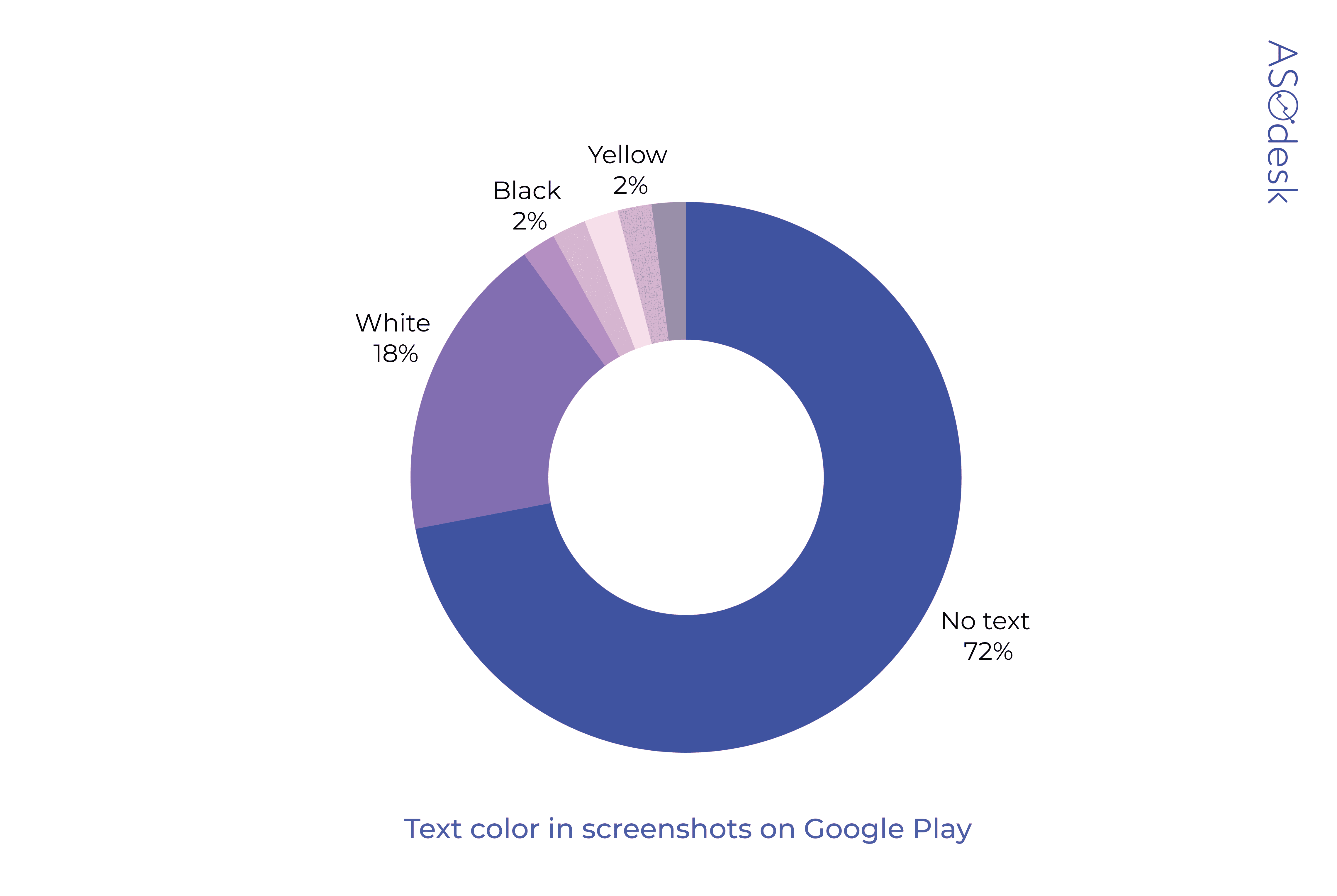
Similar to the icon text, the text on the screenshots should be placed on a contrasting background and be large so that it can be read on devices with different screen sizes.
Presence of the device
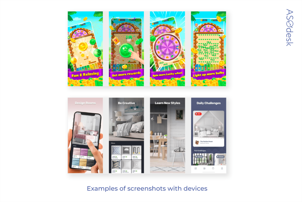
Unlike regular applications, gaming apps are much less likely to have devices on the screenshots. Some game publishers use a barely visible outline of a smartphone (see the picture above). This allows you to show how the game interface looks on the device and, at the same time, not alter the game’s typical style for the screenshots.
82% of regular app publishers add smartphones to the screenshots, while only 6% of gaming apps have devices in the screenshots. Most of the time, the screenshots of gaming applications are not edited in any way and just show the game interface.

Screenshot orientation and composition
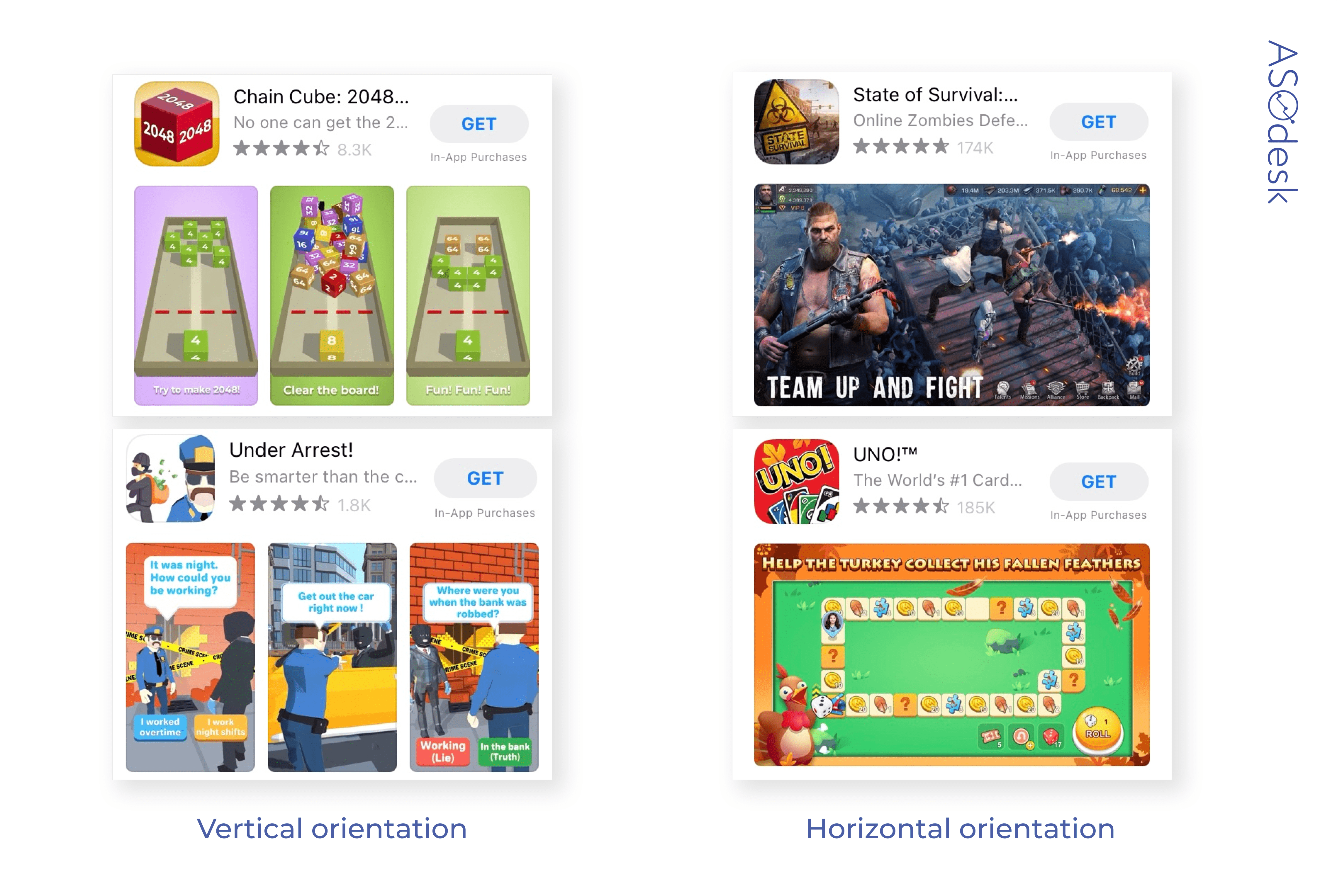
Developers prefer to use vertical orientation, which allows them to show three screenshots in search results at the same time and share more information about the app with the user. Horizontal screenshots are more commonly used for games that have videos on their pages.
In order not to mislead the user, the format of the screenshots must correspond to the orientation of the game itself.
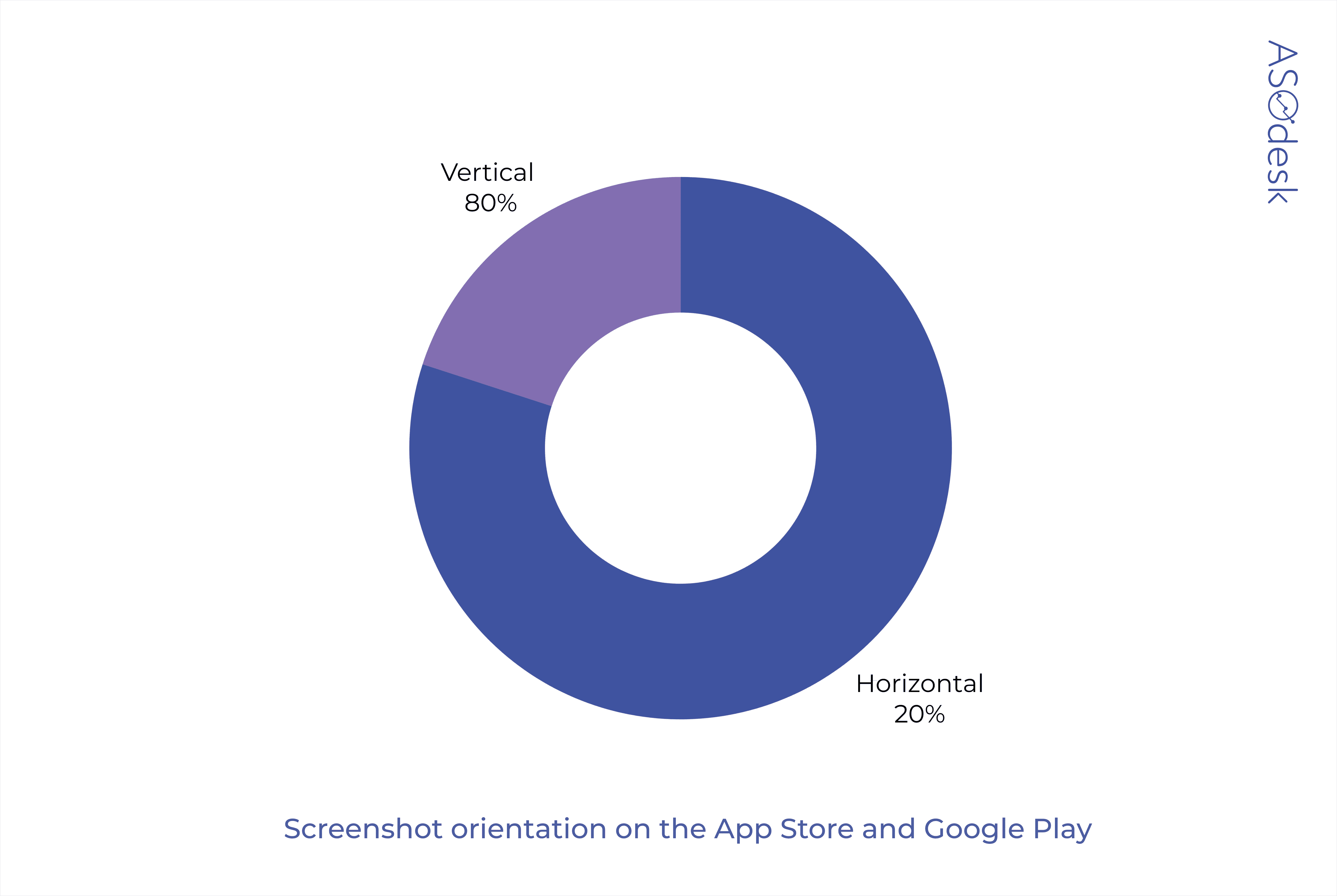
Only 20% of app publishers on the App Store and Google Play use horizontal orientation.
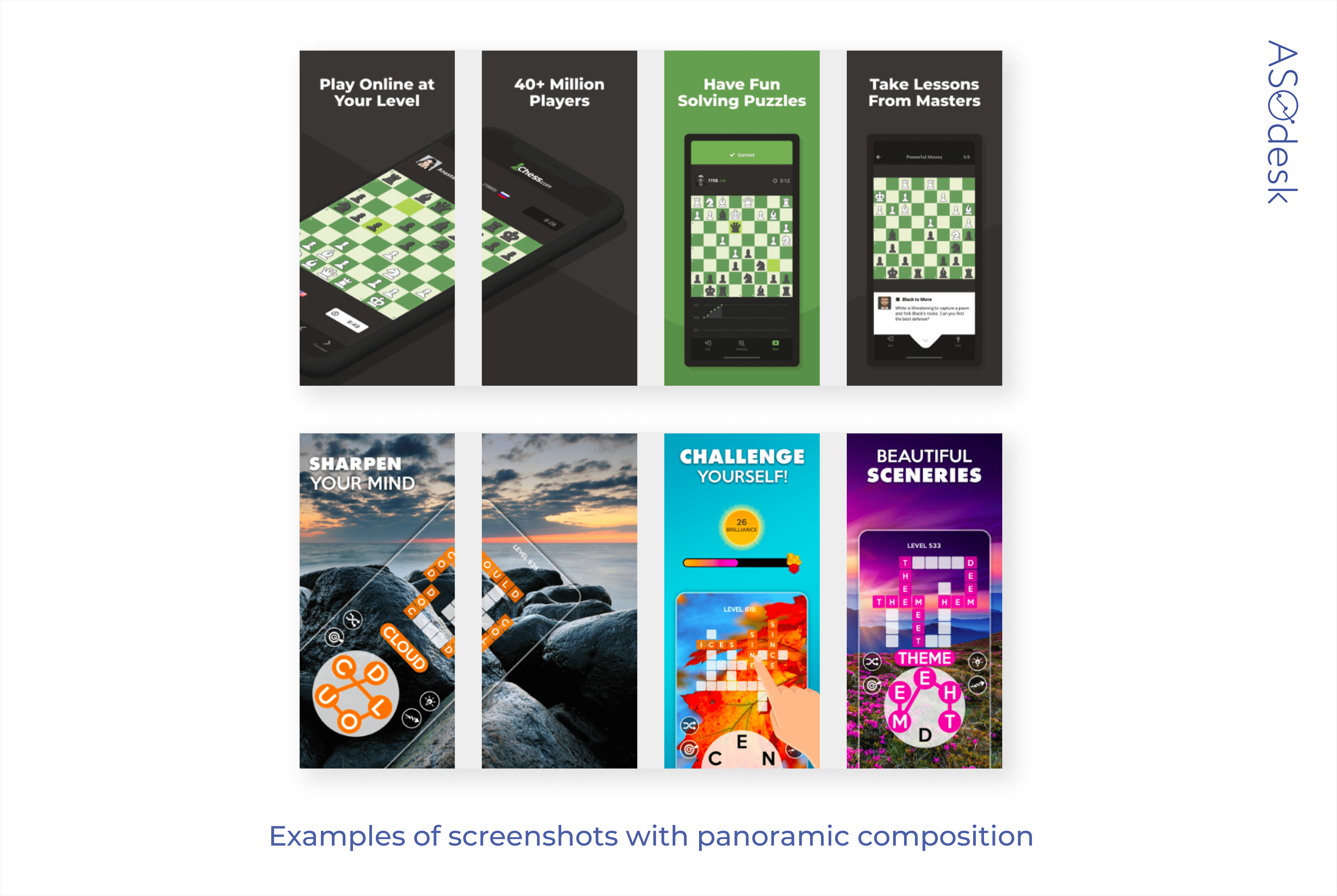
Game publishers rarely use panoramic composition.
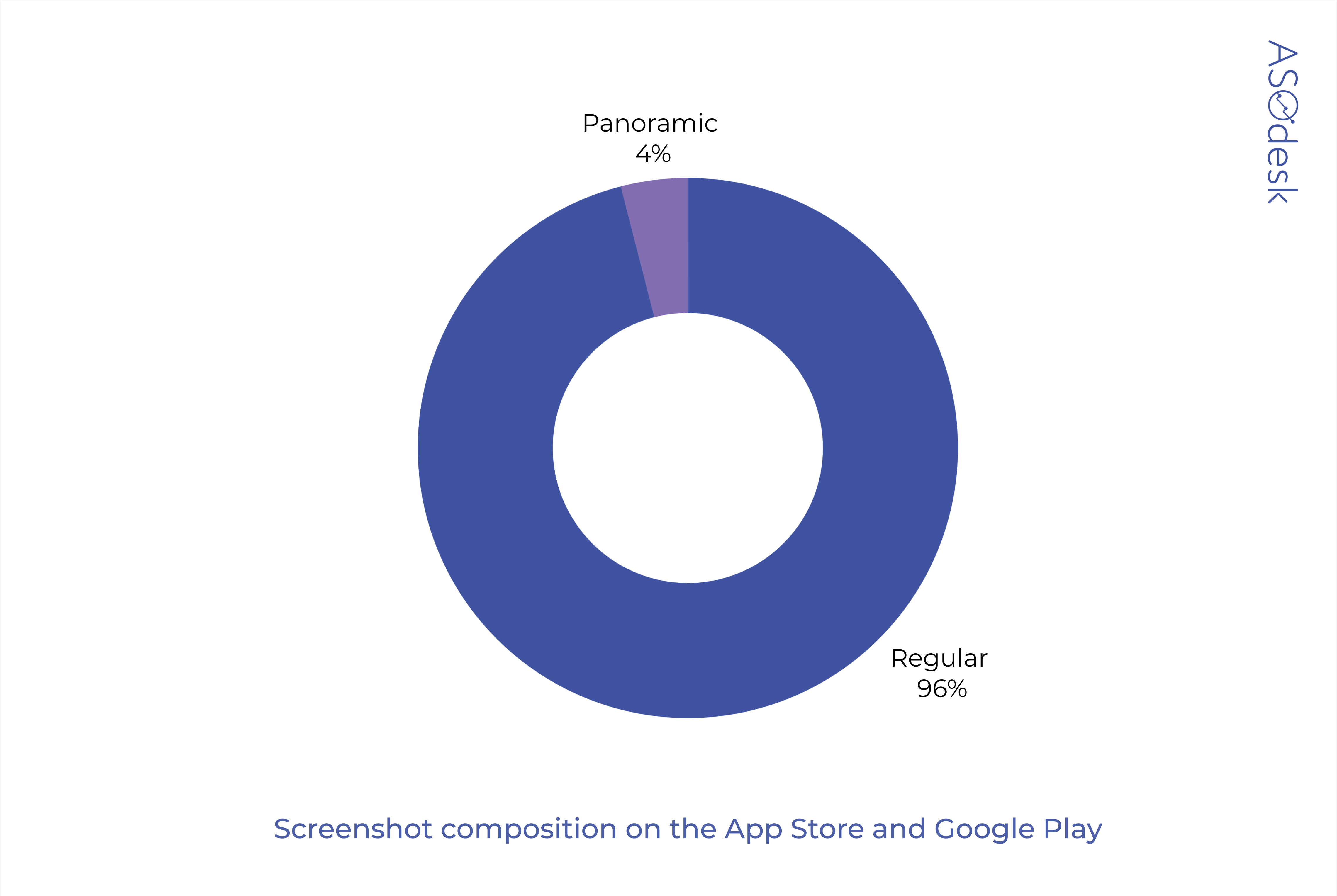
Many developers only add a panoramic composition in the first two screenshots.
In the study of visual trends in 2019, we wrote that panoramic composition can motivate users to scroll through the application page further. But to check if this format affects the conversion of apps in your category, you need to do A/B testing.
Number of screenshots
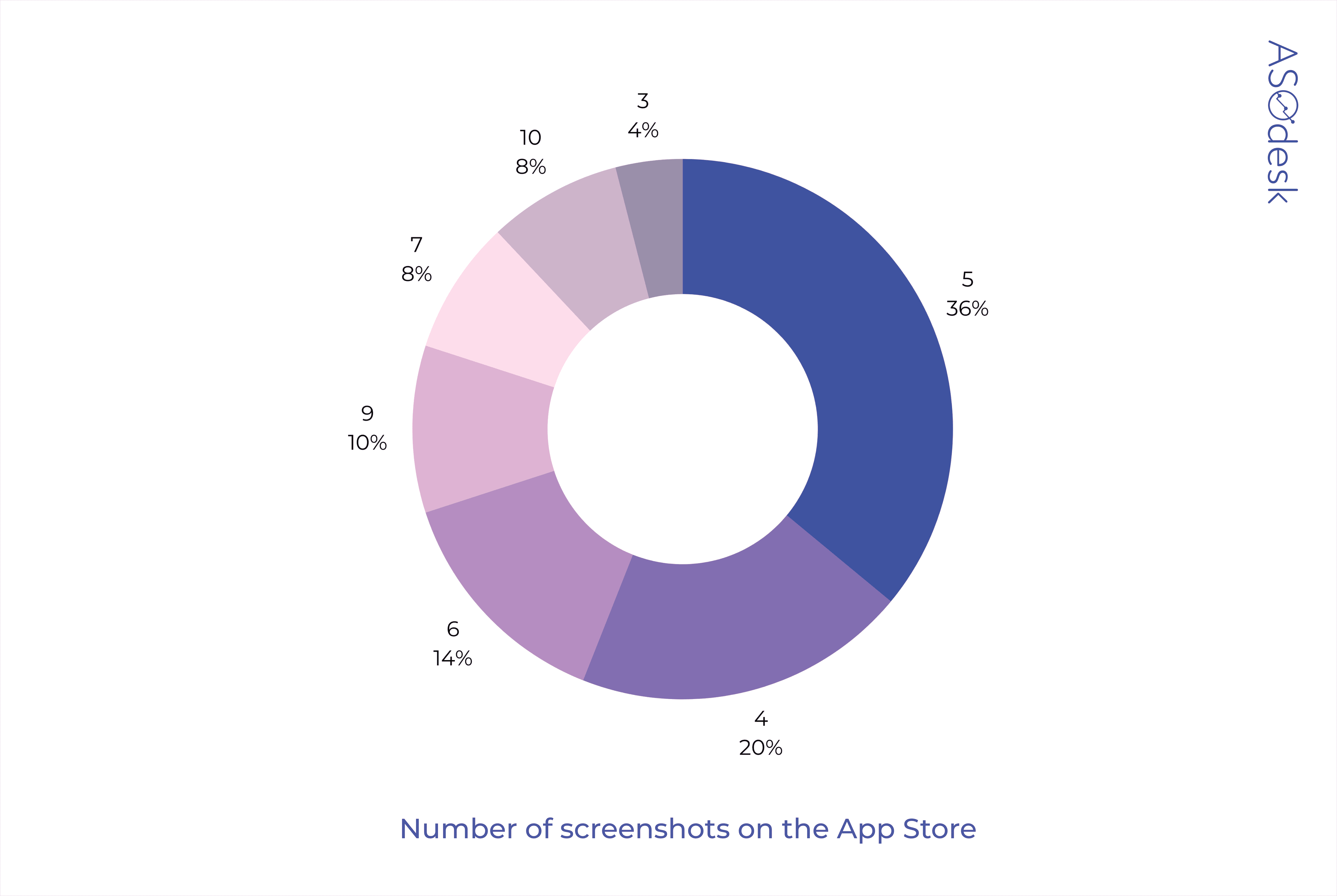
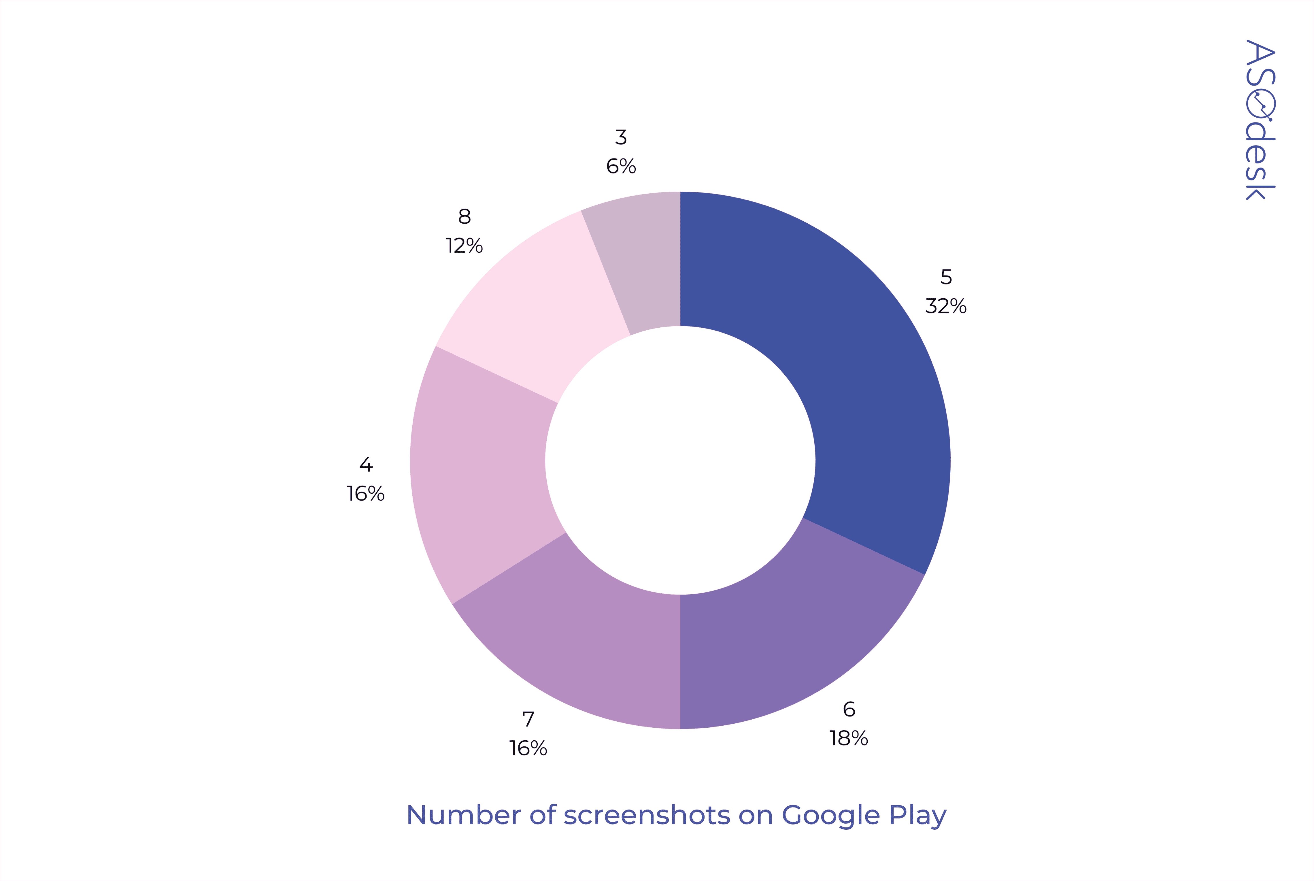
Usually publishers post 4–6 screenshots on the game page. Although there are 10 available screenshots on the App Store and 8 on Google Play, many developers don’t use their full potential to attract users.
In the App Store, only 8% of developers use the maximum number of screenshots.
Only 12% of app publishers share 8 screenshots on Google Play.
You can often find almost the same screenshots, in which only the game level or setting is different. If there are no significant changes on the screen throughout the game, there is no point in posting similar screenshots.
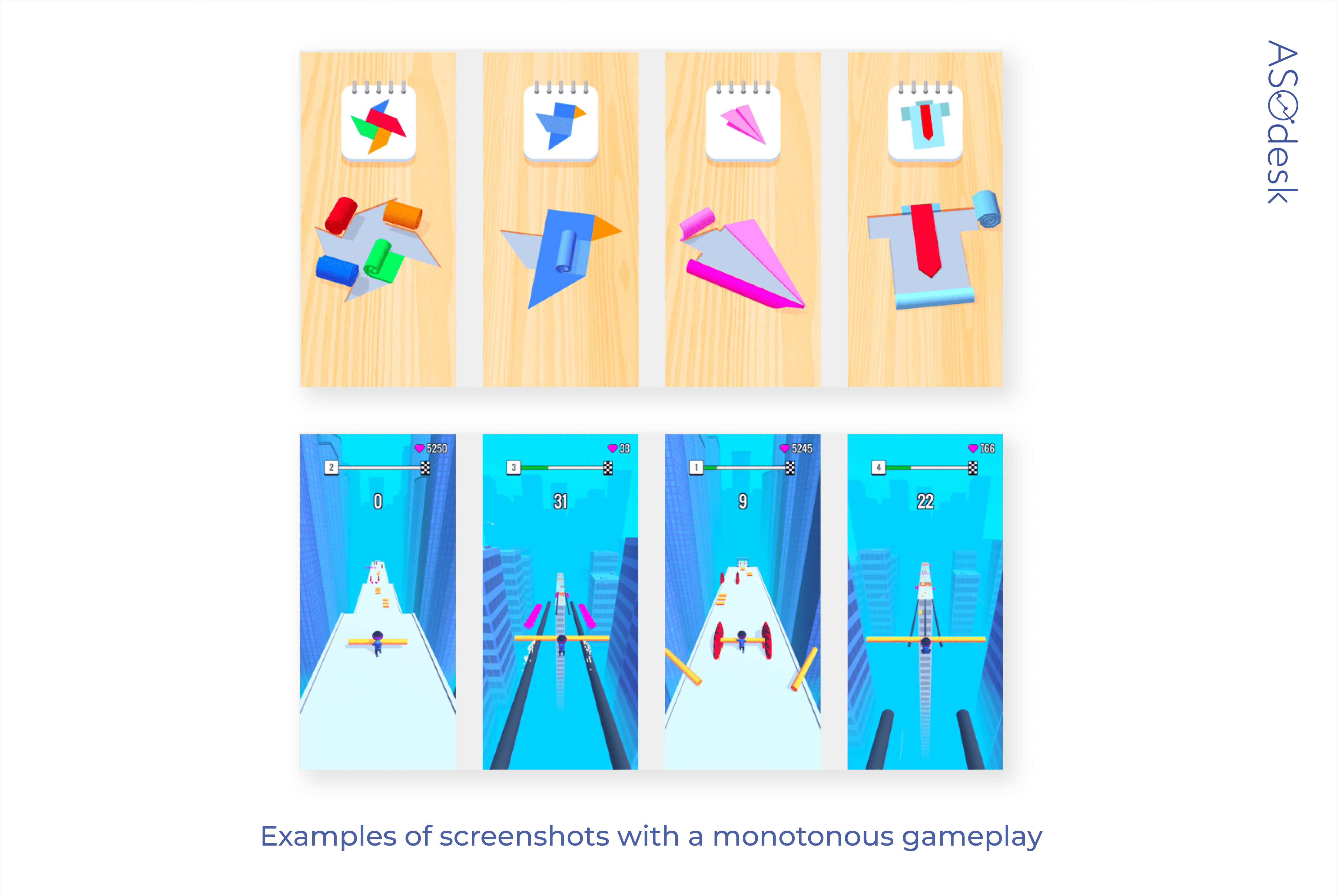
Instead, you should think about what other features of the game might motivate the user to download the app and add those features to the screenshots.
Daria Pavlyuk, Head of ASO, ZiMAD
Advanced editing of screenshots has a positive effect on the install conversion rate of gaming apps.
While the App Store only allows you to add a couple of marketing screenshots, Google Play doesn’t pay attention to how much the colors or sizes of objects match the reality of your game.
Developers who use 3D can always make the models more interesting, brighter, and diversify the gameplay scenes with a lot of action. You shouldn’t overdo it, Google can find fault with this if you hope to be in Featured.
Peter Fodor, the Founder & CEO of AppAgent
Many big games in 2021 will experiment with screenshots targeting churned players. The growth of mobile gaming in corona times significantly increased the number of players who then naturally churn.
To re-engage them, marketers should not only focus on retargeting ads but support reactivation with the right messaging in screenshots as well.
This means focusing on deeper game experience, new live events, and recently added characters. Balancing the store presence for new and churned players will be an interesting challenge.
Lina Danilchik, Marketing and PR Manager at SplitMetrics
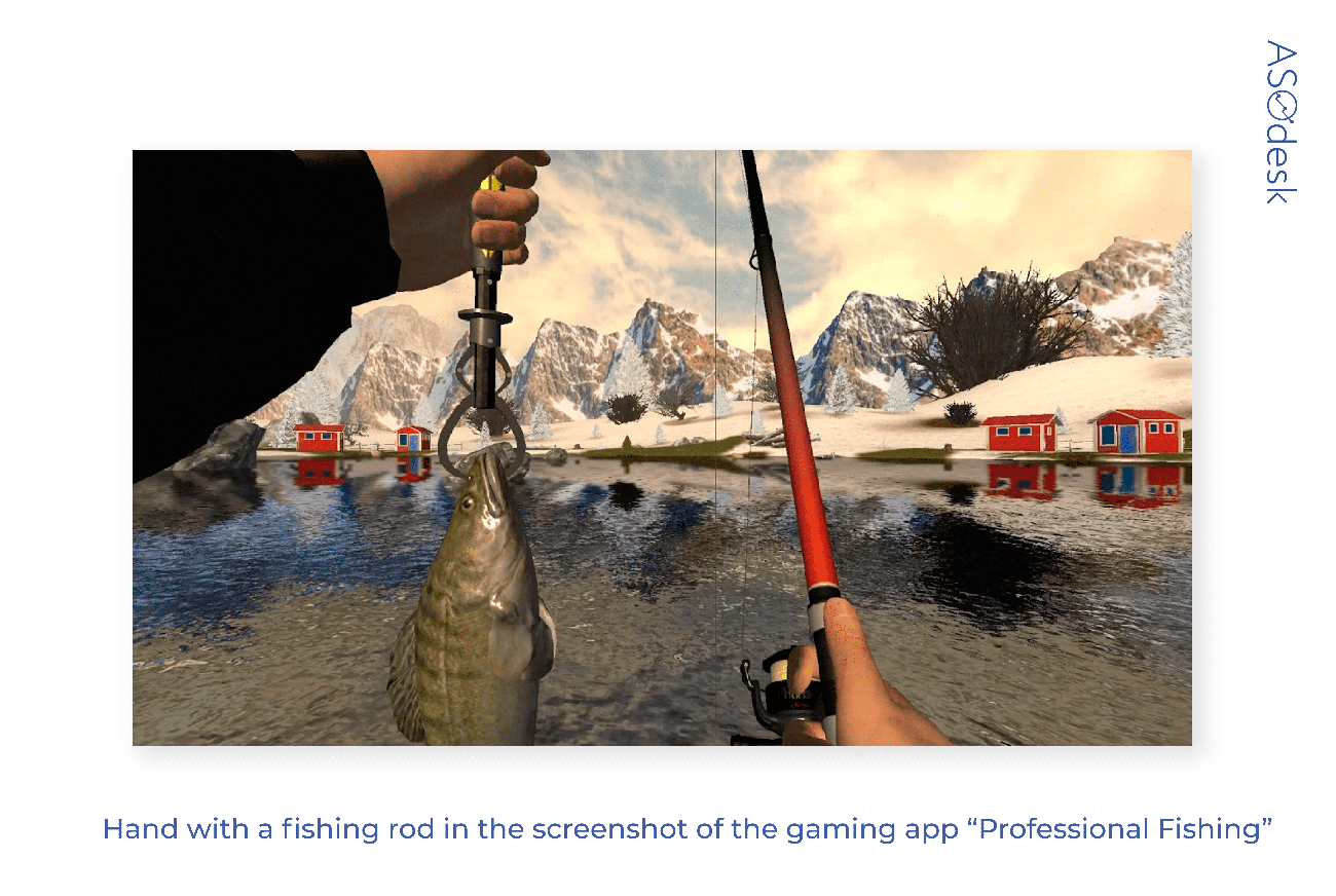
In 2021, there will be a trend towards larger user engagement with casual games. Here is an example: a fishing game puts a hand with a fishing rod on screenshots so that the user imagines themself as a character.
Most developers simply put the game process on screenshots and do not use design techniques. If you edit the screenshots and highlight the UI elements, you can make the application more noticeable amongst your competitors.
Peter Fodor, the Founder & CEO of AppAgent
We often use upscaling key elements in screenshots to simplify the message. Sometimes it’s even good to try to clean the UI a bit and see if the manipulated screenshot will pass the review. I consider this a reasonable strategy because the purpose is just to make screenshots easier to read.
However, it is not guaranteed that this will lead to higher install conversions. You need to test different options for screenshot editing and look at the change in the conversion rate.
Video design
Unlike regular app publishers, game developers are using video more. After all, vivid and dynamic gameplay cannot be demonstrated in screenshots. Videos, on the contrary, can show the gameplay really well. The main goal of the publishers is not to show all the useful functions of the application but to interest the user with the setting, quality of graphics, action, and good game physics.
Video format evaluation parameters:
- Presence and number of videos
- Audio, text, and video format
Presence and number of videos
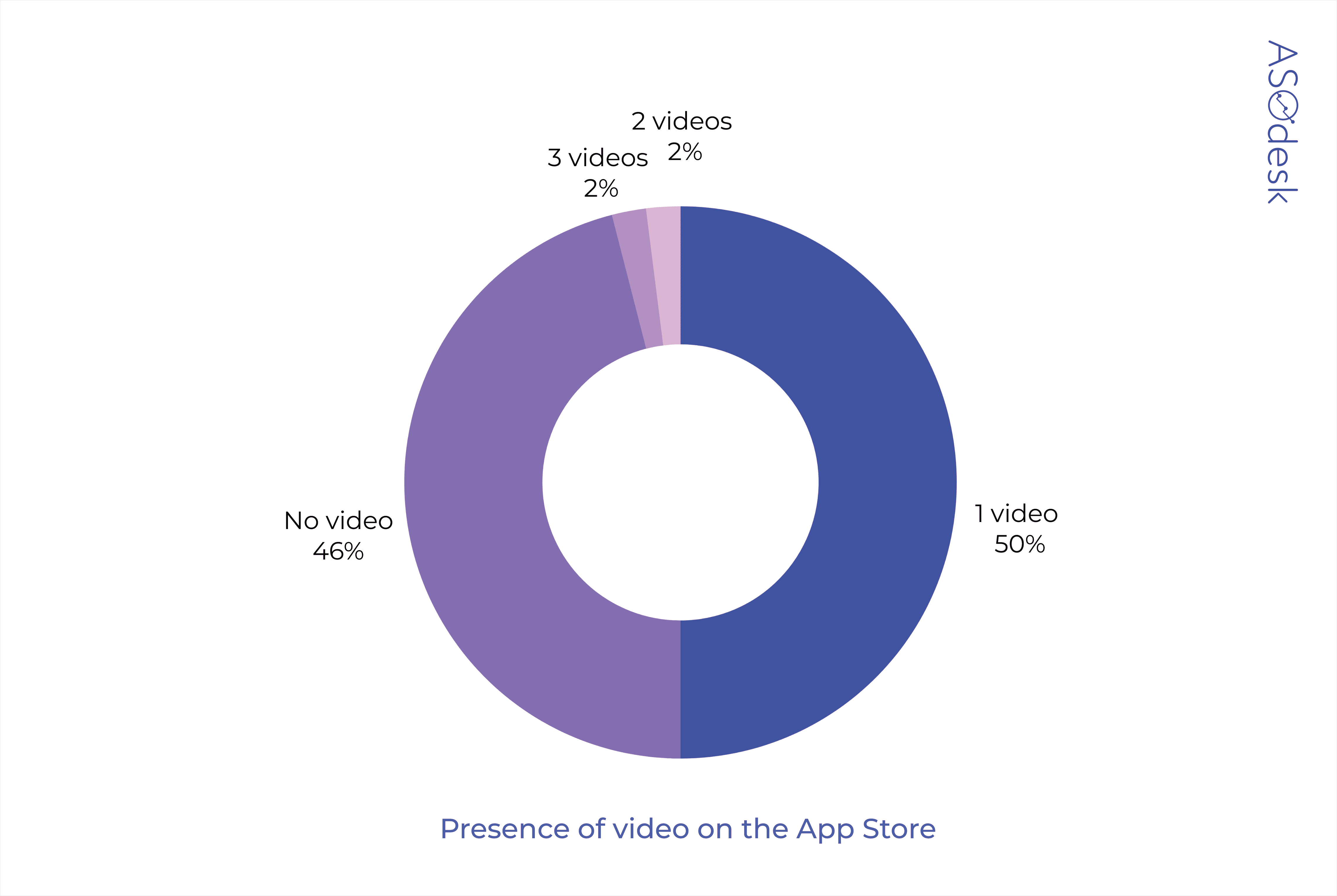
On average, half of the developers on the App Store and Google Play add videos. You can add two or three videos to the App Store, but only 4% of publishers do this.
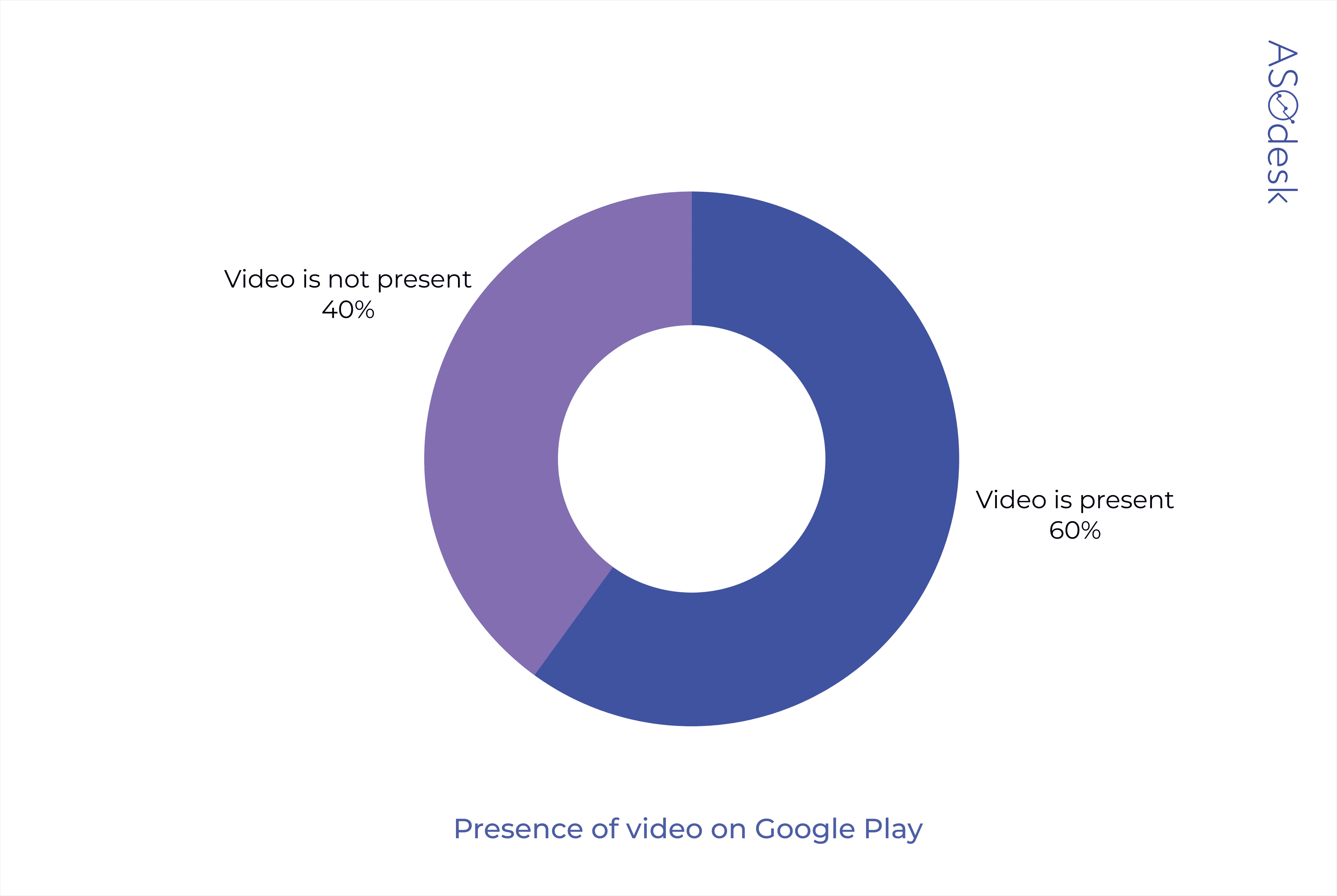
On Google Play, 40% of game publishers add videos.
Daria Pavlyuk, Head of ASO, ZiMAD
We use both screenshots and videos for games. Video on the landing page raises the conversion rate quite significantly. We tried to remove videos, but after analyzing the metrics, we realized that they are necessary for our application categories.
Lina Danilchik, Marketing and PR Manager at SplitMetrics
Videos work better for games than for regular apps. This may be because users tend to spend more time on gaming app pages in the App Store and Google Play than on regular app pages. This trend is described in our latest ASO benchmark report for various game categories.
Audio, text, and video format
Almost all videos are accompanied by audio. Most of the time, you can hear dynamic music or sounds that are present in the gameplay.
App Store developers add text to the video in 60% of cases. The text describes the main actions that the user performs in the game and encourages them to install the application.
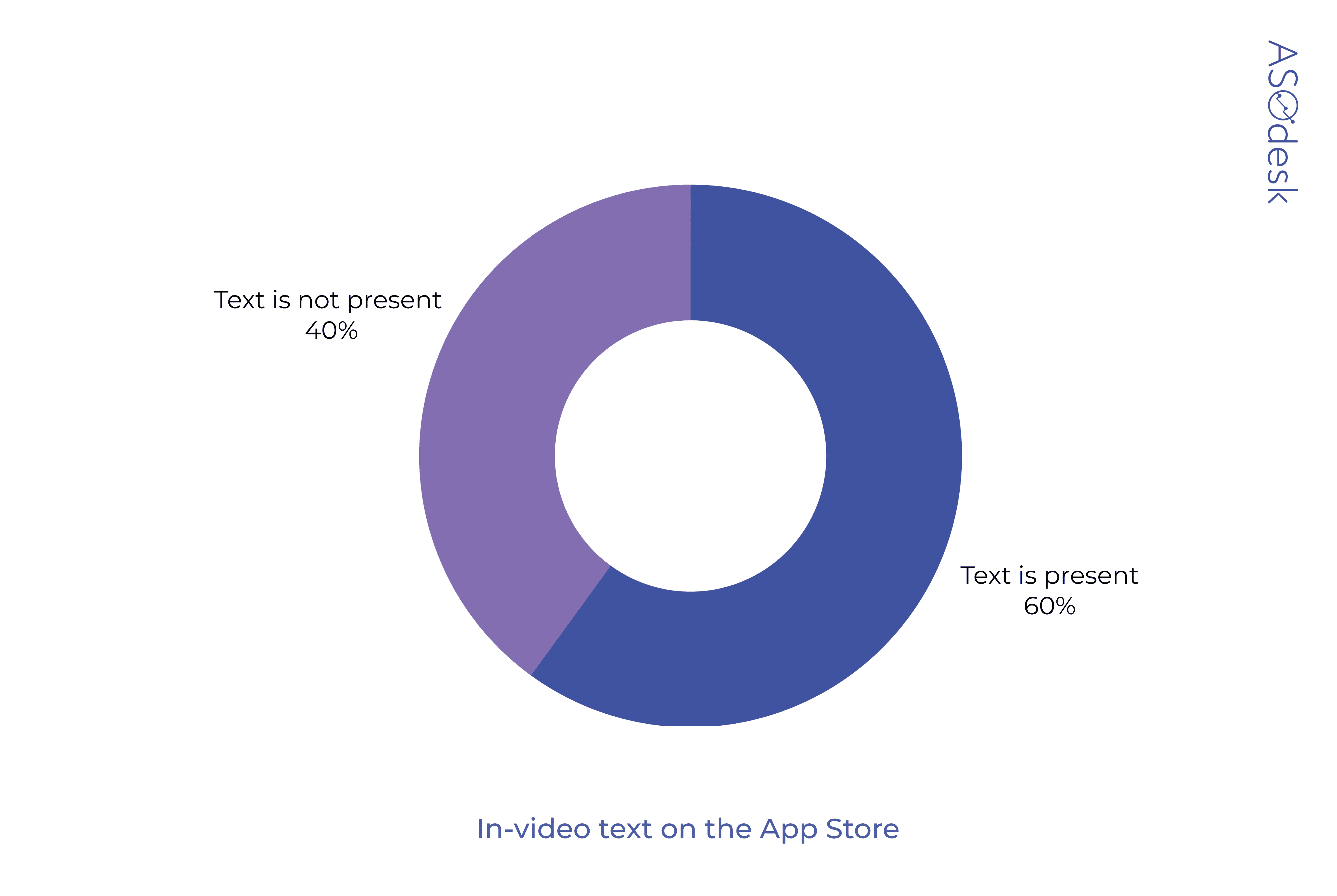
At the same time, on Google Play, text is used only in 10% of gaming applications. As a rule, developers simply show the gameplay without any textual comments.

Half of the developers on Google Play show not just the application interface, but create mini-films.
For example, the video of the Call of Duty application is not a regular recording of the gameplay, but a full advertising video, which uses effects such as zooming in, zooming out, and fast cutting. The video is accompanied by dynamic music and gameplay features highlighted in text.
Additional effects, text, and music increase the chance that the user will be interested in the game. Test page options with a different number of screenshots and videos and see which option will increase the install conversion rate.
How to design gaming app pages
- Publishers add bright color icons — mainly in light blue.
- Icons contain the game character or game graphics.
- Screenshots illustrate the interface and are not post-edited. Most publishers do not use color and background in screenshots.
- Vertical orientation of screenshots is most common.
- An average of 4–6 screenshots and 1 video is loaded on the game page.
- The video uses dynamic music or gameplay sounds.
Many app publishers use repetitive screenshots, barely edit them, and add fewer videos and screenshots than the app stores allow. Therefore, you can test options for screenshots with a color background and graphic elements, and add as many screenshots as possible. This will help you become more noticeable in search.
Checklist for visual optimization of games
- Explore the design of the app pages that come up next to you in the search results. Try to choose colors and graphics that will grab the user’s attention.
- Place a recognizable character or game graphics on the app icon to quickly demonstrate the essence of your game.
- Test out minimalistic icons. They are rarely used by game developers, so you have a chance to stand out amongst other games.
- Try to add additional elements, characters, and graphics; add devices to screenshots.
- Add text describing the game’s features. The first three screenshots, demonstrate the main advantages of the application.
- Make sure the text on the icon or screenshots is readable — even on devices with small screens.
- Use as many screenshots as you can to provide more information about the game.
- Do not post similar screenshots, the user may not see the difference between them. If the game assumes a monotonous setting, pay even more attention to the post-editing of screenshots and experiment with different options for presenting the information.
- Take screenshots in a format that matches the main orientation of the game.
- Test the use of multiple videos in the App Store. This will tell the user more about the game’s features. This will tell the user more about the game’s features.
- Accompany the video with music and text and edit the video to make it even more fun.
- Pay attention to the trends that, according to experts, will be popular in 2021: contrasting colors, brand names on icons, engaging users with gameplay in the screenshots.
- Don’t just rely on trends and try to differentiate yourself from the competition. Track install conversions across different design options to find the most effective set of screenshots, videos, and icons.