Visual Optimization Guide for the App Store and Google Play
It’s not enough to just draw users to the product page on the App Store or Google Play as part of your ASO strategy. Your goal is to get people interested and lead them to installing the app. You have to maximally optimize all the graphic elements on the app page, because the visual part affects conversion into installs.
According to the data provided by Storemaven, the product page should take no longer than 3 seconds to explain what the application does. It is these few seconds that affect the decision about making an install. If you want your app page on the App Store to increase conversion, you should make it memorable.
Factors That Affect Conversion
Icon
This is that very first page design element that users pay attention to. It has to distinguish your product from competitors and be memorable. Change the button, conduct A/B tests, and choose the variant with the highest conversion.
Icon Requirements
Each app is supposed to have a set of small icons for the Home screen and a larger icon for the App Store itself. It also appears throughout the system, such as in Settings and search results.
Here’s the App Store icons size table for different Apple devices:
| Device /Context | Icon Size |
| iPhone | 180px × 180px (60pt × 60pt @3x)120px × 120px (60pt × 60pt @2x) |
| iPad Pro | 167px × 167px (83.5pt × 83.5pt @2x) |
| iPad, iPad mini | 152px × 152px (76pt × 76pt @2x) |
| App Store | 1024px × 1024px (1024pt × 1024pt @1x) |
Screenshots
Both markets have precise recommendations regarding screenshot sizes, the acceptable number, and the content that can be placed on them. Make sure to carefully read through recommendations and requirements to avoid issues with the verification stage.
Number of Screenshots
Recommendations for the App StoreN
On the App Store you can place up to 10 screenshots on the app page for iPhone, iPad, Apple Watch and Apple TV. Screenshots must be PNG (no alpha) or JPEG. You can find more details in App Store Connect documentation.
- You can add up to 10 portrait and landscape screenshots.
- You can also add an App Preview video that will be displayed both in search results and on the app page.
- If you don’t have preview video, App Store will display the first three portrait screenshots or one landscape screenshot from the app page.
- If you have the app for iPad, making iPad screenshots keep in mind that the iPad Pro 2nd generation should have a Home button, while the iPad Pro 3rd generation does not.
Recommendations for Google Play
On Google Play you can add up to 8 screenshots for each supported device type: smartphone, tablet (7 and 10 inches), Android TV, and Google’s Wear OS.
Visual Design of Screenshots
Most likely the vast majority of users will not look through all of the available screenshots. Since the size of device display is limited, the user only sees the first two screenshots. This is why the main features and advantages should be shown on the first two screens.
Screenshot Format
It’s best to use vertical screenshots for App Store and Google Play applications.
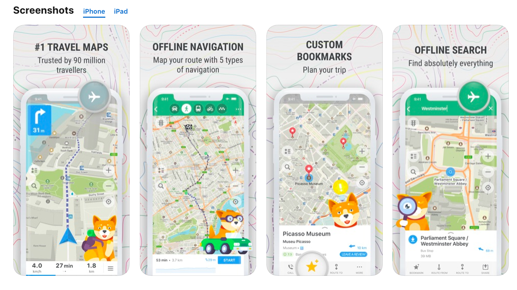
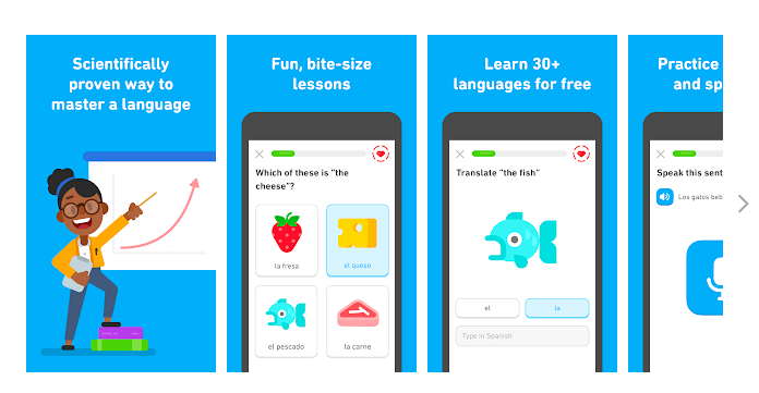
In the case of iPhone and Android games, horizontal screenshots are preferable, if the interface has such a format. However, if a game’s interface is vertical, then screenshots should show that as well.
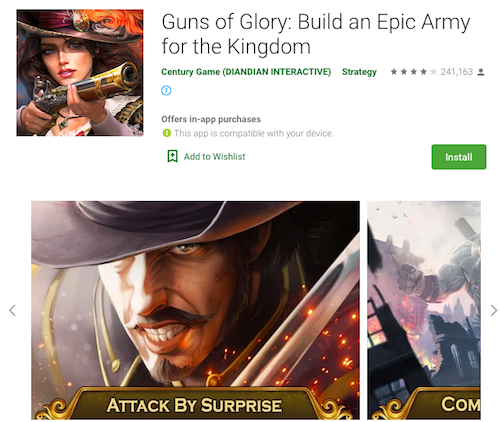
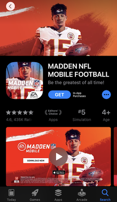
Remember that user behavior can be different in the two stores, so it’s best to prepare different screenshot sets: one for the App Store, one for Google Play.
You can stand out with horizontal screenshots in the markets against competitors, who use vertical screenshots on their pages. Always experiment and find the best options for presenting your app on the App Store or Google Play.
Some screenshots taken for example have been awarded an ASO prize. You can find more examples of ASO winners at the following link.
Composition
Variability of compositions used by publishers, when designing screenshots, is a bit more versatile, than screenshot formats. Normally, publishers are using a usual composition variant, with a simple background or with images instead of it, panoramic design that consists of screenshots making one composition, or variations of the usual design with the use of additional visual elements.
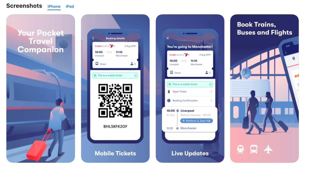
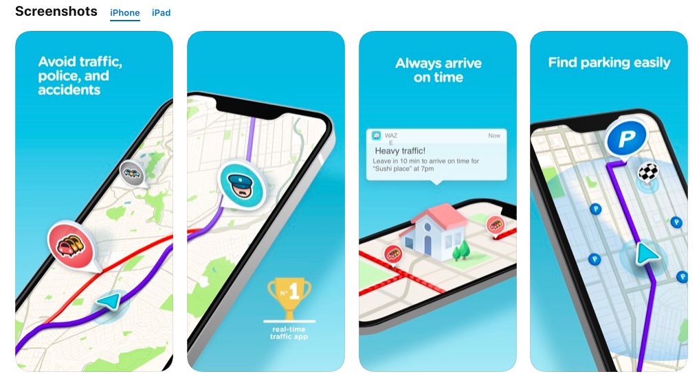
In August, the design of Google Play was updated, pay attention to your screenshots in the new design. If you previously used tag line on the screenshot, then in the current design on the device, the text can be tiny and poorly readable.
Outline Product’s Advantages, Rather Than Its Functions
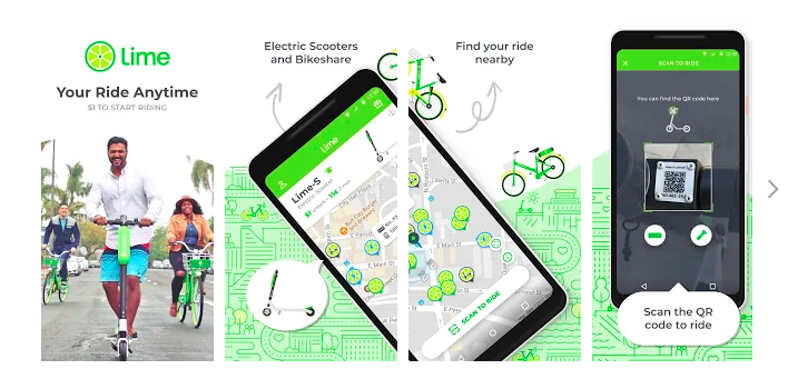
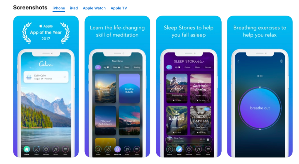
Important information provided on the first screenshots shouldn’t be a simple function enumeration. You should educate the user on the advantages and value of your app.
- Highlight the number of users that already trust you.
- Note the set of functions they will receive by downloading the app.
- Describe the obvious values of your product, compared to similar products that are already available on the market.
- Outline the achievements, awards, and prizes that the app has received.
New Functions
If you have added new functions to the app, make sure to prominently show that on screenshots and highlight them upon application update. Your users should get a clear idea of the new functions.
Localize Graphics for Different Markets
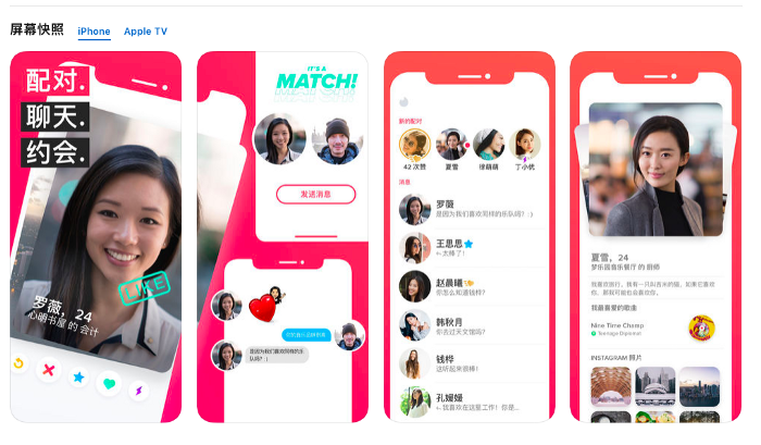
All graphic materials should be localized, based on the cultural and lingual specificities of each country. You may have to make a complete adaptation of all graphics for a local market. Such adaptation is known as culturalization. You don’t just translate the texts and put them on screenshots, but actually change graphic elements, considering the unique features of the local market.
Examples of culturalization are the use of a particular color pattern or photographs with people of a different nationality. Perhaps you will have to add symbols or replace people’s images with illustrations. It all essentially depends on cultural specificities of that particular country you want to promote your product in. So do your cultural homework!
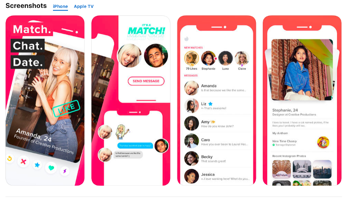
In the example you can see that the publisher is using completely different photo images for their application — one creative set is good for the Americans, while an entirely different one is used in China.
Product/Developer Page Artwork
If Apple selects your app to have Product Page Artwork, it will appear at the top of your app store page. Developer Page Artwork is used to customize the appearance of your developer page.
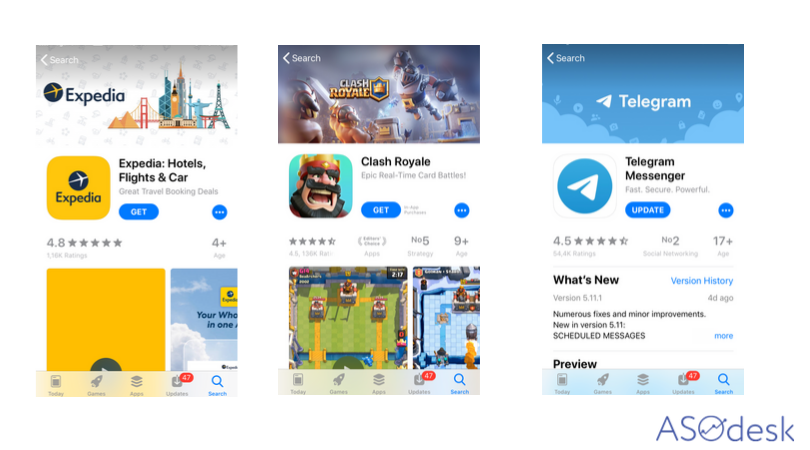
Don’t include:
- Taglines
- App icons
- Prices
- iOS devices or other branded devices
Keep in mind that:
- The Page Artwork can impact on conversion rate, but less than other visual elements.
- It is difficult to change or impossible it after Apple approves.
- The Page Artwork is not country-specific and therefore non-localizable. The one image that you submit will show in all countries where your app is available
Requirements
- Dimensions: 4320 x 1080 pixels
- File Types: PSD, ZIP
- Naming convention: AppName_AppleID_AppStore_Product-DeveloperPage
Apple’s full list of guidelines for this artwork can be found here.
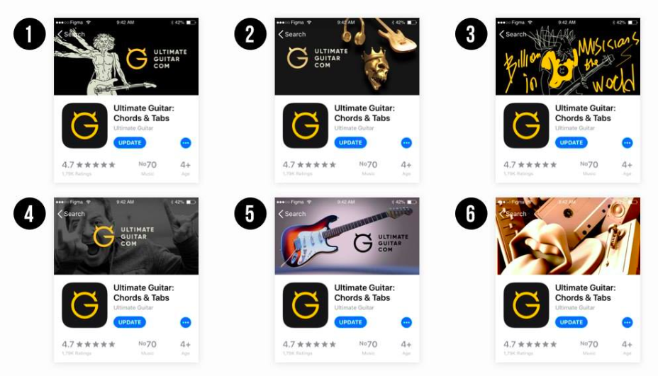
Dark Mode
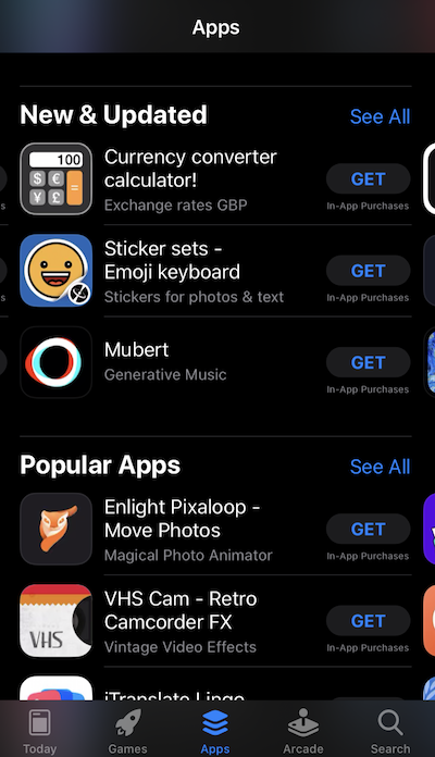
A dark theme has appeared on the App Store with iOS 13 release. Now some visual elements such as an icon and screenshots may look completely different than on a light background. Black or dark icons, dark screenshots, without the presence of contrasting elements can be lost on a dark background.
Video preview
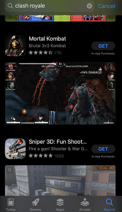
Video previews on the App Store and promotional videos for Google Play are an additional opportunity to tell the audience about the features and functions of the app.
Adding a video can substantially increase conversion from page views to installs. According to SplitMetrics’ report, adding a video preview onto the App Store can increase engagement and conversion rate by 16%, and according to StoreMaven’s data, the presence of a video on your app page can heighten the conversion rate by 20-35%.
Before planning to post a video preview on the app page, we recommend that you conduct A/B tests. There were cases when adding a video preview negatively affected the conversion rate to install.
When planning your products’ promotion on the App Store and Google Play, remember to prepare for store differences. Whereas you can add a video preview on the App Store, in the case of Google Play you can only add a link to a video, published on YouTube. Together with this, you must add special graphics on the app page.
Checklist for video preview for the App Store:
- Video preview on the App Store impacts on the conversion rate from view to download.
- Video preview should be from 15 to 30 sec. (according to SplitMetrics, users watch video from 7-11 sec).
- It is possible to add three videos. But according to SplitMetrics, adding three video preview on the page can decrease the conversion rate.
- App previews may only use captured footage of the app itself. Don’t film people interacting with the device (such as over-the-shoulder angles or fingers tapping the screen), and don’t use app previews to show behind-the-scenes footage of your app’s development. Stay within the app.
- App previews are for all audiences, so they must be appropriate for ages four and older. Avoid objectionable content, violence, adult themes, and profanity.
- Video preview downloaded not in the primary locale users see only in that country.
- Video preview downloaded in the primary locale users see in all countries.
- If the app has portrait screenshots, but the video preview has landscape design. In search results, users will see a landscape video preview, but on the app page, it will be shown down under screenshots.
- Pay attention to the Featured banner on a video preview, if users switched off the autoplay of video, they see only featured banner in search results.
- Games are often used landscape preview; apps prefer to add portrait video preview.
- Run A/B tests for the App Page with a video preview, and without. Running experiments, you can see the difference in conversion rate to installs.
- There is no native tool in iTunes Connect; you can use such tools as SplitMetrics, Storemaven, etc.
Guidelines for video preview for the App Store here.
Guidelines for video for Google Play here.
A/B Testing
In order to understand which screenshots are going to be most effective, make several creative sets and conduct an A/B testing. Screenshots that will get a higher conversion should be used for your app page design. On Google Play, you can conduct an A/B test in the Google Play console, but there is no such opportunity in iTunes Connect. You can use third-party tools, such as SplitMetrics, Storemaven, or Asogiraffe. By using these tools, you can launch experiments and highlight screenshots with the highest conversion.
The App Store and Google Play are constantly changing and, because of this, requirements regarding graphic materials change as well. To stay current, you must monitor these changes and, according to them, change your application’s icons and screenshots.
Highlight the benefits: use screenshots to draw attention to the achievements, awards, and prizes received by the application.
Study competitors and new trends in graphic material design, as all the same screenshots become boring and user’s eyes get tired. By replacing old screenshots with the new ones, you can increase the conversion rate. Keep things fresh and relevant!
Rating and Feedback
According to a report created by Appentive, high rating helps an application to stay in the category top and query top from the search. The higher the rating and the greater the amount of feedback, the more likely the app is to be noticed. The more negative feedback your app gets, the lower its rating is going to be, and the lower the rating, the lower the conversion into installs.
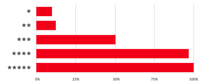
On the App Store and Google Play, users can rate your app on a scale of 1 to 5 stars. Rating is one of the application page’s elements that you see right after the icon and name.
On the chart below, you can see that applications with lowest ratings are going to be installed by less than 25% of respondents, while apps with a rating above 3 stars are going to be downloaded by over 50%. If you are not able to work off the negative ratings and will not be able to sustain your rating at a sufficiently high level, all of your ASO optimization efforts are going to be in vain. Therefore, you should always monitor rating changes on Google Play and the App Store. It is particularly important to do before launching advertising campaigns.
How to Work with Feedback
Many users don’t restrict themselves just with ratings, they leave both positive and angry feedback about your product. It’s vitally important to monitor all of these comments and react to them quickly.
The process of working with user feedback can be divided into several stages:
- Monitoring;
- Feedback responses;
- Feedback changes monitoring;
- Work with useful feedback;
- Complain on negative comments.
Monitoring is daily work consisting of following all the feedback on the App Store and Google Play. First of all, this allows you to find out about problems or failures in the app’s work quickly, as well as reacting to them fast and then pass everything on to the developer team. Secondly, this helps to find out your users’ opinion about the product. And thirdly, timely reaction to the negative feedback will perhaps help fix the app’s rating.
In this manual, we have described in detail in which stages you can divide ASO optimization for more effective work. Among other things, this includes the factors that you should consider when working with textual and visual data of an app page on the App Store and Google Play. In the next set of materials, we are going to tell you everything about how to evaluate search optimization efficiency in both stores and how to conduct Apple Search Ads campaigns for app promotion on the App Store.
Thanks for inspiration https://asostack.com/, https://www.apptentive.com/, https://splitmetrics.com/, https://www.storemaven.com and ASO experts, who mentioned useful aso hacks for Visual Optimization in different ASO communities.


