Trends 2019: Visual Optimization for Mobile Games
Mobile games market is even more competitive, than the mobile app market. The number of games on both platforms constantly increases. In 2018, the App Store had 811,911 games, while Google Play has had 288,848 games available for download.
The amount of applications installed on a user’s device is still limited to a particular extent. Studies show that an average smartphone features about 60 to 90 of installed apps. This is why developers should try really hard in order for a game to get noticed and downloaded.
If your game isn’t backed by a strong publisher or a large advertising budget, you should take advantage of everything app stores have to offer and make sure that your game’s page on the App Store or on the Google Play stands out among competitors. This can be achieved through visual optimization: you can make the icon more prominent, add screenshots that draw attention and add a video preview.
You should explore 2019 visual page design trends of top free game applications that we have collected for you. Maybe this will help you find interesting ideas for visual design optimization.
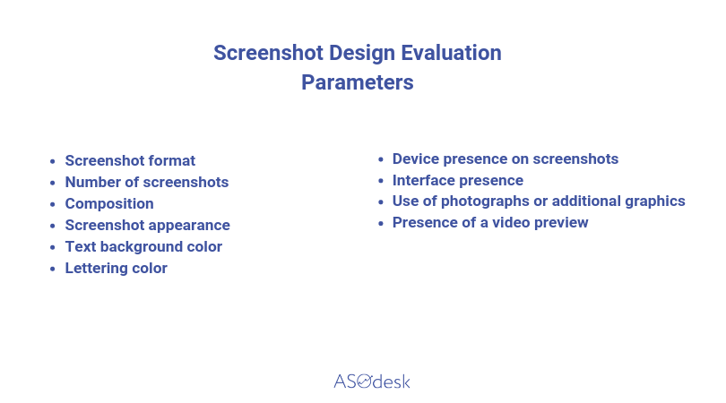
This article continues the research series on visual page optimization on the App Store and Google Play. Previously, we have studied application page design and this time we, at ASOdesk, have analyzed the top 50 free games on the App Store and Google Play. We have focused on studying graphic elements, such as the icon, screenshots, and presence of a video preview. We have evaluated visual screenshot design on the App Store and Google Play game pages according to the parameters listed below:
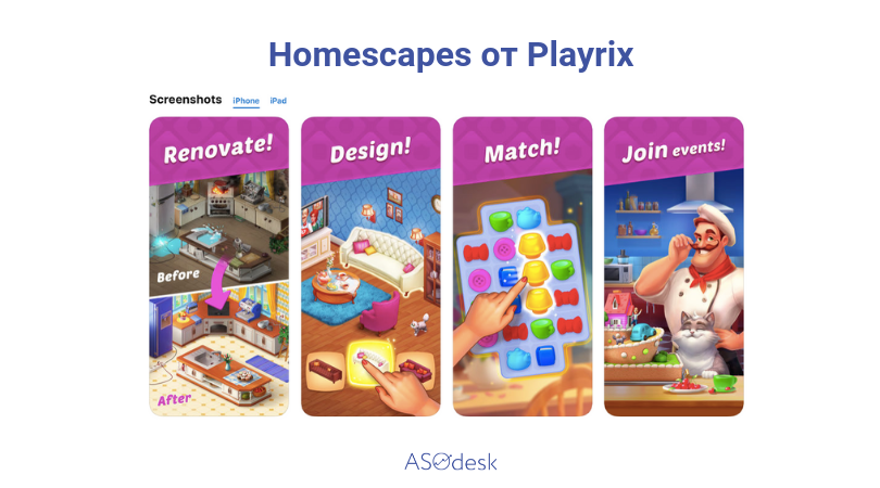
Before getting into details, we want to note that there are substantial differences comparing to regular applications. Game page design an almost completely different type of screenshot design, comparing applications with screenshots that have devices placed on the background and interface placed in them. They are predominated by simple images of game interfaces, whether with an additional design or without it. During the analysis of a game’s visual page design, we were noting that developers often used the text background instead of a usual background, on which they subsequently placed promotional texts.
Design
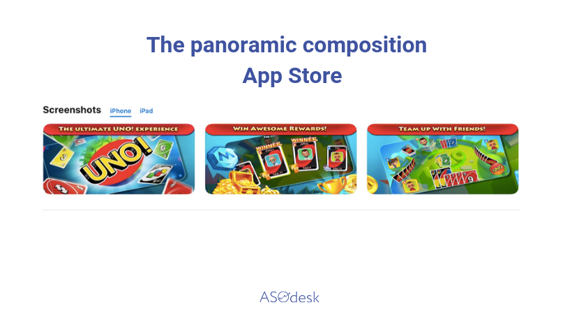
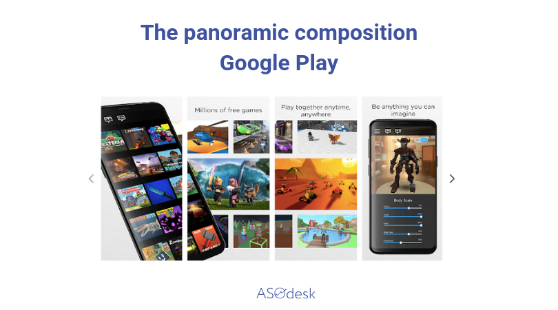
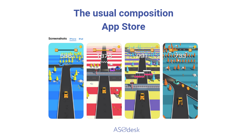
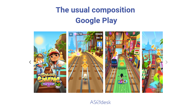
App developers compete with each other in terms of visual page design uniqueness in both the App Store and Google Play. Everything is different in the game world: they don’t use device photos, have minimum promotional text, rarely place characters on their screenshots or additional elements of game graphics. The main screenshot type is basically a game interface image, with several screenshots showcasing game level designs and gameplay. There is no background – developers use game interface image instead of it. In rare cases, it’s possible to use a panoramic composition or bright background with a device placed on it.
Also, we have noted that elaborated screenshot designs for application stores are mostly used by large developers and publishers.
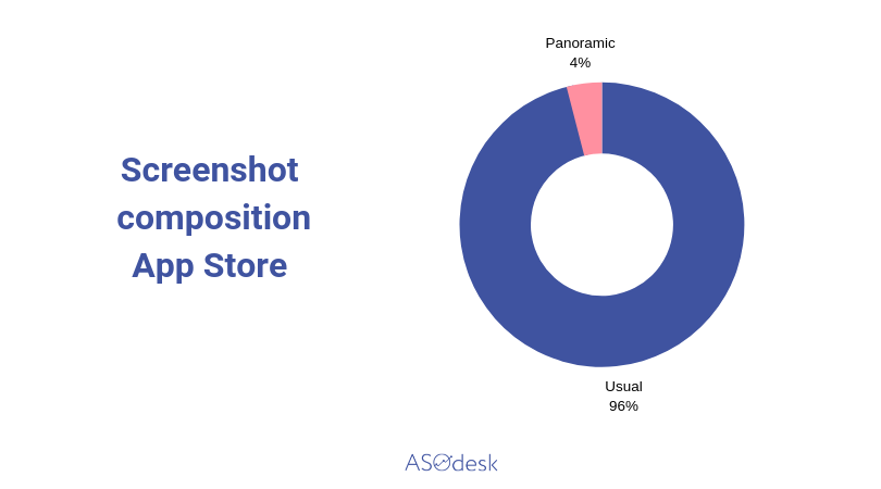
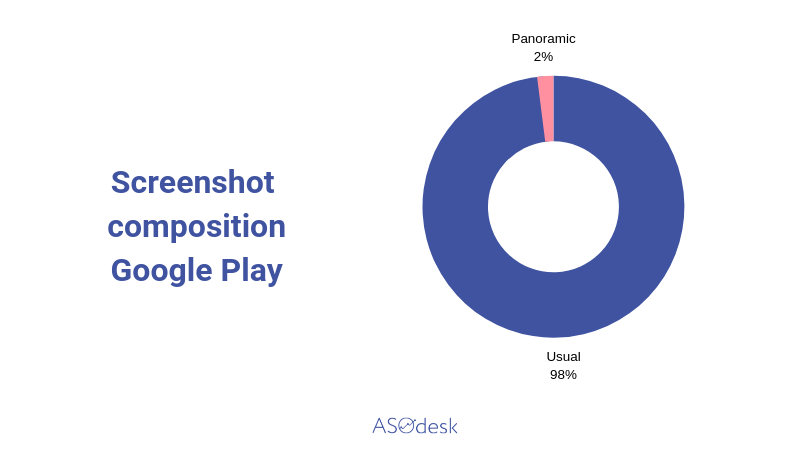
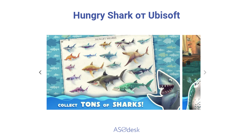
Panoramic compositions in both the Google Play and the App Store are seldom and are used by a small number of developers.
In most cases, you will see interface images on screenshots formatted either vertically or horizontally, without any additional design details.
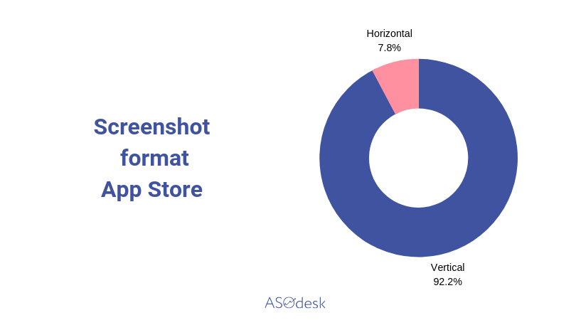
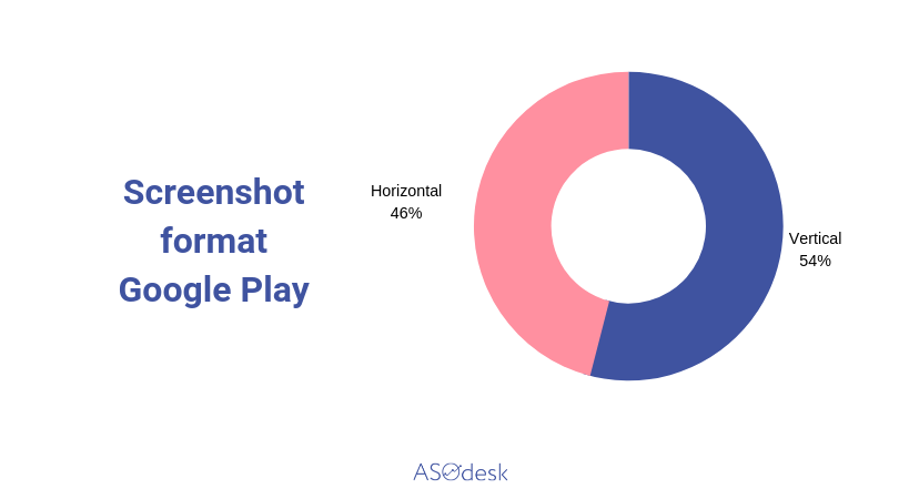
Screenshot Format
Vertical screenshot format for games is prevalent on the App Store, whereas in case of Google Play developers use both horizontal and vertical screenshots at about the same rate.
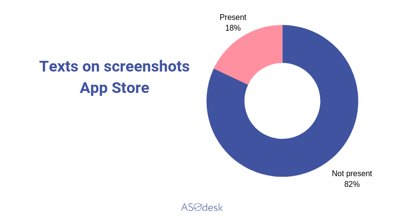
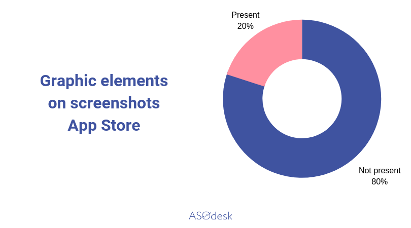
On the chart below you can see that developers almost don’t use text on screenshots of App Store’s top 50 free games.
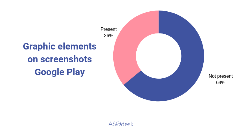
The situation is completely different in case of Google Play, where half of all screenshots are accompanied with promotional texts.
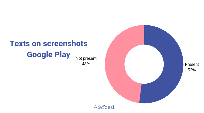
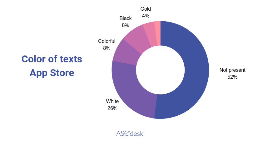
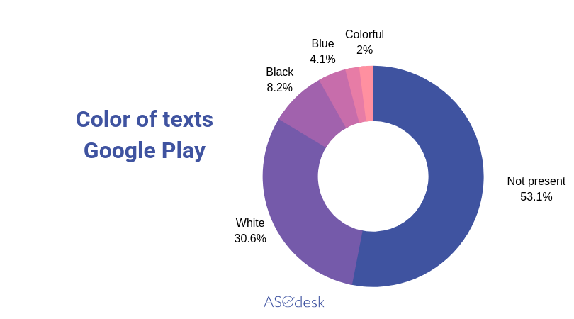
Over a half of developers don’t use promotional texts on their screenshots. In case there are any, the inscriptions are placed on the text background above the interface, while the color pattern is kept diverse with color white being prevalent.
As of such additional elements, as photographs or presence of devices on screenshots – their use is rather minuscule. Characters and graphics from the game are the most widespread elements in screenshot design.
Number of Screenshots
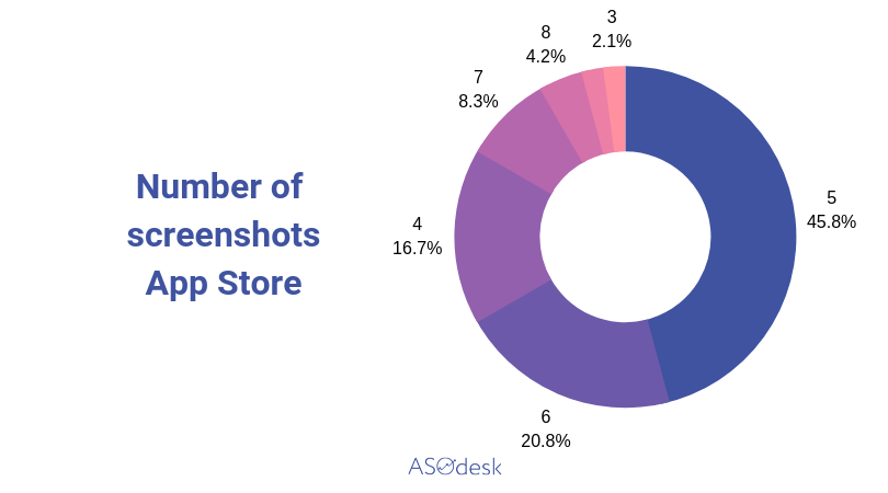
App Store allows publishing up to 10 screenshots. But most developers from the top 50 free game applications are only using 5 screenshots.
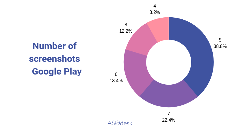
On Google Play, developers can add up to 8 screenshots for each supported device: phone, tablet (7 and 10 inches), Android TV and Google’s Wear OS. Not everyone uses this opportunity. After analyzing 50 free games, we found out that developers mostly use five or six screenshots in the page design.
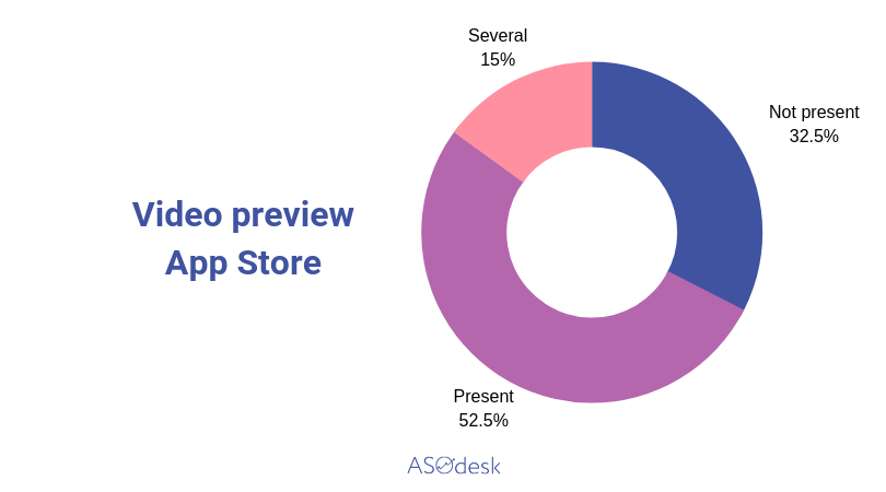
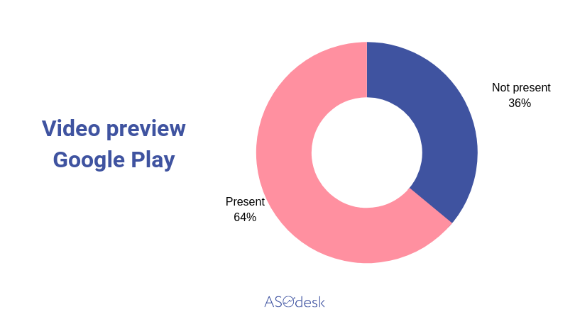
Video Preview
When analyzing the top 100 free apps on the App Store, we have noticed that less, than a third of all these applications are placing video previews on their pages. The situation is reverse, when it comes to games: after analyzing the top 50 free game apps on the App Store and the Google Play, we can say that a third of game applications lack the video, while some are placing even two or three promotional videos on their pages.
As you can see, when promoting games in both markets, adding a video is more important, than designing screenshots, and an increasing number of developers are taking advantage of opportunity to showcase gameplay in the form of a video clip. Now, what can we say about the format of videos, as such?
Generally, these are video game recordings that showcase various game stages and mechanics. Large labels make promotional clips with cuts from the game and promotional text inserts. In this case, video is the most effective way of showing all the special gameplay features within 30 seconds.
Icon Design
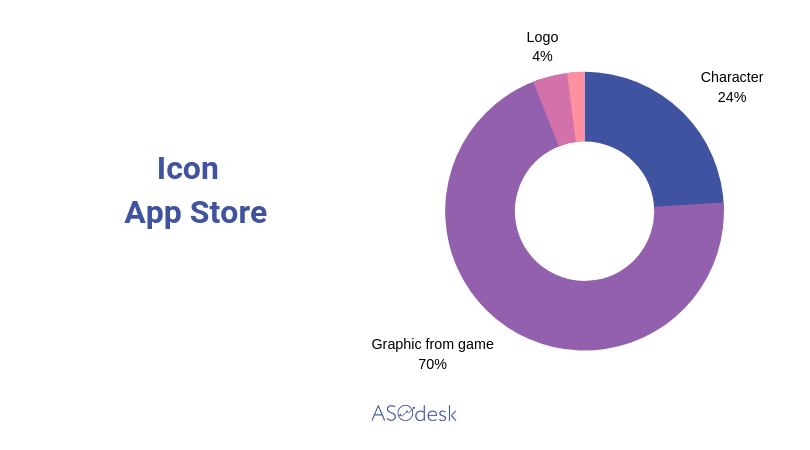
Along with screenshots, we have also analyzed visual icon designs of applications from top 50 free apps on the US App Store and Google Play.
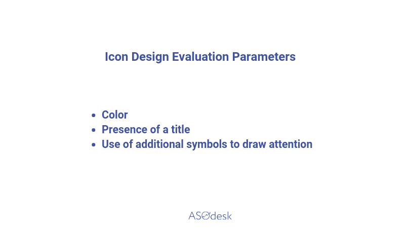
We should note that the game icon design is absolutely different from application design. While in apps’ case a simple design prevails – a background and an object on the icon, whether a logo, name, or graphics, – in case of games, the icon is generally a bright, elaborated element of the game graphics, large character image, or an outlined game element. There is no background as such in the icon design here, with sky or part or interface serving as a background.
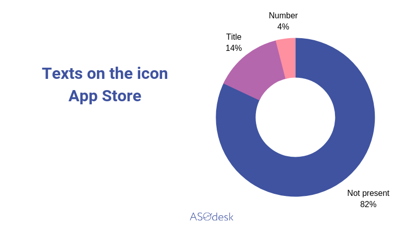
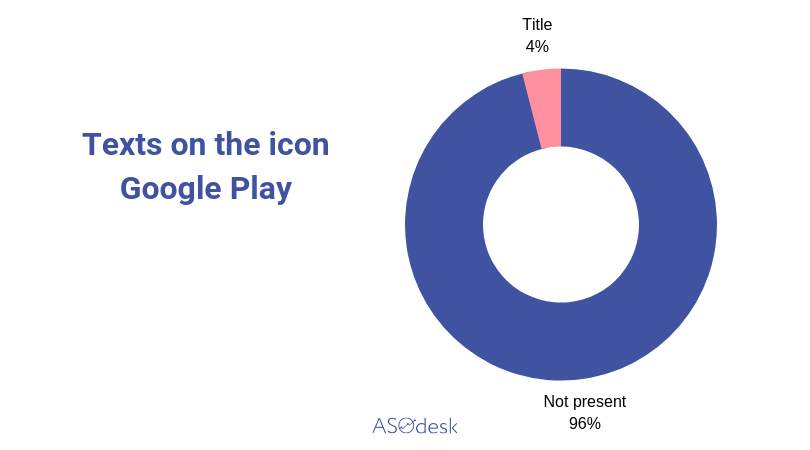
It should also be noted that inscriptions or game names are rarely placed on icons.
Here are a few icon examples on Google Play and the App Store.
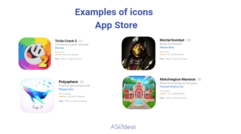
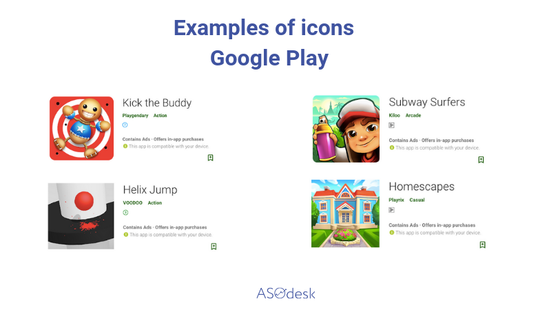
Game graphics use is prevalent on the App Store icon design.
Characters or game graphics are used at about the same frequency on Google Play icon design.
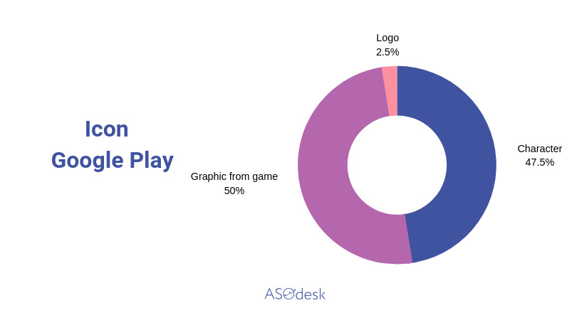
Almost no one places game names on icons, and numbers are added rarely.
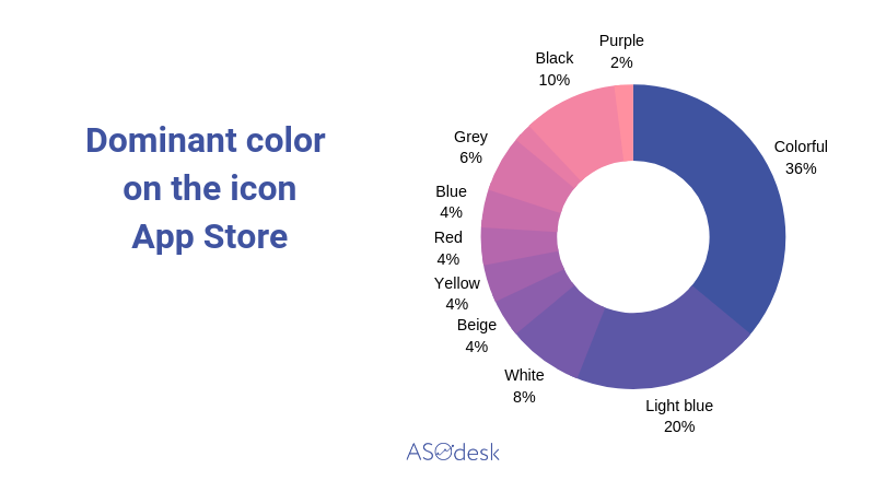
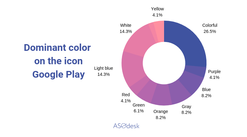
As of color design, as we have mentioned previously, there are almost no such compositions, as background plus object, when it comes to icons. However, there are dominant colors that take most part of an icon.
Conclusion
We have analyzed 50 top free games on the App Store and 50 top games on Google Play USA. So, what can we say about visual game optimization at the first sight? It is definitely different from application optimization, while the difference between Google Play and App Store pages is insignificant.
- Game publishers prefer to use images of interface and stages without any additional design in their screenshots;
- Developers are using vertical and horizontal formats same as frequently;
- If screenshots include additional design elements, these are mostly inscriptions on text backgrounds and game characters;
- Most publishers place five or six screenshots on their pages;
- More, than a half of games add video previews, while on the App Store some developers upload two or three clips;
- Video previews don’t stand out with an interesting design, mostly consisting of game recording;
- Icons are created on the basis of game graphics or a game character;
- Icons with characters look more prominently;
- Icon design is prevailed by several colors at once;
- Game applications don’t place names on their icons, only in seldom occasions.
How Can You Optimize a Game Page in Stores?
- Analyze large titles from your niche and see, what type of design are they using for promotion;
- Use more diverse screenshots, part of which can be accompanied with texts that expand on your game’s adavantages;
- Add several video previews to the App Store page;
- Make an enticing promotional video, not just a gameplay recording;
- Elaborate the icon, outlining a character or large elements.
If you have interesting examples or cases of visual element optimization on the App Store or Google Play pages, send them to us and we will gladly write about them. Any comments and feedback are welcome, as well!