
Checklist for visual optimization in the App Store and Google Play
Visual assets are one of the first things the user sees and can be very influential in the download process. Users will rely on your visual app icon, screenshots, and videos to decide whether to install your app or mobile game. So read on to find out how you can make the best of them and boost your conversion rate in the process.
There are a lot of things to take into consideration when planning and producing visual assets for your app’s listing page. Our friends from Apptamin have collected several tips that are important to consider when choosing an icon, screenshots, and videos.
Contents
- Don’t skip the preparation phase of producing visual assets
- Pay attention to your competitors’ screenshots and videos
- Create different visual assets for the Google Play and the App Store
- The first few seconds of video preview are essential
- Include branding in your assets
- Leave fake ads for UA
- Don’t forget to localize your visual asset
- Checklist for visual optimization tips
Don’t skip the preparation phase of producing visual assets
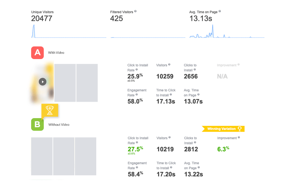
Don’t go into it blind. Producing visual assets is something that takes time, energy, and money but they are an essential tool to help your app grow. Visitors who watch the video are 3 times more likely to install the app and screenshots can increase your conversion rate by up to 28%.
However, experiments of SplitMetrics show that sometimes videos can negatively impact the conversion rate if they’re poorly done. That’s why it’s so important to conduct A/B tests to choose the best variant of video or screenshots.
So before you start creating and producing visual assets make sure you know exactly what you want and how you should go about it. Research, and look at what works for your app and what kind of users you’re targeting. Once you know what your target audience looks like, you’ll know what attracts them to apps or mobile games.
For your app video, the first step is to write a script, so you can organize what information you want to share and how to showcase it in the best light possible. It’ll also help you know what content you will need to capture from your app, and if you might need additional footage or motion design.
The same goes for your screenshot, prepare which information you want to show and organize them as well as potential designs. Having your screenshots interact with each other is always more successful.
Here are a few things you can do to prepare for your visual assets:
- A mood board, it helps visualize the aesthetic you’re going for as well as what you want the user to get out of your assets.
- A script for your preview video, this one is a must-do! A script will help you build the narrative you need to make the best preview video.
- A roll-call of all your assets: will you need screen captures, character scenes, music, sounds, etc. Check what you have and see if you need anything more .
- Prepare a poster frame (just like a thumbnail) for your video.
- Think about possible localizations and translations of your visual assets.
If you need to, don’t hesitate to get some help.
Pay attention to your competitors’ screenshots and videos
It’s always important to look into what the competition is doing. You’ll get to see what their goals are, and how they’re positioning themselves if they’re planning a strategy similar to yours or not.
It can be tricky because sometimes all your competitors will have similar strategies, and that can either be because they haven’t thought of any out-of-the-box idea or maybe because it’s the only strategy that works with that audience.
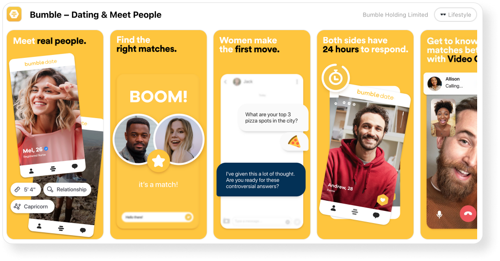
Look at dating apps. Tinder and Bumble have very similar strategies. They’re betting on people. When you look at their screenshot, it’s centered on humans and human interaction.
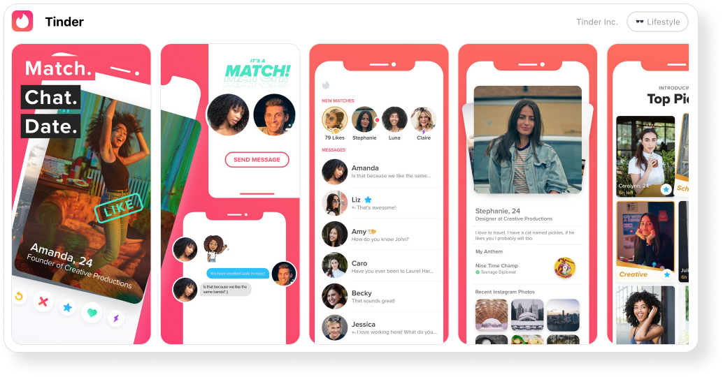
Of course, they each have their own color scheme, taglines, and designs. But the key element in both strategies is people. They put the emphasis on meeting new people and chatting. After all, that’s what users go on dating apps for.
To achieve this, they added a lot of pictures of actual people and made them stand out, either through size or placement.
On the other hand, Hinge decided to go a different way. There’s a prominent face only on the first screenshot (and then again on the 4th). Their main strategy seems to be about the experience rather than people.
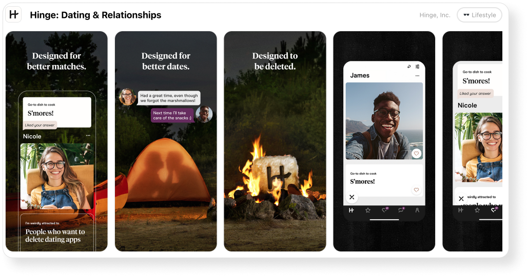
The third screenshot doesn’t even feature any people or phones or conversations. And the background picture spanning over 3 screenshots is all about setting the scene for a camping date. They are more interested in labeling their product as something adventurous, an experience first and foremost where Tinder and Bumble took a bet on human connection.
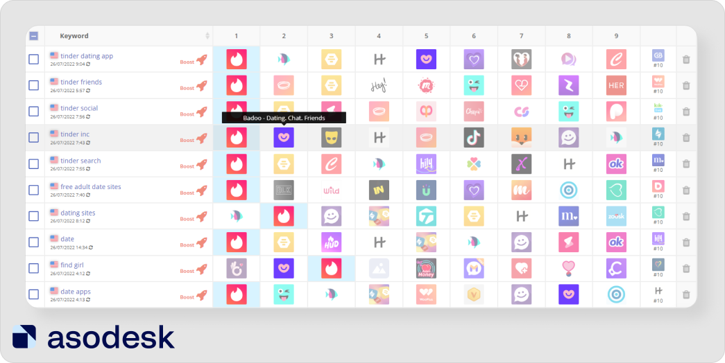
You can check if you stand out from other apps with the Keyword Charts in Asodesk. The tool will show the positions in the search results and icons of apps that rank for the same keywords as you.
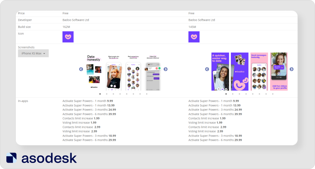
You can also go to ASO Comparative Report, see their app pages in the App Store or Google Play, and check if they have changed the icon and screenshots in the last updates.
There’s always a lot to learn by watching what the competition is doing. So don’t forget to analyze apps from your niche.
Create different visual assets for the Google Play and the App Store
One essential thing to remember is that you cannot use the same visual assets for both the Play Store and the App Store. For example, using Google Play creatives on the App Store can lead to a 20-30% decrease in installs.
Both store users have different expectations and different behaviors. You cannot consider them as a whole or reuse the assets produced for one in the other. They also have different rules.
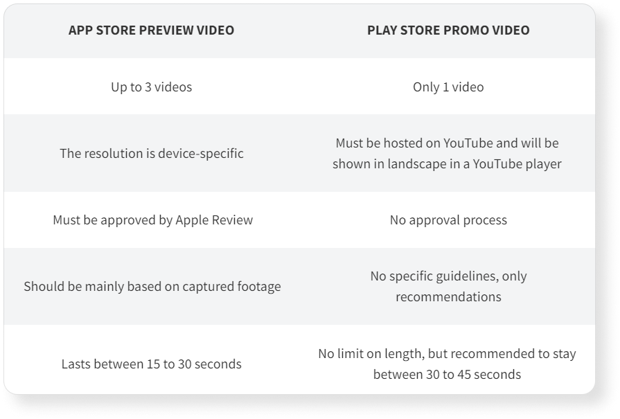
In general, there is more freedom with Play Store’s promo video. There is no limit on time and less control, although Google provides some recommendations to help you make the most of it, you’re free to be creative and use more storytelling to sell your app. On the other hand, Apple has every visual asset go through Apple Review and asks for preview videos to be almost entirely based on captured footage.
Finally, if you show a device in your preview video, remember to only show Apple devices for the App Store and Android devices for the Play Store. Learn other differences between App Store and Google Play requirements and see tips on how to create visual metadata in the Asodesk article.
The first few seconds of the video preview are the most important
You need to hook your user’s attention right off the bat. The first 5 seconds of your preview video are essential. Show the most important thing first, visitors should be able to understand very quickly what your app is about and learn more while the video progresses.
If you have a mobile game, start with a very dynamic scene for the opening sequence. Add a little drama and play up the emotions to keep the audience engaged all through the video.
For non-games apps, play on sounds, colors, or voice-over to be attention-grabbing.
Look at this JustEat app preview video, the first few seconds are very dynamic: there’s an array of very bright colors driving attention to the way they move as well as a text (“Une petite faim?”) that asks the user if they’re hungry. This catchphrase at the very beginning addresses the user and makes them feel involved in the process. It also plays on hunger, motivating users to order food, which is always useful for a food delivery app.
Also, don’t take too long to show users what you have to offer. Preview videos are limited to 30 seconds on the App Store, and even if there is no time limit on the Play Store, you should be careful about the length of your video. Mobile users have a short attention span, especially for this kind of content.
Likewise, the most important information should go in the first screenshots. Visitors are 10 times more likely to scroll through your Gallery than see your full description, so it’s essential to show all the important information on your screenshots. But most users will only look at the first screenshots and not scroll all the way to the end of the gallery. So choose your first 3 screenshots carefully, they’re the ones with the most impact.
Include branding in your assets
To really set yourself apart, branding is the cornerstone of any marketing strategy. Peggy Anne Salz, writer, journalist, and founder of MobileGroove, believes that the future is all about app brands, so developers should work on building them now. That includes your app’s listing page and your visual assets.
According to Asodesk, 76% of apps from the top 100 in the App Store and Google Play use their logo on the app icon. So if your brand is well-known, it is better to put its logo on the icon.
However, branding is not just about the icon or the name, it’s about the details you add to your screenshots and preview video.
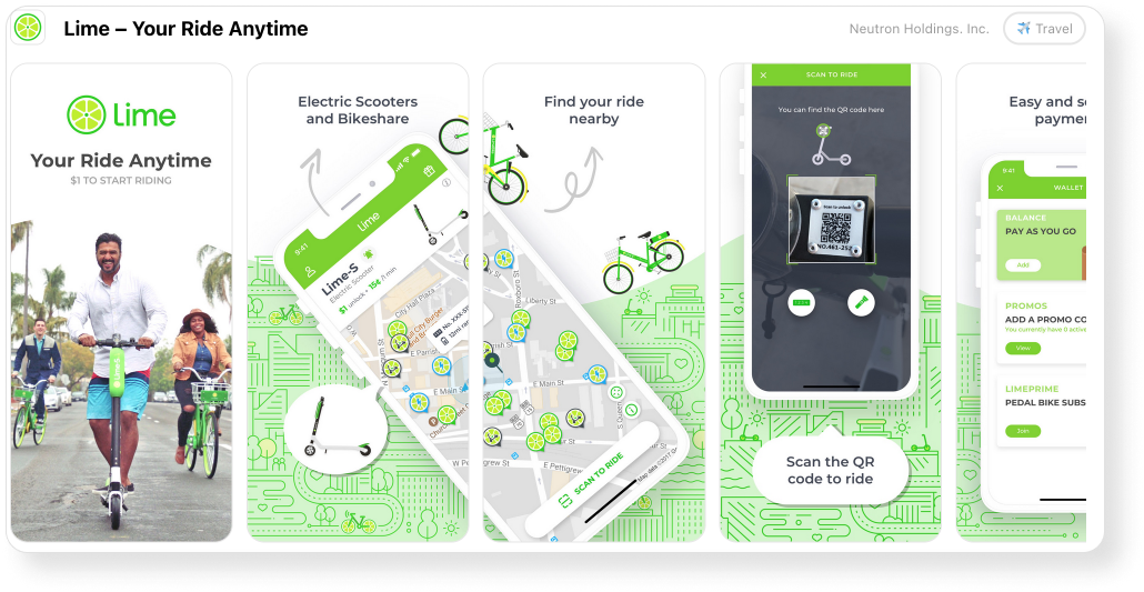
For example, Lime’s screenshots are very on-brand. Every single one has either a scooter or a bike on it. They are color-coded according to their brand’s color, the first thing you see is a bright green, associated with not only their logo and icon but also the color of their products. The maps in the background also had a nice touch, helping people associate them with movement, connection, and traveling. This is an app you use to get somewhere, and that’s what they’re showing you.
For Chip, a finance app, it’s the same. The first 3 screenshots, the ones that will always be visible without scrolling the gallery are heavily branded, even more so than the following ones (which have duller colors). They decided to bet everything on the first screenshots and the first impression users will get when landing on the app page. After all, a good first impression increases conversion by 35%. The first screenshots create the Chip’s brand with its key elements: the color scheme, the typeface, and the coins.
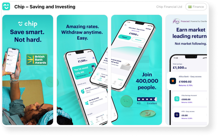
However, if you’re unfamiliar with the brand in itself, you wouldn’t recognize it just from a glance at the screenshot. Blue colors are often used for finance apps because they are associated with trust, which is a pillar of any financial company. Outside of their specific shade of blue, these screenshots lack something that makes users remember the brand right away.
Now, let’s exit the finance world and take a look at Reddit. Reddit dived into branding with a key element of their platform: /. The / is how every subreddit starts. It’s a key element of the social media’s identity. Outside of their typeface, they also heavily use orange tones, their main brand color.
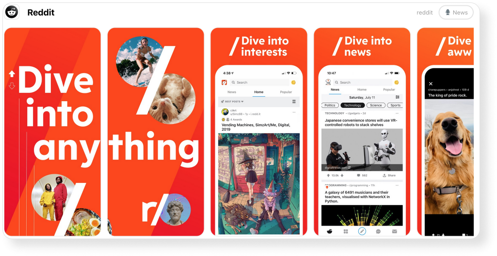
The most striking element is still the /, because everyone who knows even remotely Reddit will recognize it as an element of the app. Even the pictures in the first two screenshots are in a bubble shape, which is also a clear element taken directly from Reddit (every profile picture there appears in that same bubble shape).
Leave fake ads for UA
Fake ads are a very successful endeavor, especially for mobile game ads. They consist of showing footage or gameplay that is not included in the app. It often boosts the conversion rate but the number of app deletions and bad reviews will grow once users arrive in the app and realize it’s not what they expected.
For your store listing pages, both in the Play Store and the App Store, you should avoid doing so. Because the app store page is the last obstacle between your user and the use of the app, if the last visuals they see do not match the ones they will see inside the app, minutes after downloading it, you will create deception, and churn.
As for the App Store, your visual assets won’t even pass Apple Review if the footage is too far from the actual content of the app. Be as truthful as possible to your app, users will see the difference.
Don’t forget to localize your visual asset
Last but not least, localize. 70% of users are more likely to spend time and money on products available in their native language, it’s essential for them to fully understand the app listing page when they’re surfing through the app store.
More importantly, don’t rely on automatic translation. If possible, always work with a native speaker. Not only will you have a trusted translation, but they will also be able to provide cultural tidbits and help you tailor your product to its new locale better.
In addition to localization, you should do culturalization — adapt your app page to a region’s values and cultural nuances. However, most of the time the goal is for your app or mobile game to encounter global success. That means extending its presence outside of your borders.
Sometimes it can even help in unexpected ways, for example, the Spanish (MX) locale is indexed in the English US App Store so which can boost your ranking. Your visuals should also be culturally appropriate. Colors may have different meanings in different countries, and design taste may also differ from region to region. For example, Japan loves cluttered screenshots whereas Western Countries like them simple.
You can learn tips on how to localize an app page for Japan in the Asodesk article.
Having visual assets that match your target country’s culture, even more than their language, is essential for a successful conversion rate. Don’t miss out on it.
Checklist for visual optimization tips
- Prepare before you get started, think about what you need and what you want to do. Don’t go into it blind!
- Benchmark and look at what the competition is doing, there’s always something to learn here.
- Adapt your assets to the store, the App Store and the Play Store have different expectations.
- The most important information should be in the first few seconds.
- Brand your assets! Your store creatives can be a useful branding tool.
- Only show what’s really in your app, you cannot use fake footage.
- Simply translating your texts and visuals is not enough; always do your best to culturalize your content.
Subscribe to our newsletter to keep up to date with news digests, as well as useful articles on ASO, mobile app marketing, and working with reviews.


