Top 10 Recommendations on Screenshot Visual Optimization
Visual elements of a page is the face of your product.
When landing on your application’s page in the App Store or Google Play, the user initially notices the icon and screenshots. From that moment and on, they only have a few seconds to decide on whether to download the app or not. Screenshots affect install conversion, so a manager that responds for optimization has to monitor the changes at all times and experiment with visual imagery, trying to get a better conversion.
We have gathered the top recommendation on ASO optimization for screenshots for both app stores.
Follow the Requirements Closely
One of the basic rules that work for both Google Play and App Store is following their requirements. Both markets have precise recommendations regarding screenshot sizes, their acceptable quantity and the content that can be placed on them. You should carefully read the recommendations and requirements in order to avoid issues that may surface during the review.
Recommendations for Google Play and App Store.
Number of Screenshots
App Store allows placing up to 10 screenshots on you’re the page of your app for your iPhone, iPad, Apple Watch, and Apple TV.
Google Play allows adding 8 screenshots for each type of supported devices, including smartphones, tablets (7 and 10 inches), Android TV, and Google’s Wear OS.
Our recommendations for both application stores:
Most users will most likely not be looking through all of the available screenshots. Hence, in order to provide the information about the main advantages, you should use the first 4–5 screenshots to the max. You can use all the other screens for placing additional interface elements and not as important information.
Portrait or Landscape View?
App Store
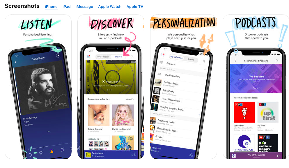
We have analyzed 100 top iPhone applications and have noticed that almost all the apps use portrait orientation for their pages. This can be explained by the fact that most applications have a vertical interface, so all the promotional information is provided in the same format. In addition, vertical screenshots take less room. You can place more information on them. In the same time, the user will not have to perform lengthy scrolls to the side.
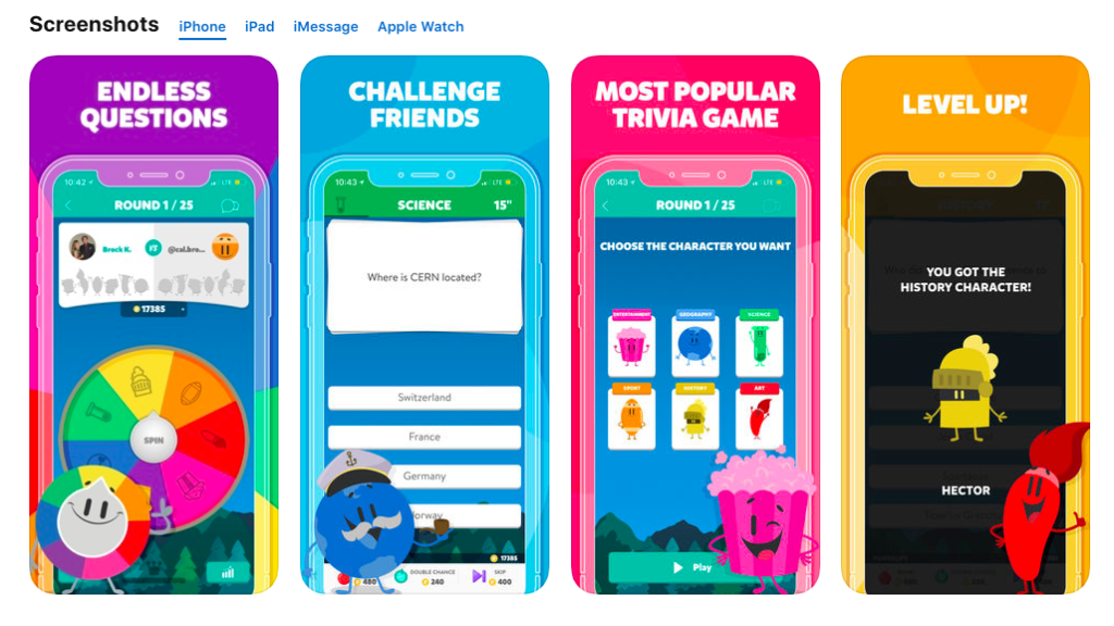
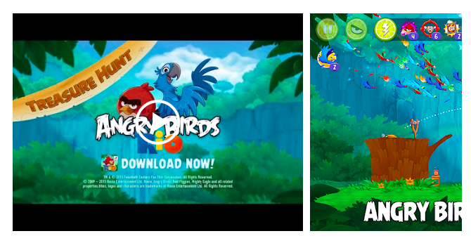
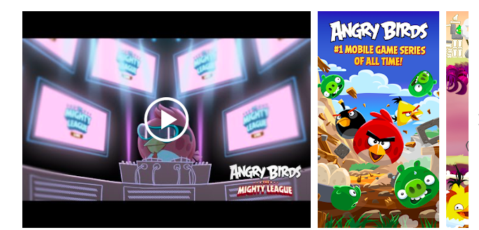
As of games, developers use both vertical and horizontal format at about the same rate.

Google Play
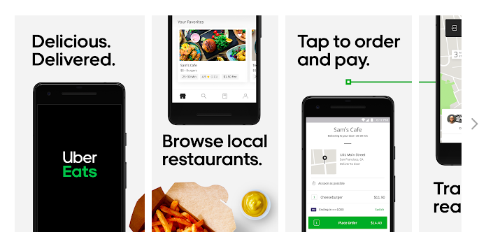
The situation is similar with Google Play: application publishers prefer using portrait orientation, whereas game developers upload screenshots in both landscape and portrait orientation.
The choice of screenshot types is conditioned by the interface itself, as well as gameplay features: you can show more details in the landscape mode. Also, game applications are using additional graphics and include video links.
Our recommendations for both application stores:
We recommend you to explore your niche’s top applications and take notice of what screenshots your competitors use and, considering your product’s interface orientation, create a set of screenshots. For applications in both App Store and Google Play it is better to use vertical screenshots.
As for iPhone and Android games it is more preferable to make horizontal screenshots, if the interface itself has the same format. In case the game interface is vertical, then the screenshots should show that as well. Also, keep in mind that user behavior may be different in each store and it is better to plan different sets of screenshots — one of the App Store and one for Google Play.
Put Advantages in Front
Since device screen size is limited, the user first sees only two screenshots. This is why the first two screens have to include the main features and advantages.
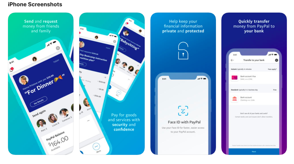
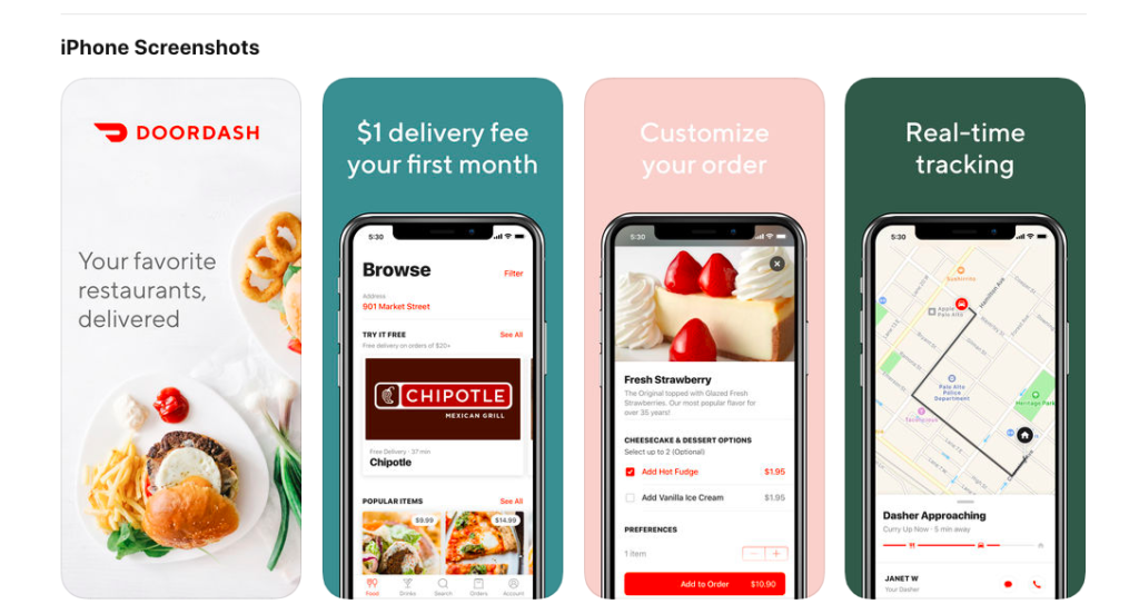
We have analyzed the top 100 free applications for iPhone in the USA and have noticed a particular trend: general information about advantages and features is provided either in the first screenshot or in the first two screenshots that make up one whole composition.
Choosing Application Style
There are several screenshot design styles used by publishers. Virtually no one uses pure screenshots without additional textual information. Everyone tries to choose the most effective way of delivering information for the potential audience. We will not be describing all the possible variations used by developers. But, we are going to outline the advantages and disadvantages of popular ways that are currently used in the App Store and Google Play.
Solid Background and the Device
A background template is selected — it most often corresponds brand colors. Device with the app’s interface is placed at the center with an enticing title put above it. Another way of doing this is placing a blurred image or gradient in the background instead of solid color.
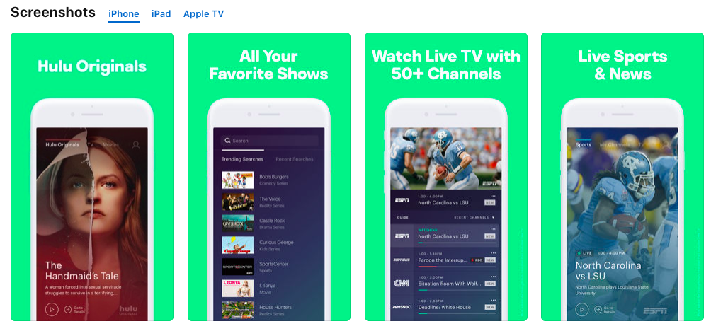
Advantages:
- Such screenshots are fairly simple to do;
- They clearly outline advantages: one function per screen.
Disadvantages:
- Technically, the use of device images is prohibited. iTunes Connect Developer Guide states, “Don’t place the screenshot inside an Apple device image;”
- Too many publishers are already using such screenshots, so you may easily get lost among them.
Panoramic Gallery
This method implies an elaborate and unique visual range. Most often, the first two screens are joined into one composition. The first screenshot usually features information regarding general features, while the second elaborates on the application’s contents. Such a composition counts on getting users interested, so they scroll further.
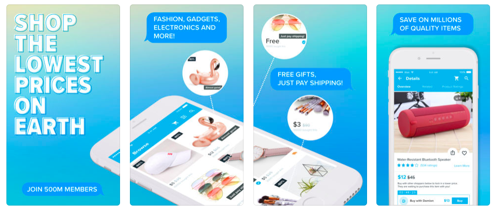
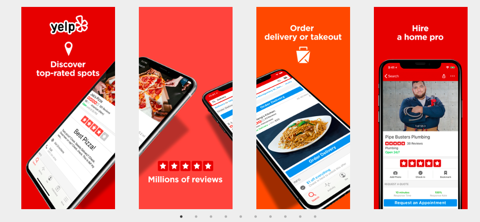
Advantages:
- High level of user involvement;
- Bright delivery of information.
Disadvantages:
You need more time on developing the concept.
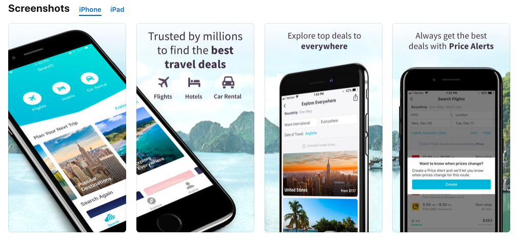
Outline Product’s Advantages Instead of Its Functions
Important information provided in the first screenshots doesn’t need to be a simple recitation of product’s functions. You should make the user understand, what advantages they are going to get by using your application. Emphasize on the users that already trust you. Outline the set of functions one would get upon downloading the application. In addition, you should mention clear advantages of your product as compared to similar apps that are already available on the market.
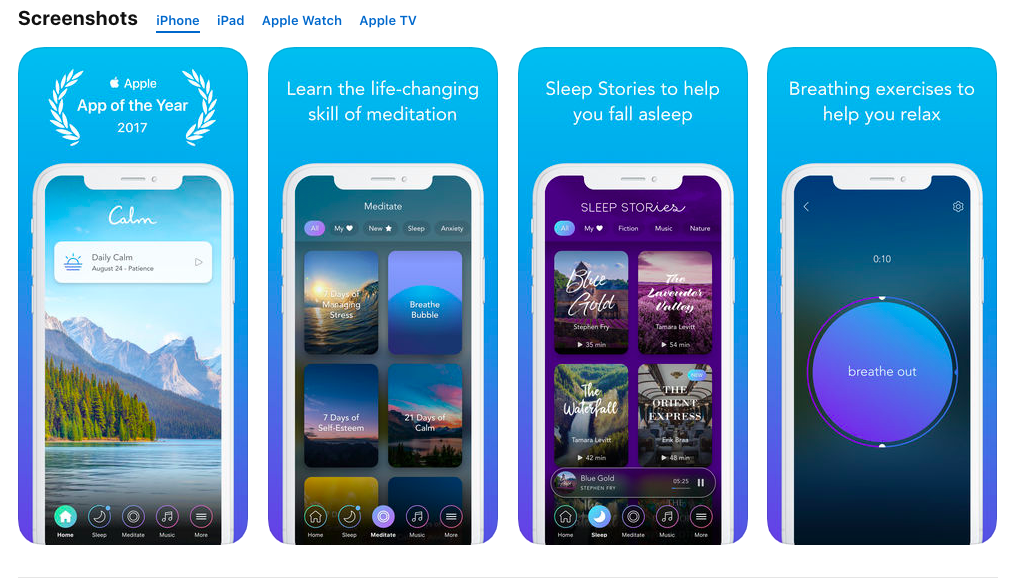
Outline Your Achievements
Your potential customers want to use the best and popular products. You should give them this opportunity. Outline your advantages: use screenshots to remark the achievements, awards, and prizes that you’re received for your application.
Localize the Graphic for Different Markets
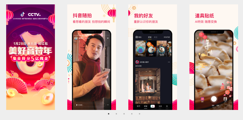
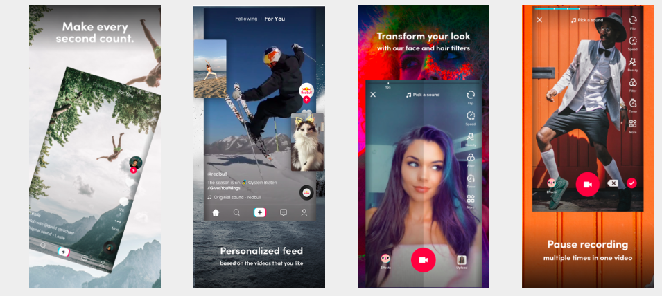
All graphic materials have to be localized by not just translating all the text on them to a local language. All the graphic has to be adapted to the local market. Such adaptation is called culturulazation. You don’t just translate texts, but are actually creating graphics taking into account all the specificities of the local market, which may include a particular color spectrum or photographs that include people of a different nationality. Perhaps, you will need to add symbols or replace photographs of people with illustrations. It seriously depends on cultural features of a country, in which you are planning to promote your product.
On the example provided below, you can see that the publisher is using absolutely different color patterns and images for their application — one of the creative sets is particularly effective for Chinese audience, while a completely different set is used for the USA.
Tik Tok Screenshots in App Store for China
TikTok Screenshots for App Store for the USA
Add Videos
Adding a video preview in the App Store and promo video for Google Play is an additional opportunity to tell your audience about your application’s advantages. This is a way of clearly showing how a product can be used in everyday life.
An added video can sufficiently increase conversion from page views into installation. According to a report by Splitmetrics, addition of a video preview in the App Store can increase engagement and conversion rate by 16%, while according to information provided by StoreMaven, presence of a video on your application page in the store can increase the conversion rate by 20–35%.
When planning the promotion of your products in the App Store and Google Play, you should keep the differences between them in mind. That is, while you have an opportunity to add video previews in the App Store, Google Play only allows adding a link to the video that is posted in YouTube. Herewith, it is necessary to add a feature graphic to the application page.
We have analyzed top 100 free applications for iPhone: only 23 out of 100 are using a video preview. In general, these are the apps meant for online shopping, food delivery, photo and video editors, as well as streaming services.
We can draw the following conclusions from this:
- Not all publishers are using the chance of showing their app’s functionality dynamically, so you have a chance to draw attention to yourself in the App Store;
- Video tutorial is only relevant, when you have enough functions and content within the application itself.
In order to check the hypothesis regarding the effect of videos on the conversion rate increase, you will have to create a video preview for your application and conduct A/B testing.
Conduct A/B Testing
When do you need to test new screenshots? Basically, each time, when you are planning to update them whether in the App Store or Google Play.
But, especially in cases, when you change your graphic materials’ concept completely. For example, you notice that the app has high positions in the top results of search queries. Your store page has a good attendance, but the conversion drops. In this case, you should analyze the current icon and screenshots, hypothesize, and create several sets of new screenshots. Then, you should start A/B testing. Consequently, you will simply need to choose the variation that shows the best conversion.
Google Play console provides a chance to conduct testing all the page’s elements. You upload your variant to the store first and then test it on the live audience. Then, you test another set. A/B tests help to analyze and choose the variations that will be most effective in conversion increase.
Unfortunately, App Store doesn’t provide any native tools for conducting such tests, but you can always resort to third-party services. As of detailed information about the tools you can use to conduct A/B testing of the visual page design, you can take a look at one of our previous articles: “What an ASO Expert Needs Besides an ASO platform”.
Let’s Sum It All Up
An effective application page design directly affects the effectiveness of your ASO strategy. Screenshots affect the decision regarding the download or purchase of a product. App Store and Google Play are constantly changing and, because of this, the requirements for visual materials update as well. You have to follow these changes and alter your application’s icons and screenshots in accordance with them.
If you have added new functions, make sure to showcase them in the screenshots and outline them upon application update. Your users have to clearly see the new functions.
Study your competitors and new graphic material design trends — the same screenshots become boring and users just stop reacting to them. By replacing old screenshots with the new ones, you can increase your conversion rates.
Continue to optimize and improve your indicators. In the same time, we are going to keep you up to date with the latest news and trends.
We always welcome your comments and questions!

