How to Make your Data Analysis of Traffic on the App Store Clear and Effective
Dmitry Kofman, the ASO Director for Gambino Slots, told us how they work with App Store Connect data and why correct data visualization is essential for both the ASO manager and the marketing director.
We, in Gambino Slots, are constantly analyzing the data from traffic sources within the stores, and we have a lot of processes that are built on this – from each ASO iteration’s efficiency evaluation to KPI setting for our PPC and ASO managers.
Previously, we’ve had huge Excel pivot tables that we were building based upon the reports uploaded from consoles. As of now, we are using a new tool developed by guys from ASOdesk – ASO Dashboard that completely fulfills our needs.
What a perfect report should look like? What’s more important – data or their visualization? In our opinion, data visualization is the most important. We can always download the data in consoles, but we can’t always analyze them correctly and build readable dashboards. This is exactly why we started using ASO Dashboard by ASOdesk.
Thus, let us take a look at the main advantages of this data analysis format and the cases, and how to work with it:
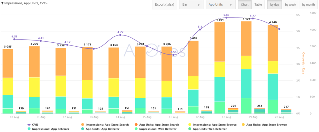
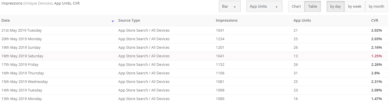
Daily Analysis:
- Tracking of unique installs, interactions, or page displays and conversion to installation ratio;
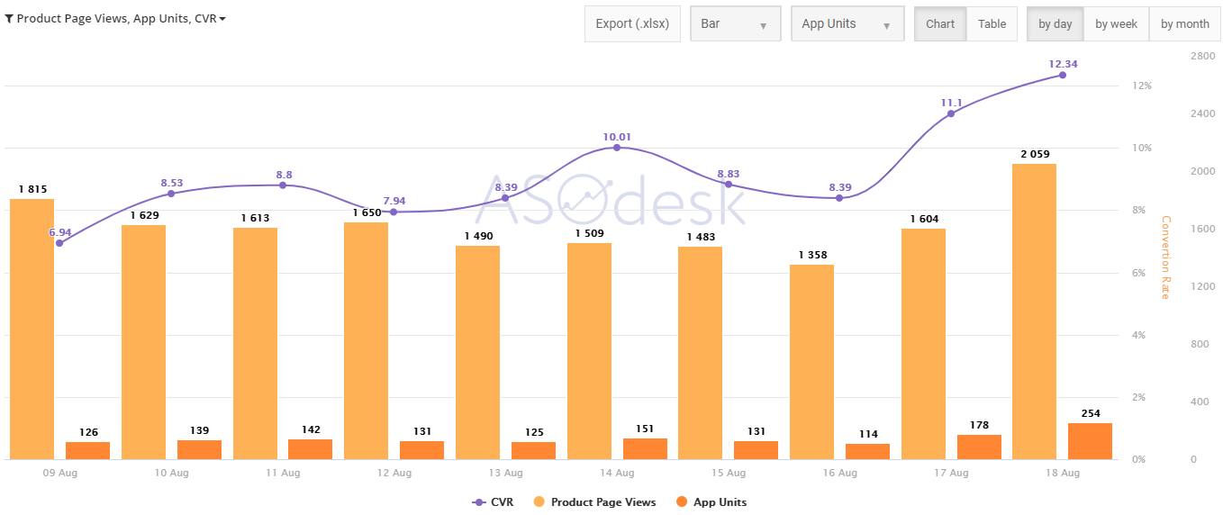
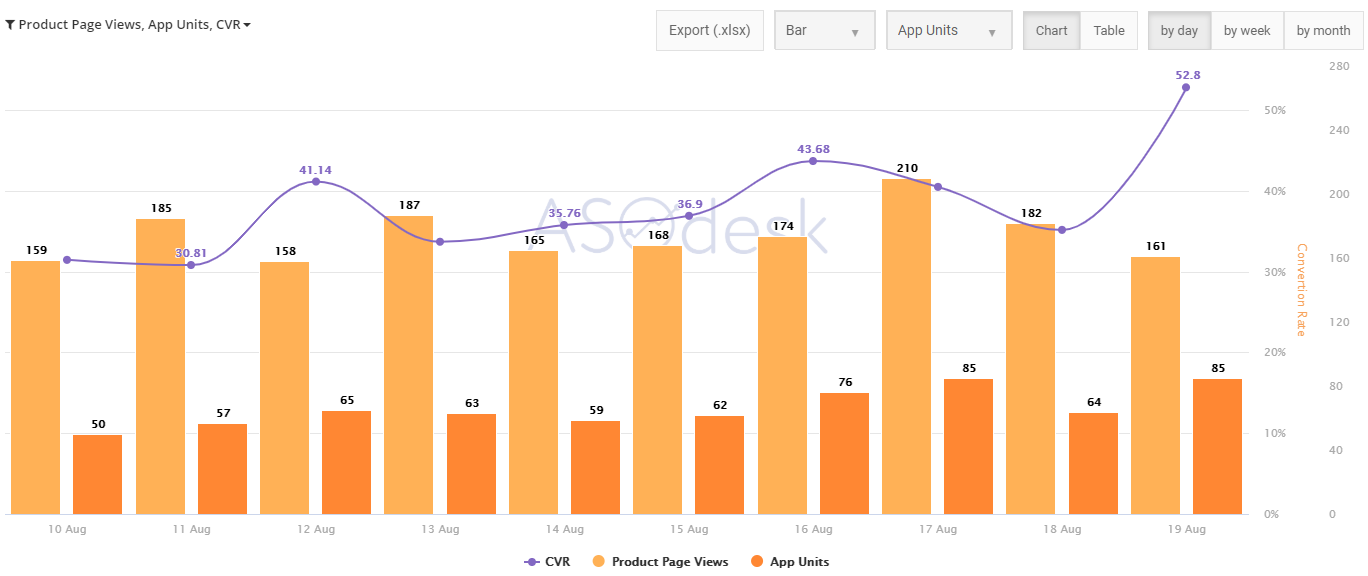
We all know that all the interesting stuff happens after the change of metadata and we want to analyze how much has conversion grown or decreased. Daily reports are useful for quick and convenient viewing of conversion rate to installs changes. You can also group or combine several parameters, such as countries, traffic sources, and devices.
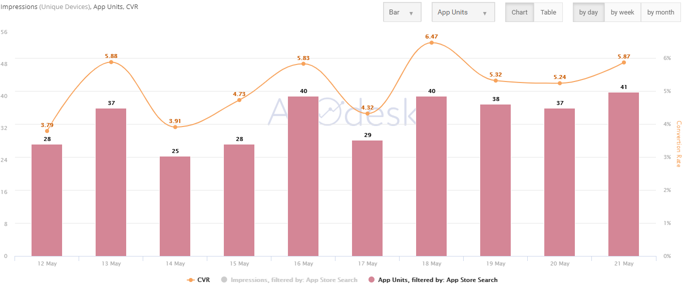
- Conversion analysis by country.
It helps you to quickly track conversion on charts after metadata replacement and not only. For example, you can select several countries that are important for you and only analyze their data. Apple, personally, doesn’t provide these data all too conveniently. For instance, we have replaced metadata on one of our projects in Thailand and now are witnessing conversion growth:
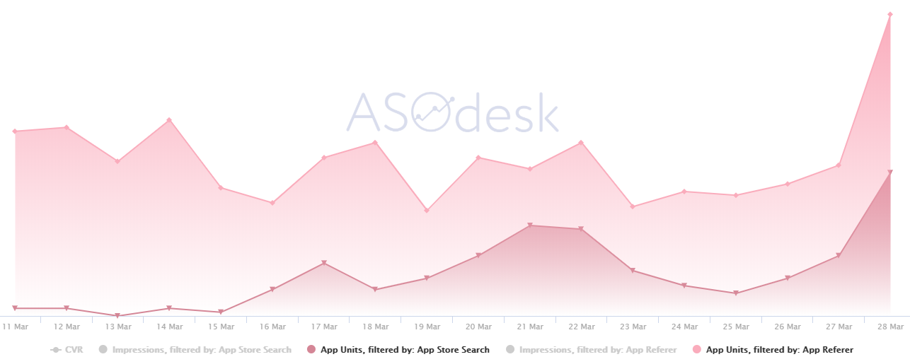
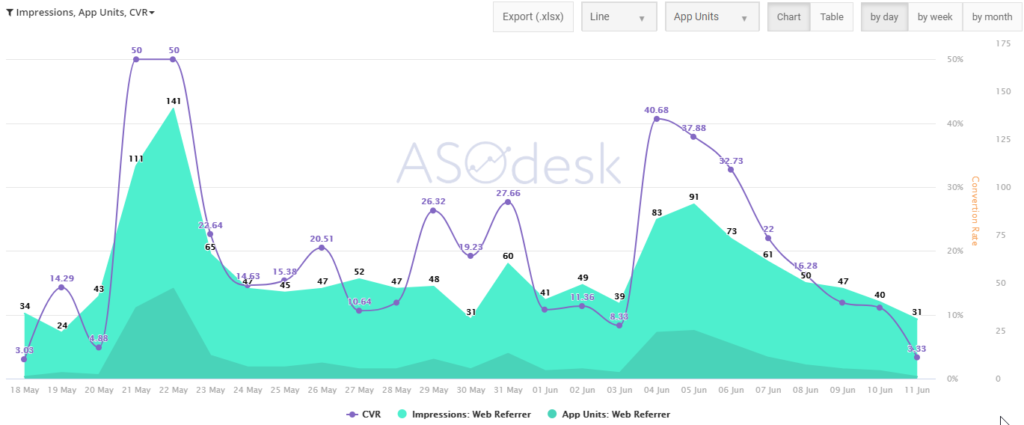
- Comparison by traffic channel.
This is where you can see the influence of paid types of traffic on the organic one. Advertising traffic has a powerful influence on organic installs. Today, there are a lot of various channels, where you can buy installs, from cheap and motivated traffic to the most quality and expensive one. Of course, we purchase a part of the paid traffic to help grow organic installs. In ASOdesk, you can effectively track advertising traffic’s influence on the organic results.
For example, if you place App Store Search, App referrer and Web referrer installs on one graph, you can see the following things:
- Dependence on the purchase of quality or non-quality traffic for organic installs;
- Loss of attribution through such tracking systems, as Appsflyer or Adjust. The thing is that if you buy traffic that isn’t exactly quality, there are high chances that some part of clicks from these sources will pass into page displays and, as a rule, they have a very low conversion rate to installs. This will seriously damage the conversion and we can lose our position in the search.
- Viral traffic from YouTube or the Web. For example, when launching a campaign for influencers or other web promotions, you can see the precise influence on the organic traffic and as well analyze, how many organic users that didn’t click the tracking link – for example, the one included in the description under a YouTube video – have arrived.
- Analysis of the general picture over a particular period and setting actionable KPI (this one’s more useful for weekly or monthly overviews).
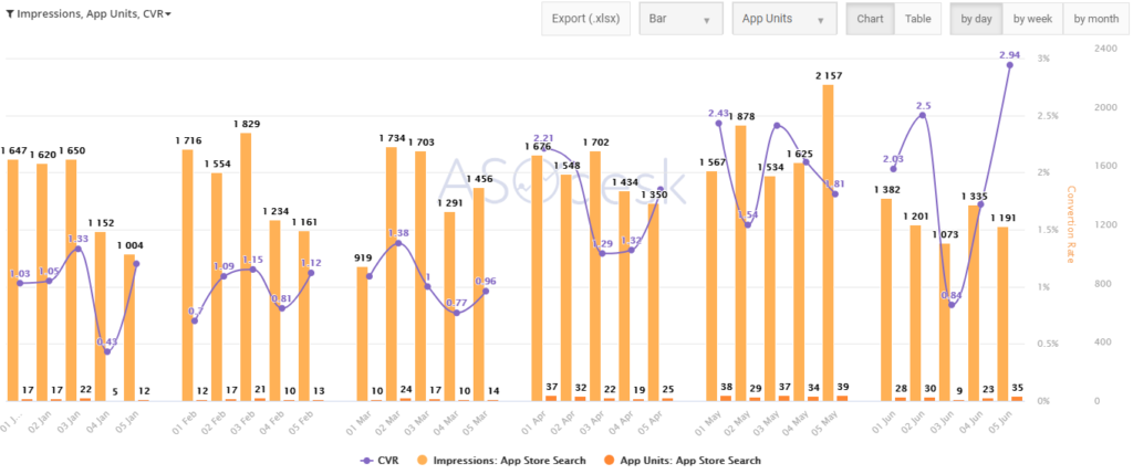
Weekly Analysis
- Here you will get the same data you get in daily reports, but now you can group them by weeks. It’s much more convenient to review such reports in terms of long time periods. In here, you will see the conversion without essential fluctuations that can be present in daily reports.
Monthly Analysis
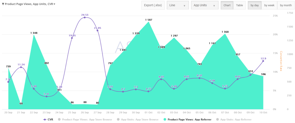
- In a monthly perspective, you can set a KPI and further tasks for your ASO and PPC managers. For example, you can show App Store Search and App referrer installs on the same chart and see the correlation. If the paid traffic helps the organic, you can estimate how much paid installs you should add for the further organic growth and set a precise KPI for the following month or another relevant period.
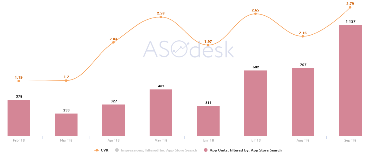
On this chart, you can see, how installs and conversion grow from month to month, and you can build a KPI based on these data.
Additional Possibilities:
You can see the data not only in the graphic format, but as well in the form of a table, and you can also download them as an Excel file, which is very practical in terms of building pivot tables. Not every ASO expert loves looking at pie charts and other graphs. It’s often much more convenient to analyze the data in the table format.
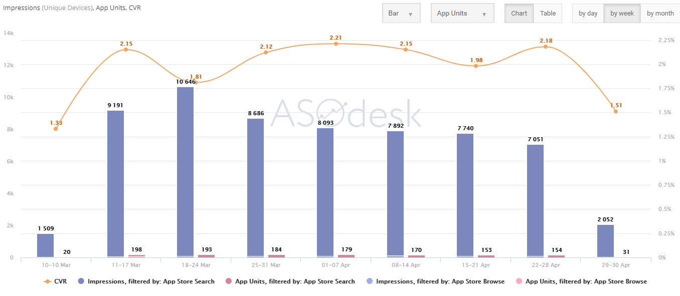
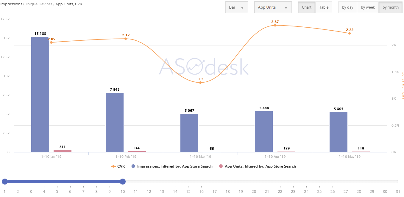
- Cohort data comparison by days. This is one of the unique possibilities provided by the ASOdesk tool. Here, the user can compare similar adjustable temporal periods. For example, the user can select 1st to 4th days of a month and the chart will show the amount of installs/displays and conversion over the selected period.
You can also see the same data by month. For example, on the graph below we can see the aggregated data just from the 1st to 10th days of the month.
This is important, when we want to analyze the beginning of a month and understand, what is the tendency, comparing to previous months over the selected dates.
- An interesting possibility to compare data by Installs vs. App Units. In these terms, we can see how many of unique and non-unique installs we have. Each application gets different data on Installs, since the data on non-unique installs are shown in App Store Connect based on users that have agreed to share information about their statistics and use with application developers.
Normally, the percentage of such users makes about 30-33%, which means we can figure out, how many of them are unique users, and how many of them are “remarketing” users.
For example, if we have 30,000 installs in a month, and this figure comes only from one third of all the users, we multiply this by 3 and get 90,000 non-unique installs (this is not a precise calculation, but it allows seeing a trend). Then, from those 90,000 we exclude App Units and get the number of “remarketing” installs.
Quick, Convenient and More Visually Clear, Than App Store Connect
Some people will say that App Store Connect shows all the metrics and data in its graphs and reports in a perfect cut, but others don’t agree with this at all and they don’t consider the interface convenient. We got used to basing everything on our own expertise. We consider it important that our reports allow us to answer many questions that appear during our work, as ASO and PPC managers and marketing directors alike.
ASO Dashboard is a great tool for data analysis and, as we see, it’s good not only just for organic traffic, but for advertising traffic as well. This tool will help you understand the ASO sphere better and deeper from your own point of view due to its flexible visualization.
We offer an expanded trial for ASO Dashboard connection, just send us request!