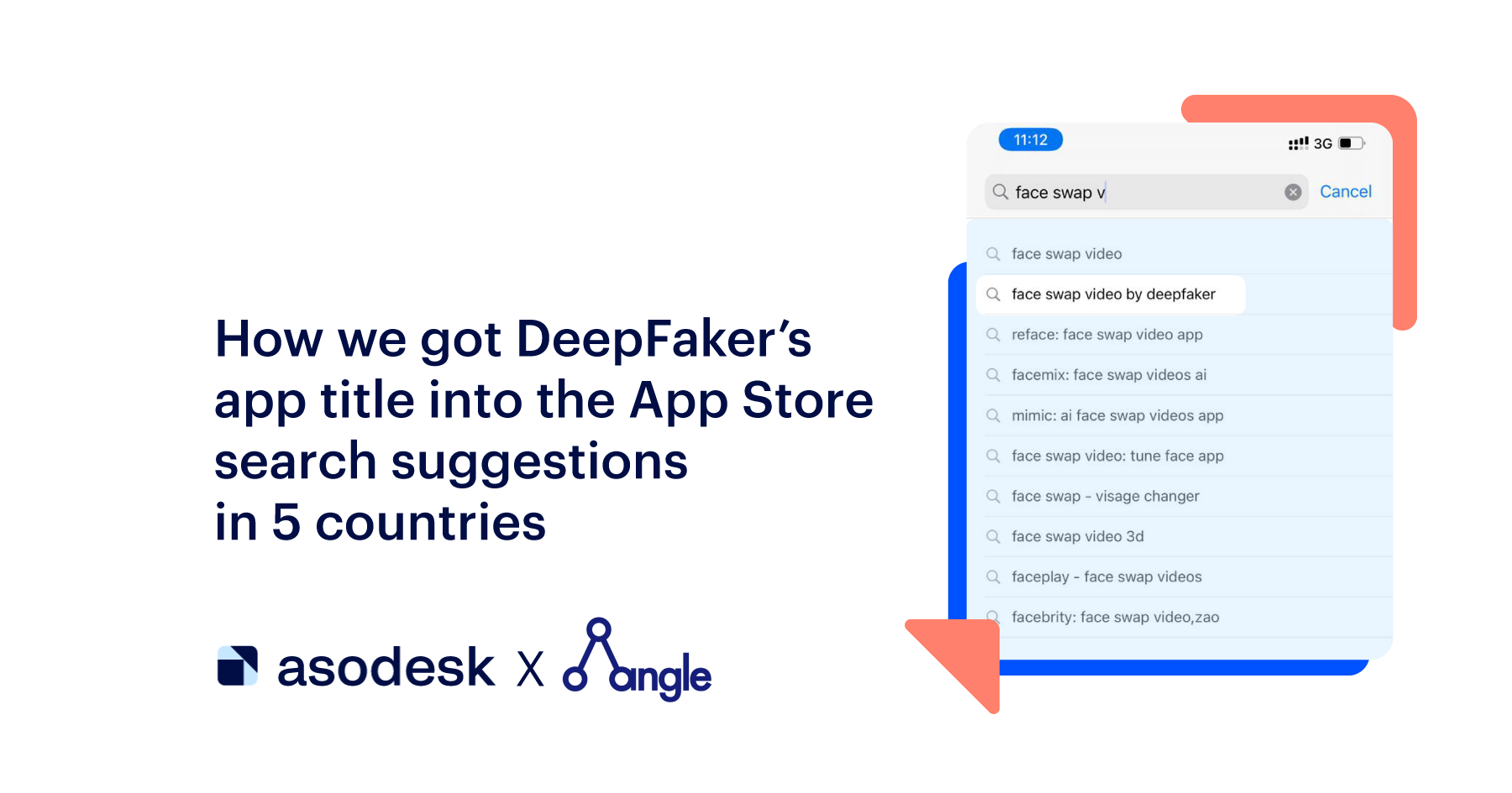
How Icon, Screenshots, and Title Update Boosted the App’s Conversion by 32%
To motivate a user to download an app, it should grab their attention: an icon, screenshots, and a title, individually or together can accomplish this task. I saw it for myself: I fully changed the application metadata and increased all its indicators. I’d like to tell you how I got it.
I am Hanna Benkis, an ASO expert in RusDate and Founder in Know&Go. When my team designed an app, I didn’t pay proper attention to its style design. The stores contained ordinary screenshots taken on a smartphone. The icon was made by a designer at his discretion based on the title. I also failed in brand naming. When I gained ASO experience I had to repair everything.
I use ASOdesk for analytics because it has all the tools for successfully working with ASO. They are convenient, easy to use and allow for saving time on manual data collection.
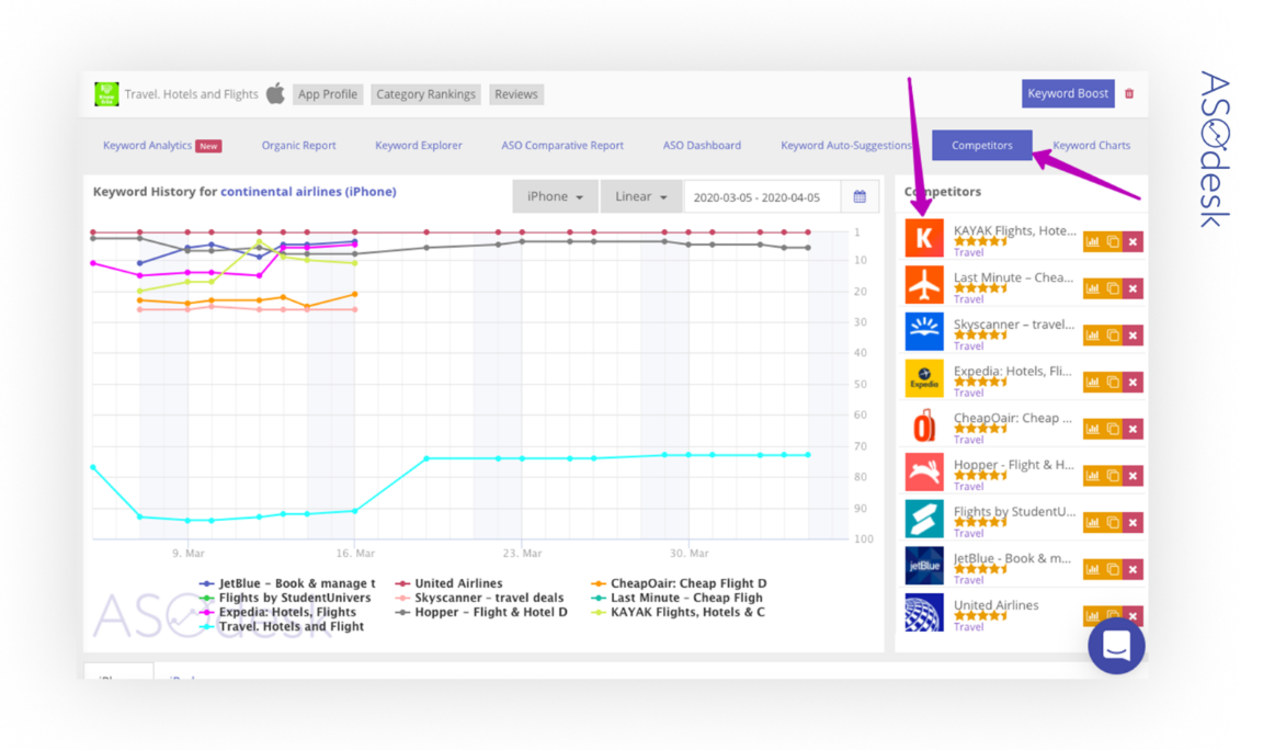
The ASO Comparative Report tab helped me in metadata analyzing. Here you can find data about all changes in the app and the way these changes affected positions on the key queries.
It stores all the metadata of your app and your competitors’ ones as well: icon, screenshots, title, subtitle, descriptions, short descriptions, and information about in-app purchases for any period (since the app started its tracking in the system). It is very convenient to monitor how metadata changes affect search results. Below we created a release and analyzed it a bit later.
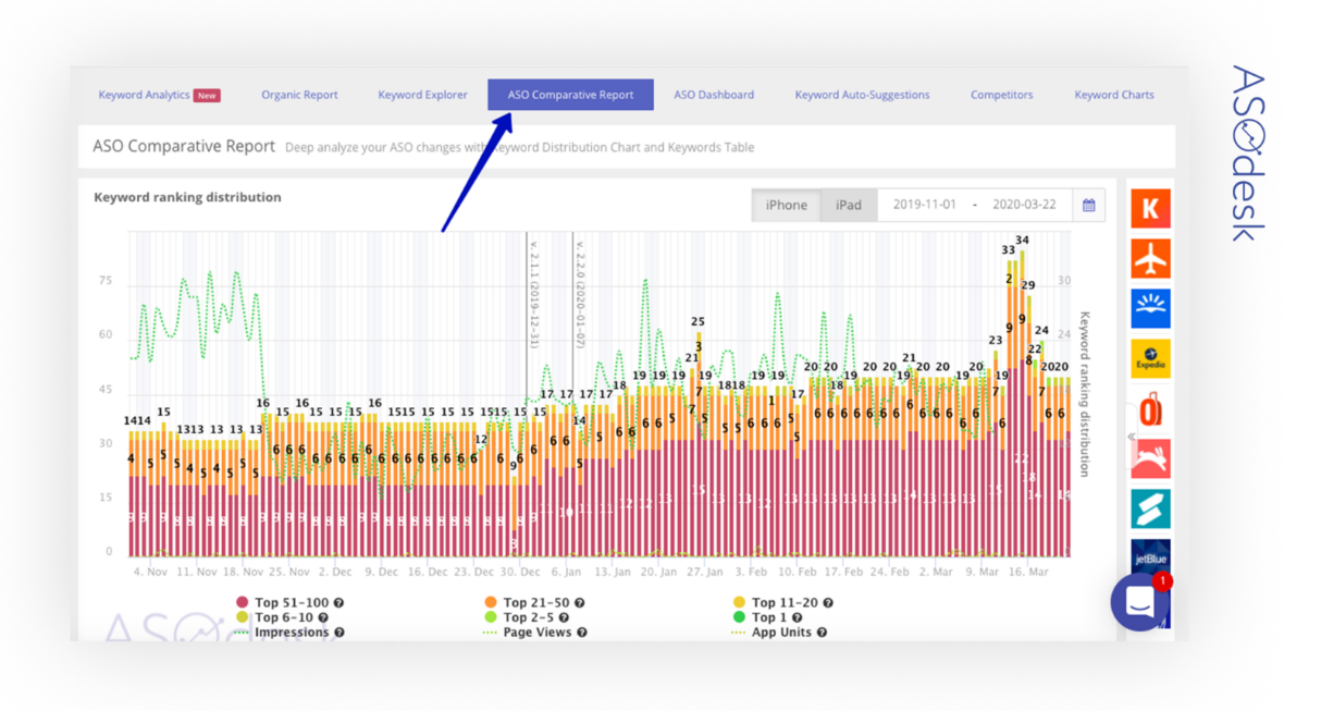
Now I’ll tell you what you can get out of the ASO Comparative Report and how it benefited me.
In the early days
Former title
This is the former title of the app: BenkisTrip. Hotels, Flights
The title BenkisTrip is too long and complicated, and I am not a Kardashian who names the product by my surname. Correspondingly, it occupies too much useful space.
We add competitors to the Competitors tab and learn what titles they have in the ASO Comparative Report tab.
The titles of competitors:
- KAYAK Flights, Hotels & Cars
- Skyscanner – travel deals
- Last Minute – Cheap Flights
- Expedia: Hotels, Flights & Car
- CheapOair: Cheap Flight Deals
- Hopper – Flight & Hotel Deals
- JetBlue – Book & manage trips
All use flights in their title, this is the most popular and traffic word. Consequently, it has fierce competition.
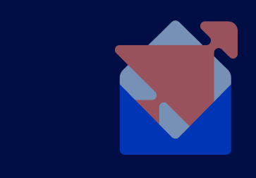
Former icon
When we had just developed the app, I didn’t know all ins and outs of icon design. I just gave the designer a task to come up with something. She came up with such an icon based on the app’s title:
There were no other options or ideas, so we decided to use it. As you can see, the icon leaves much to be desired.
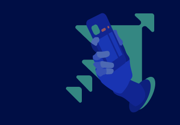
Former screenshots
I pulled my previous screenshots out of the ASO Comparative Report tab in ASOdesk, having set a date before release with new screenshots.

These are just screenshots taken with a smartphone. All pages display what is actually in the app. On the one hand, it acquaints a user with the app’s content after download, on the other hand, it is boring and stuffy.
Improvement steps
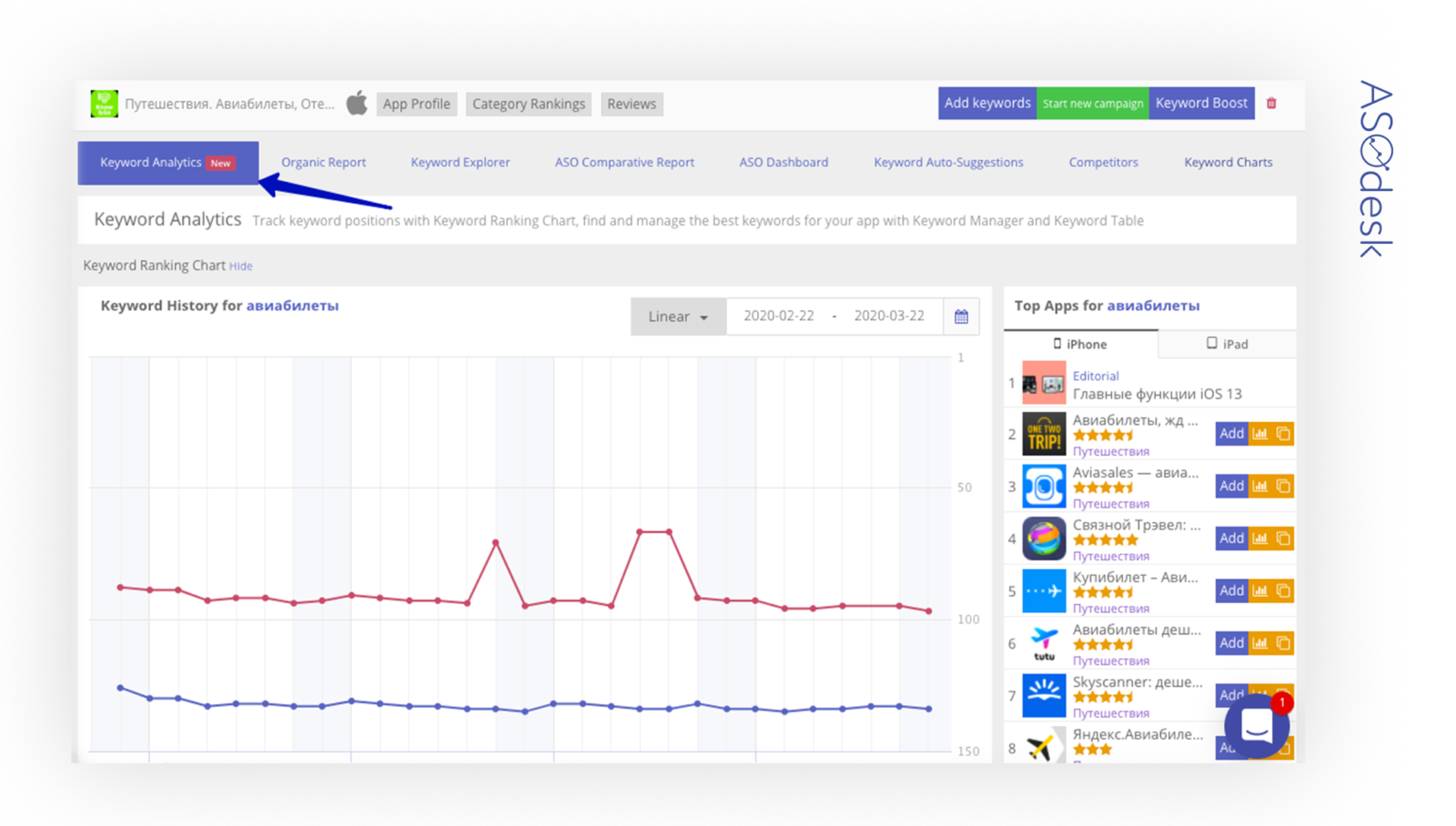
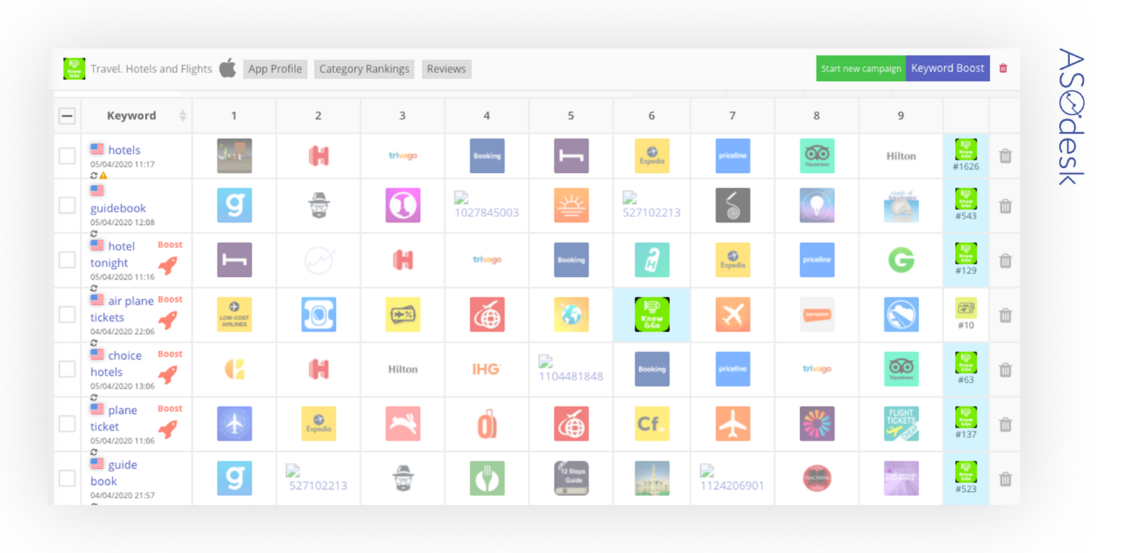
I will show you how to improve the icon, title, and screenshots. To research and generate new ideas, I started searching for competitors’ applications through the semantic core, as we search for keywords we can also find competitors’ applications. It can be done with Keyword Analytics in ASOdesk.
Having collected the keywords, I found the main competitors and all their metadata including icons, screenshots, and titles.
This is the Keyword Analytics tab to collect a semantic core, make keywords analysis, and analysis of competitors in ASOdesk:
Add relevant keywords:
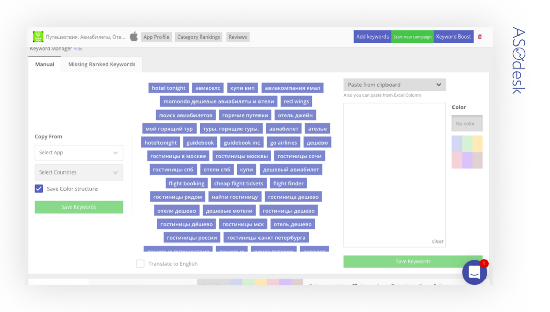
When clicking the selected keyword, you get a list of competitors. Add them to the Competitors tab.
All the data collected on competitors was placed in separate presentation documents.
Let’s look through the improvement process of the app’s metadata.
Search for a new title
With the help of ASOdesk tools, I sorted out relevant, popular, sometimes less popular but competitive keywords for different countries. More countries — more settings. I added Spain and France to this world-wide release. There are many languages in ASOdesk. Subsequently there are many keywords in all countries that can be used in your metadata.
Releases for America and Great Britain were done, so this time I decided to add 2 popular countries on the Eurasia continent since it has a large population and many people who like traveling.
First, I collected the semantic core, then combined the appropriate titles. This should correspond to the app idea, and competitors’ titles can’t be used (titles can be inserted only in the App Store in the Keyword Field).
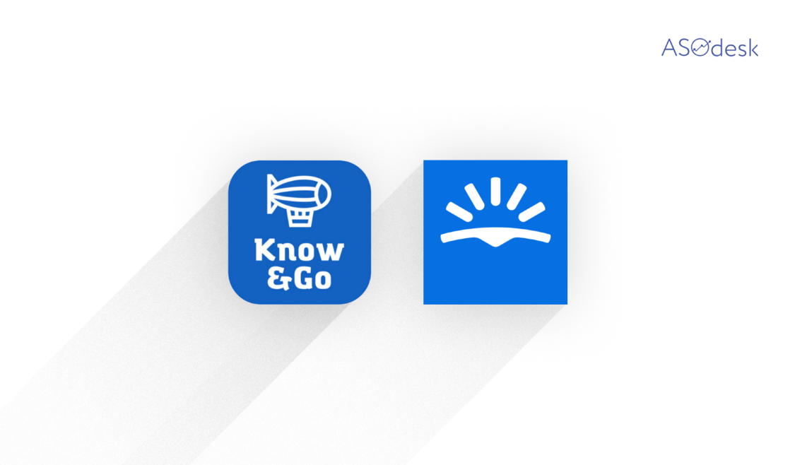
Next I had to rebrand. As I provide not only tickets and hotels search but also information on countries, I decided to come up with something that encompasses this idea. Among all the options I have chosen Know&Go.
Some of the other contenders were Trip&Go, Travel&Know, Go&Know, Trip&Know. But Know&Go caught my eye, as first we learn about a country, prices of flights and hotels, and only afterward do we go traveling.
It was decided to place the title on the icon instead of the very title as is saves space in a title field which can be used for extra keywords. After all my investigations I came up to the following titles:
- USA: Travel. Hotels and Flights
- RU: Путешествия. Авиабилеты, Отели
- UK: Travel. Finder Avia and Hotel
- FR: Voyage. Vol, Hôtel et Guide
- ES: Viaje. Vuelos, Hoteles Baratos
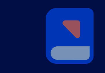
New icon design
After competitors’ analysis, I chose the 10 most interesting icons to me. It is essential to add these icons to your presentation so you can see all your competitors on one page. It is very convenient: everything is clearly visible, and similar elements can be easily found and help to come up with the issue. Apps’ icons of other themes should also be reviewed.
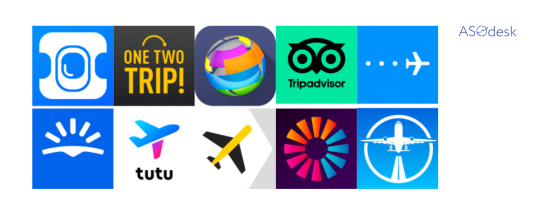
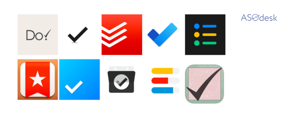
Icons can be copied directly from the Competitors tab:
While writing this article, I came up with another way to work with icons.
There is a Keyword Charts tab. It contains the entire list of applications with regards to the added keywords. The Competitors tab contains only competitor apps you added yourself.
So it can be generally seen what are the rest of the icons.
Let’s turn to our icons. Examples of applications in various domains show that all the themes have similar elements. They are tried to be pursued but do something different without leaving the frames as it is tested and works.
Learn competitors’ ideas, arrange a brainstorming session, and develop your own idea, which does not have to differ much. Sometimes a new concept in a certain category can make things worse, and sometimes it can succeed.
In my case, all competitors have planes on their icons. First, my attention was caught by TripAdvisor’s concept, but I decided to take a risk and find a new idea to stand out a bit. So I recalled about my lovely airship.
The icon color was chosen on the same principle. All competitors have navy and blue icons. Initially, our designer also suggested a blue color, but to my mind it was too similar to a well-known competitor.
It was decided to go with another color. Two colors were considered:
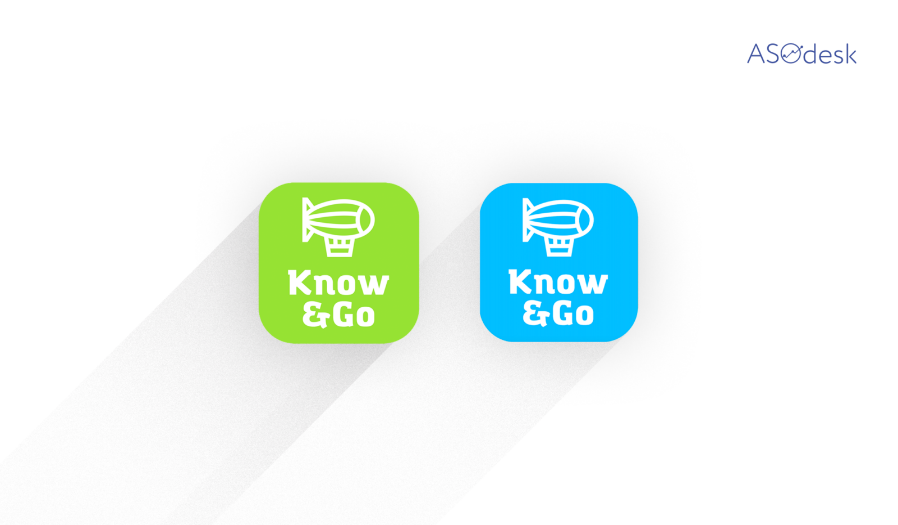
I decided to take a chance and chose a light green.
Preparation of new screenshots
I made a document with screenshots of competitors and put it together in a presentation.
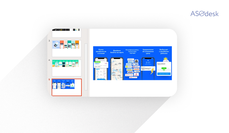
Wrote in pros and cons, found common features. Took pros, added my own creative approach and wrote the technical specification for the designer.
In my experiment I decided to choose everything bright.
What was achieved
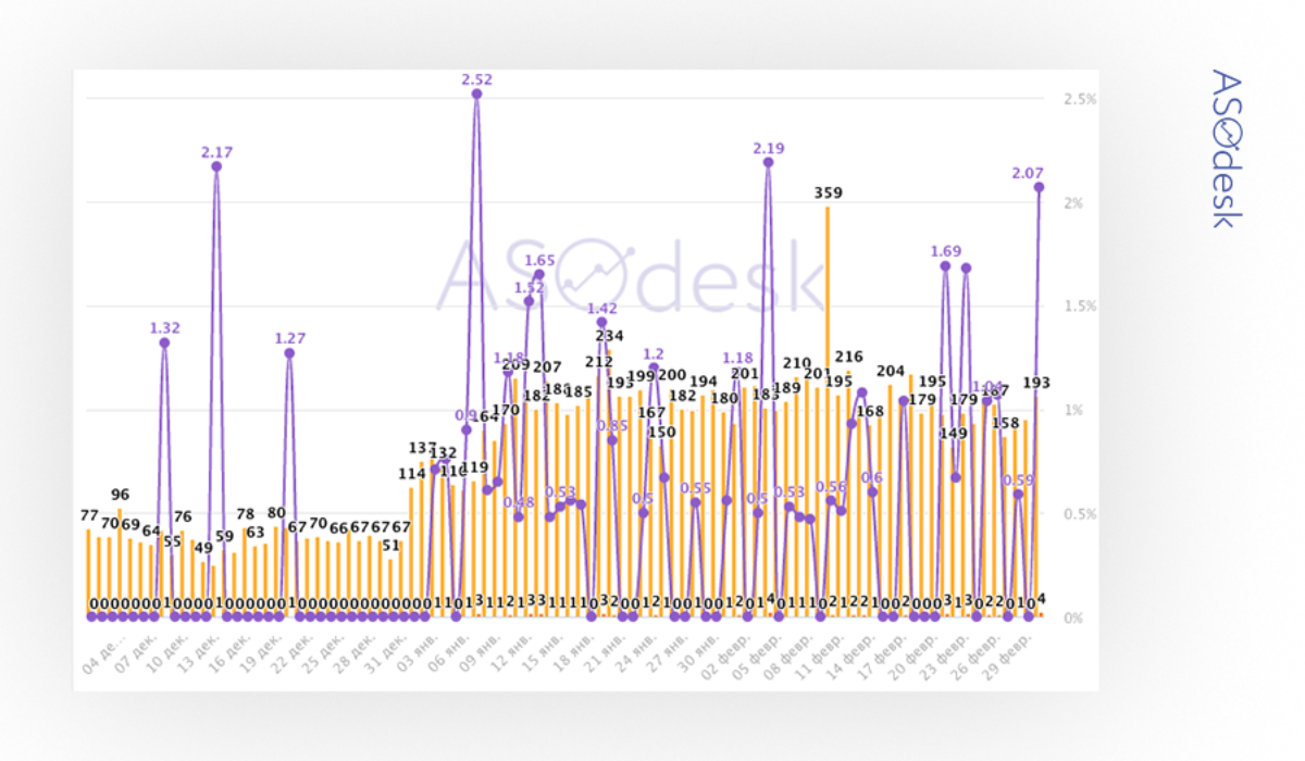
We altered the title, icon, and screenshots, made an app localization for two new countries, and released the update on December 31, 2019. It’s time to reap the rewards, and a new ASO Dashboard from ASOdesk helped me. I integrated it with iTunes Connect and now I can review the results of the work:
The changes affected all metrics of my Know&Go app. On the chart from December to January we can see a 25% increase in the number of interactions (Impressions), 9.3% increase in new downloads (App Units), and 32.3% conversion growth (CVR).
Now I appreciate the role of metadata and analytics. Therefore, I recommend to seriously consider ASO, as it is the cheapest way to promote an app that can bring you real users.