Rebranded Asodesk: introducing our new corporate identity
For the first time in five years, Asodesk has renewed its corporate identity. Read this article to find out how we came to this, why we did it, and how it turned out.
Why did we rebrand?
Over the past five years, the company has not undergone a constructive rebranding, and the logo has not changed since Asodesk was established. At the time, we had not yet thought about positioning and scaling a business. We took the first option we liked, and our corporate colors, font, and graphics were established on this foundation.
Over time, we realized that the logo does not reflect our positioning and goals. Initially, Asodesk was primarily a set of tools for working with ASO; now it is a whole ecosystem for promoting mobile businesses. It also includes tools and data for marketing, working with product and app reviews, as well as training and agency services.
We decided that it was time to visually reflect who we are now and create a more reflective image of the market driver: our team who is passionate about our work and strives to help with the challenges of promoting mobile businesses. So, for the company’s 5th birthday, we decided to rebrand!
Together with our partners from Shishki, we have identified key ideas that we want to reflect. The Shishki team created a design concept for us, which they have already partially implemented on the site. Gradually, the new style will completely replace the old — and we’re sure you will get used to it soon. But for now, here’s a brief overview.
What’s changed?
Our main goal is to help mobile businesses grow with tools, data, training, and services. Therefore, the idea of scaling applications was used as a point of departure.
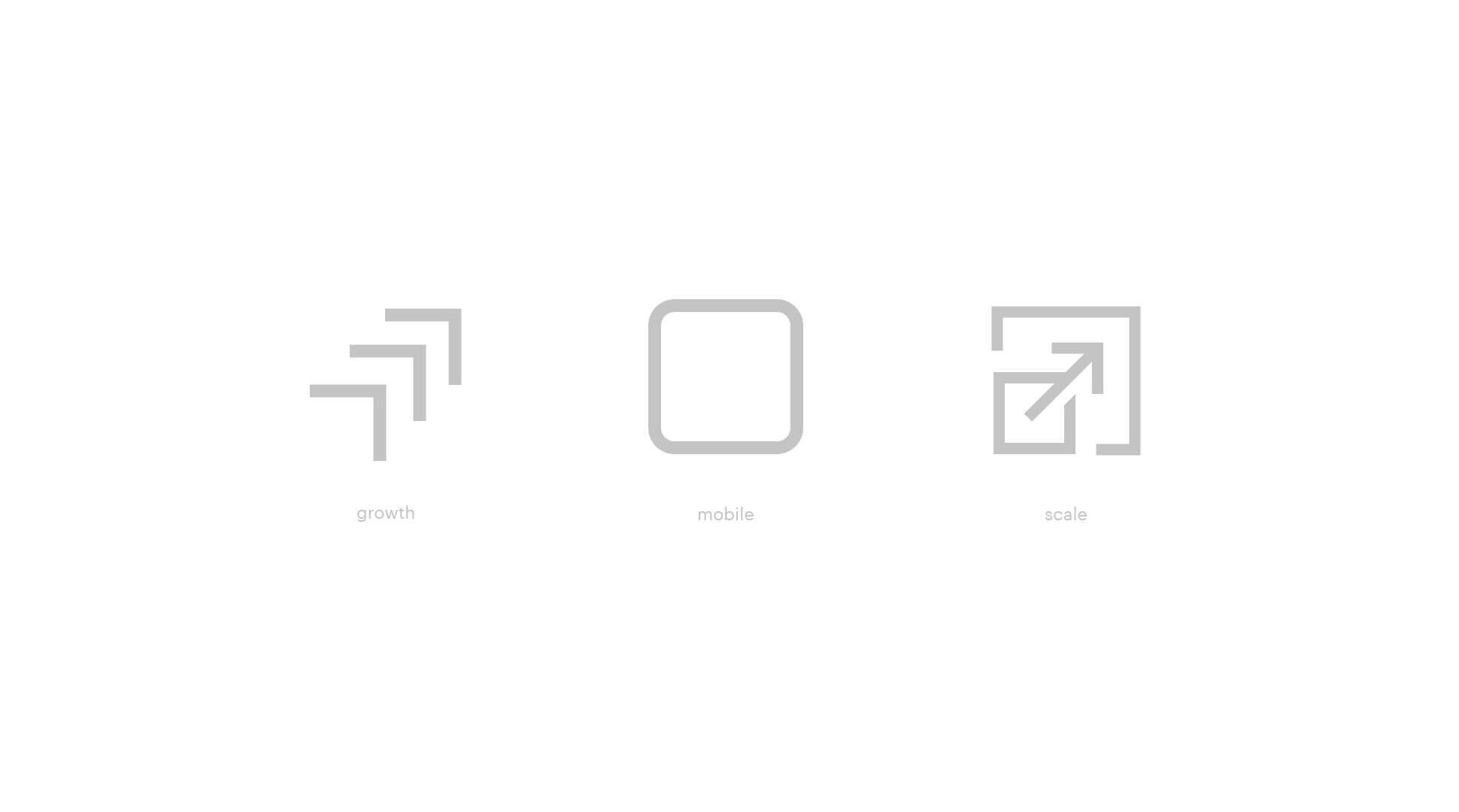
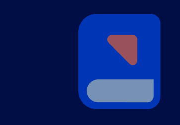
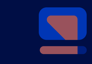
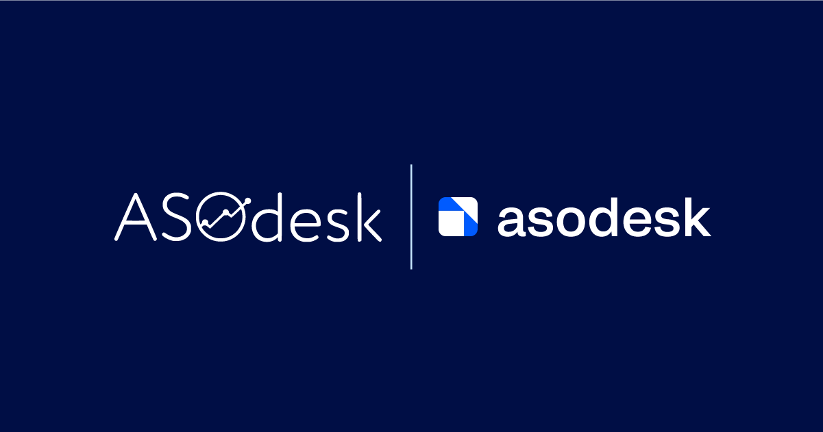
The new logo shows the app’s icon silhouette and an arrow that signifies growth.
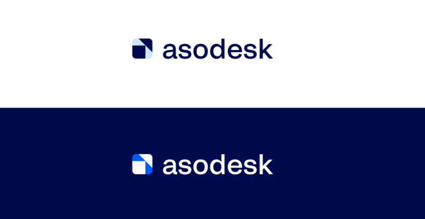
We wanted to show that Asodesk is not only ASO tools, so we have left out the abbreviation from the company’s name.
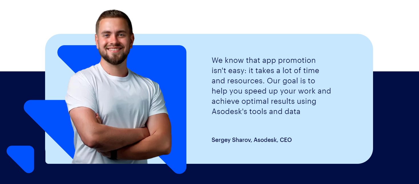
Something we wanted to keep unchanged was the color blue, as this is our CEO Sergei Sharov’s favorite color. Therefore, dark blue formed the basis of our brand identity’s aesthetics. Bright, modern shades of electric blue and coral were chosen as accent colors.

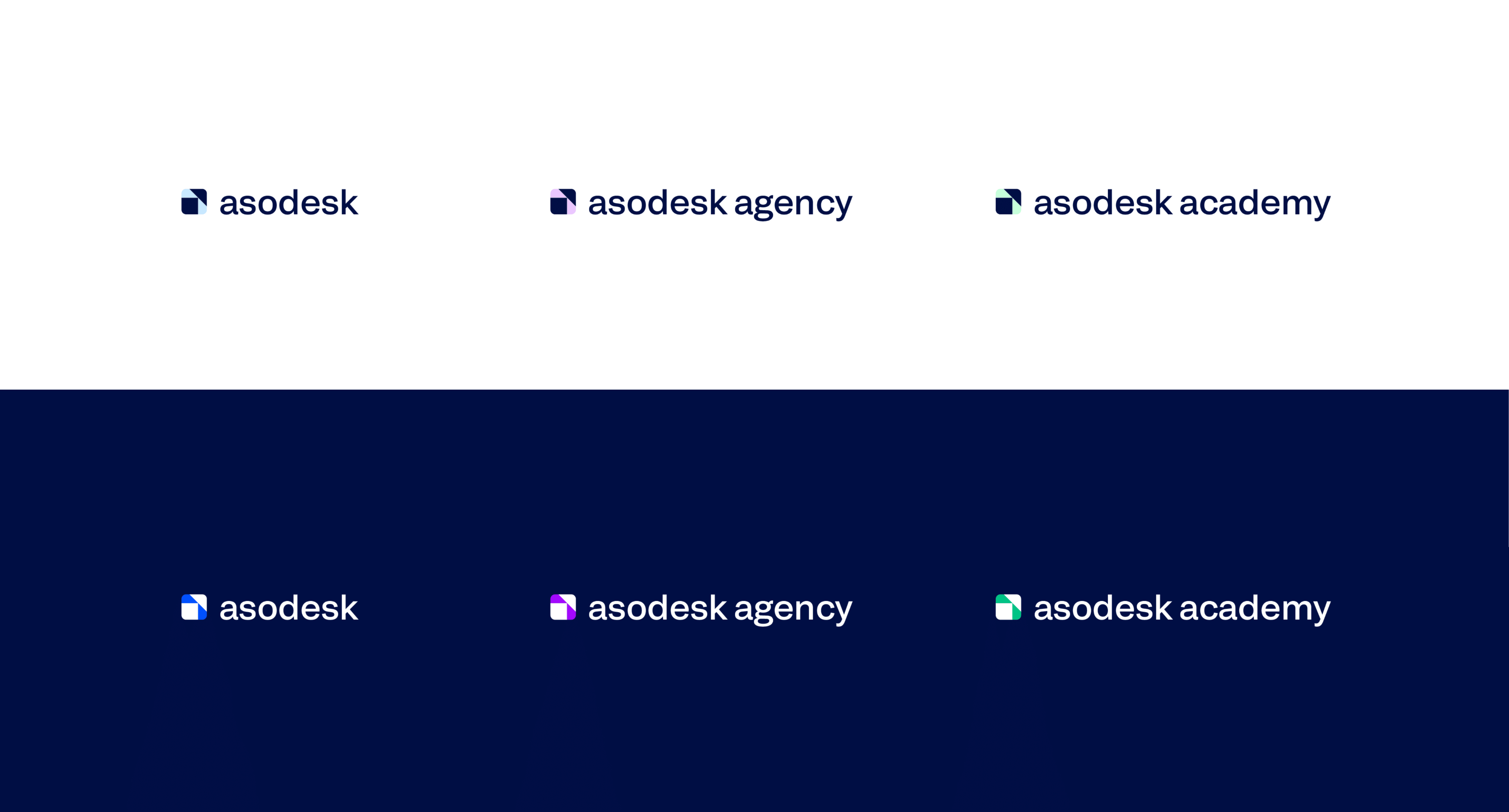
It was important for us to separate the agency and the academy from the main platform, since their audience, goals, and promotion methods may differ. Each unit now has its own logo and unique color (purple for the agency, green for the academy).
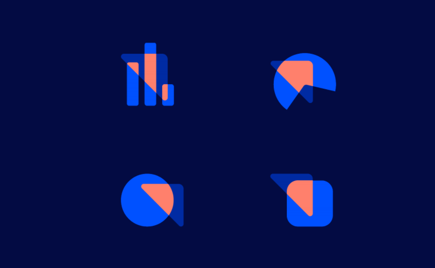
One of the strengths of Asodesk is our data, so the main elements of the style are graphs, pie charts, and diagrams, which you can always see within the system. For the corporate elements, our designers used the idea of a “lens” (coral), through which we’re looking at the data in Asodesk (blue). The data, in turn, shows steady growth.
We also wanted to emphasize that one of our main values is people, as they are behind everything we do and behind our clients’ businesses. One of our best attributes is that we always do our best to communicate and solve our clients’ problems, and not just provide impersonal tools. Therefore, it was important for us to show who is behind Asodesk. You can get to know the team in the “About Asodesk” section.
What’s next?
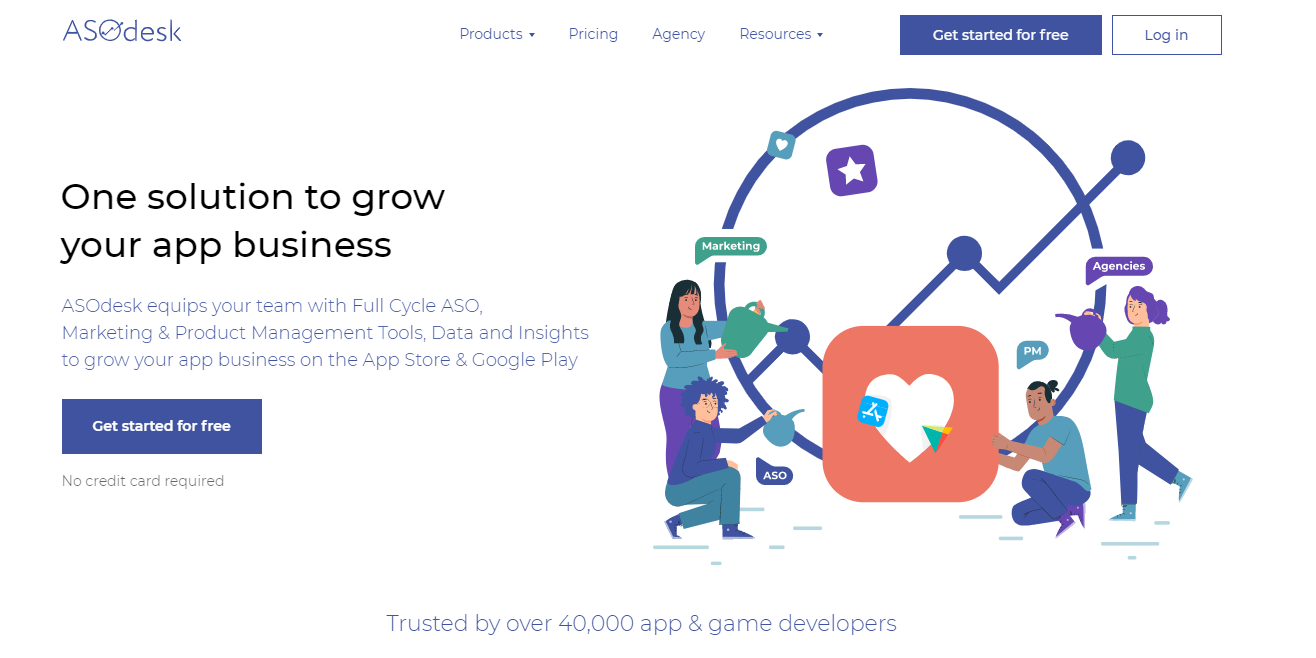
We’ve already updated a significant part of the site: the home page, almost all product pages, the pricing page, and the “About Asodesk” page. We work iteratively, gradually updating all the pages and other media. The system will also look different inside — more up-to-date and user-friendly.
Since the company turns five years old this month, we were in a hurry to show our new look. By the way, check out our birthday special — we’re giving away 5 cool gifts for app growth. 🤩
If you have any questions or suggestions, we are always open to them — just write to bs@asodesk.com