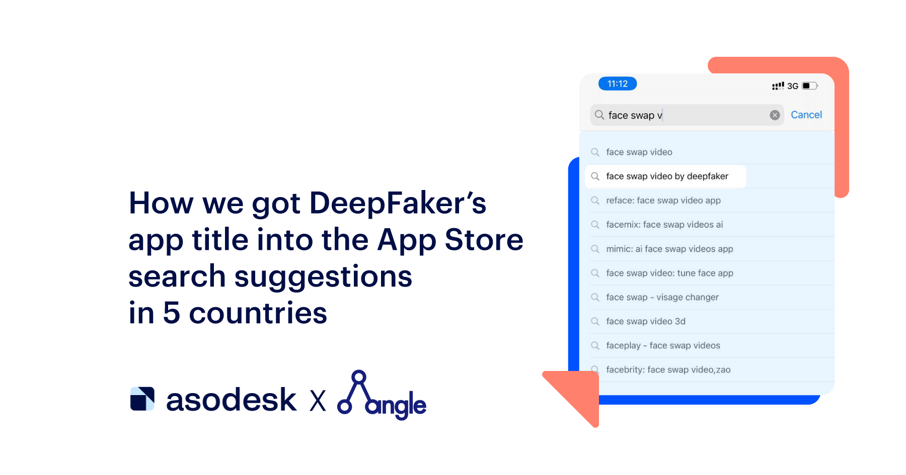
From “angry guy yelling” to game graphics: A/B testing of the Towerlands app icon
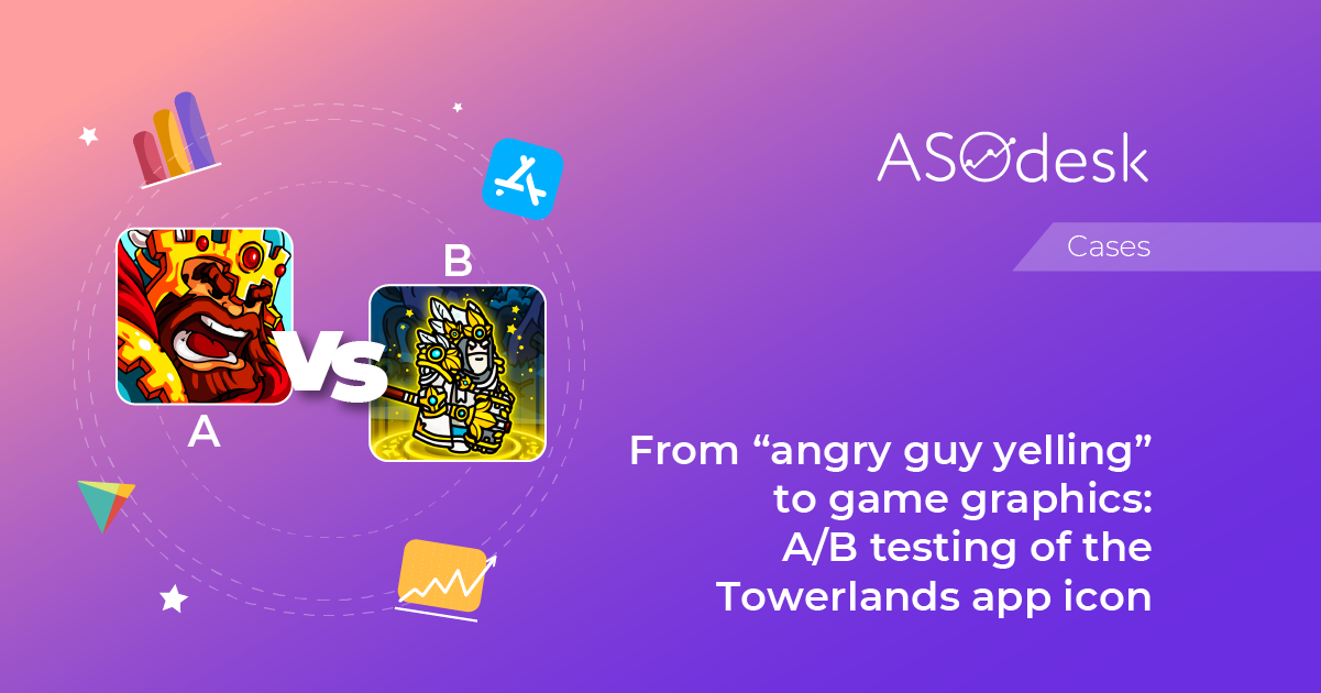
In this article, I will tell you how to conduct A/B tests of the gaming app icon. I’ll share my insights and show you which icon options worked best and worst for Towerlands.
My name is Konstantin Shabanov and I am Head of Marketing of the Black Bears team. I manage the process of User Acquisition and ASO. Our team has been developing games for 9 years and more than 10 million users have already played our games.
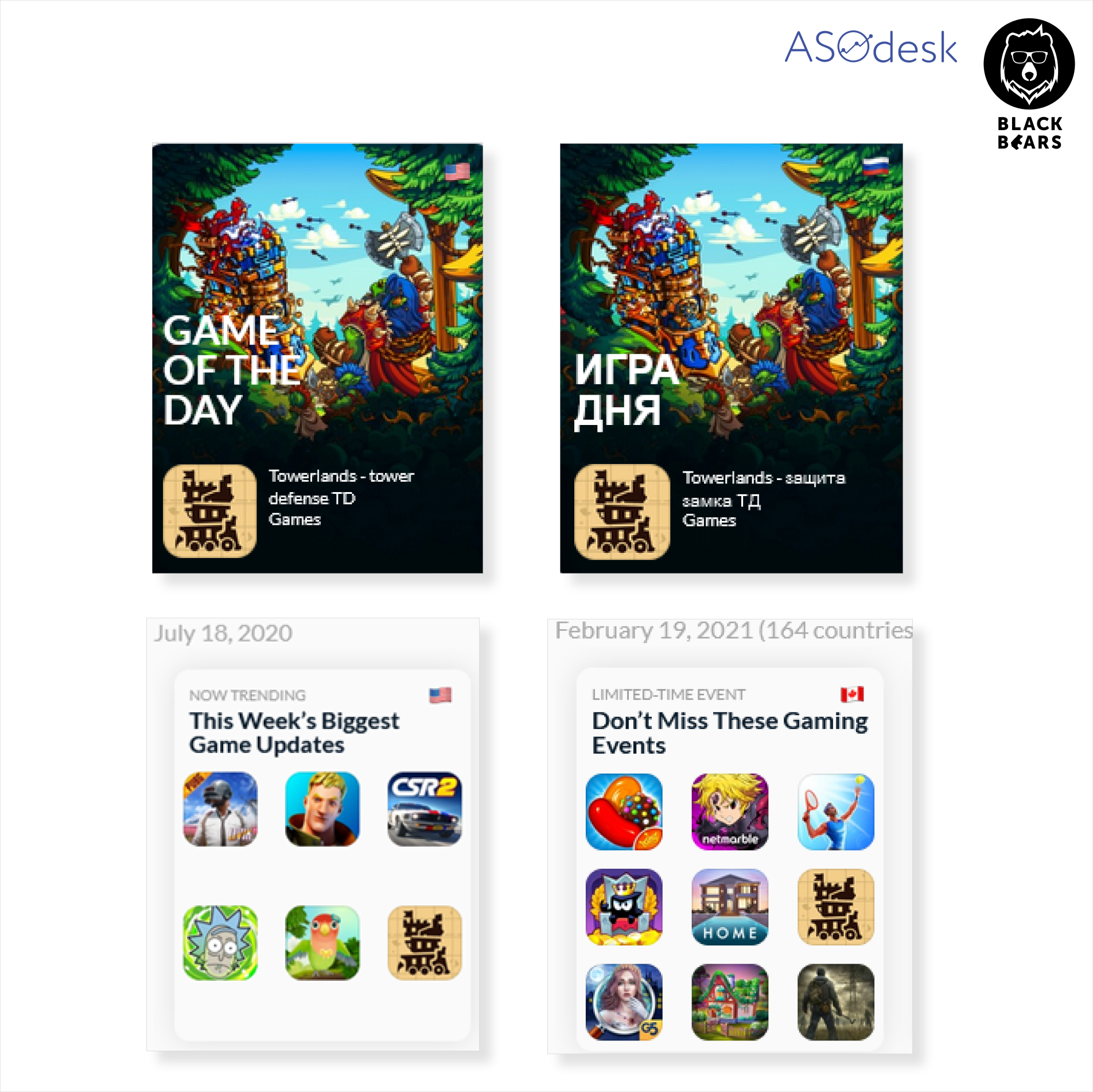
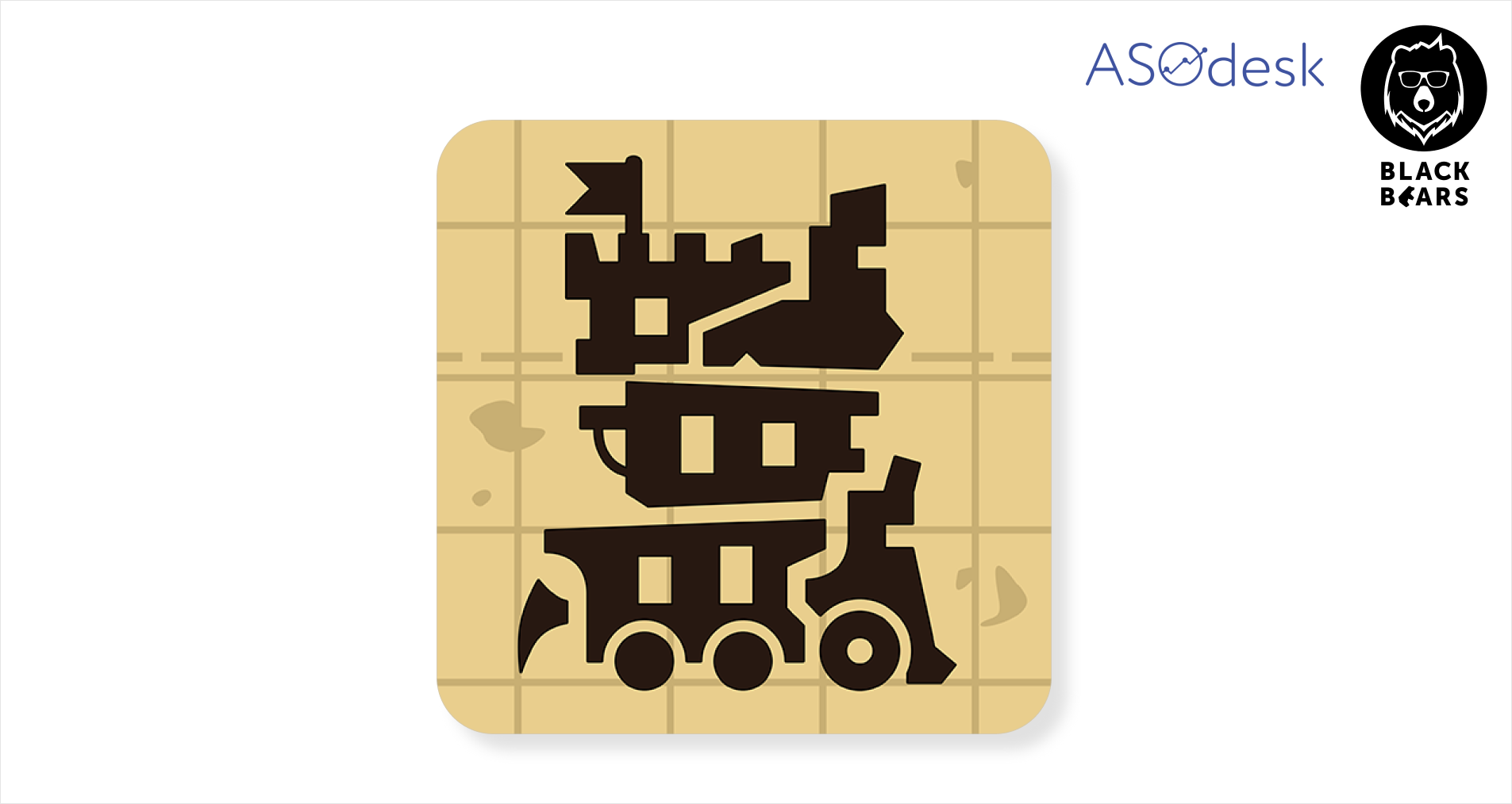
Towerlands is a game about castle defense. This flagship appeared on the App Store and Google Play in 2020 and is often featured in various countries. Towerlands is between a casual and mid-core game type. The goal of the game is to defend the castle from waves of enemies using a battle tower.
A/B testing of the app icons during the soft launch
In order to choose the most effective icon that will help increase the conversion rate to install, we decided to conduct A/B testing. Developers always start with a soft launch i.e. launching the app in a limited number of countries, where the user behavior is similar to the target markets. First, we launched the game in Canada, Australia, Indonesia, and the Philippines.
The icons were tested on the Android platform using Google internal experiments and were evaluated on the same basis. We only took icons that showed an unambiguous result if Google gave the green zone. For example, if the conversion increased by 28%.
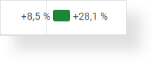
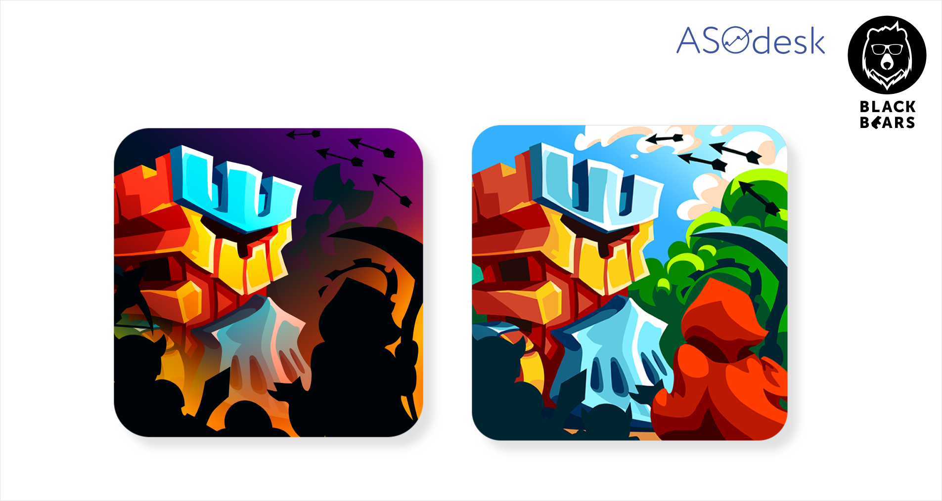
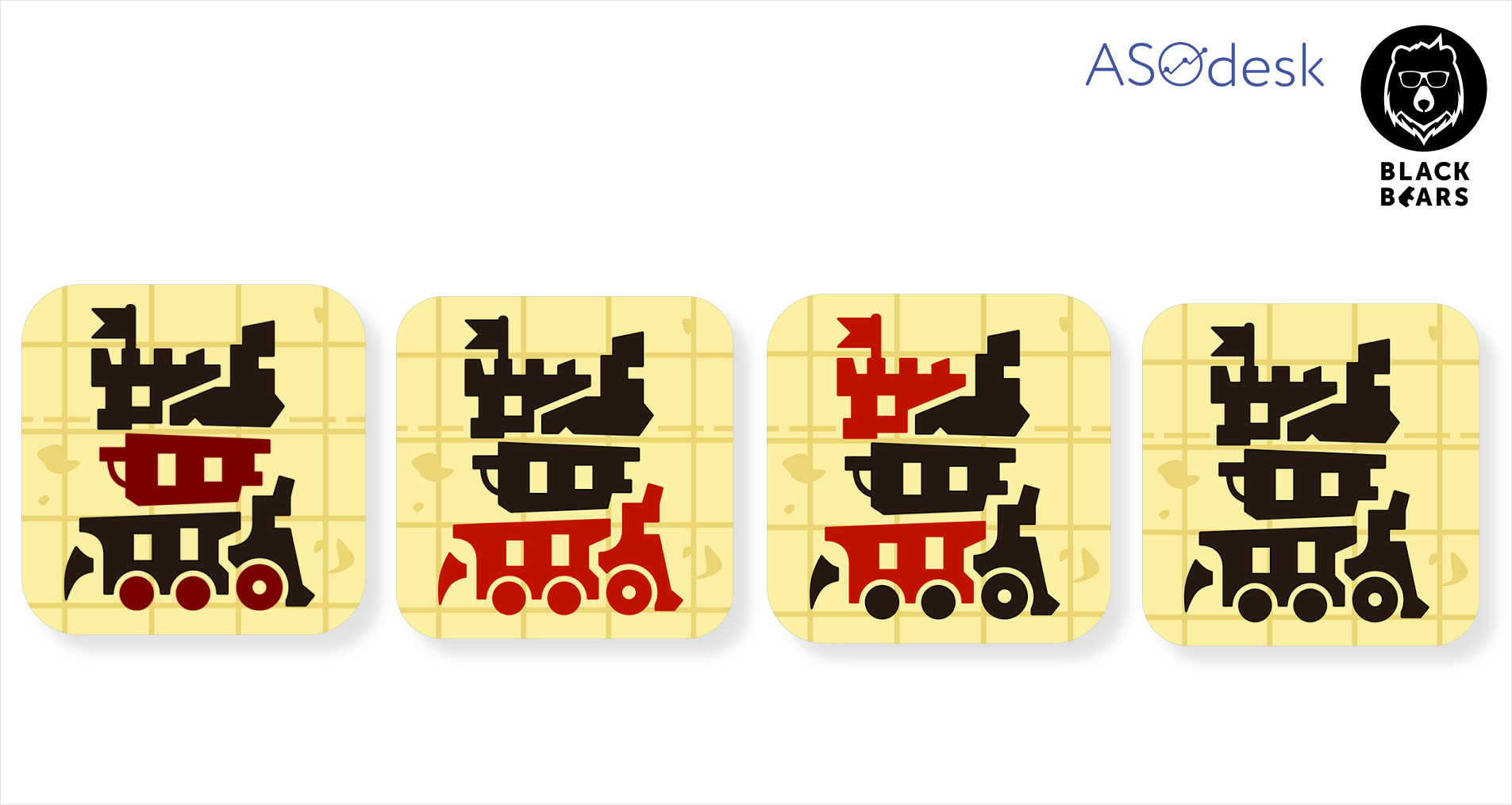
We launched the test for all countries that were available at the soft launch. We also had several ready-made icons with different concepts. The experiment involved four icons. Two of them show 2D and 3D versions of the battle tower from the game.
In one of the options, we took a well-known “yelling guy” icon concept that was popular amongst the competitors such as Clash of Clans, Game of War, and other similar games.

We made the last icon based on the results of the competitive analysis; many competitors depicted characters defending the tower and we did the same. Eventually, this icon won the test.
It was much more effective than the original 3D image of the tower. We realized that competitors were not using this concept by chance.
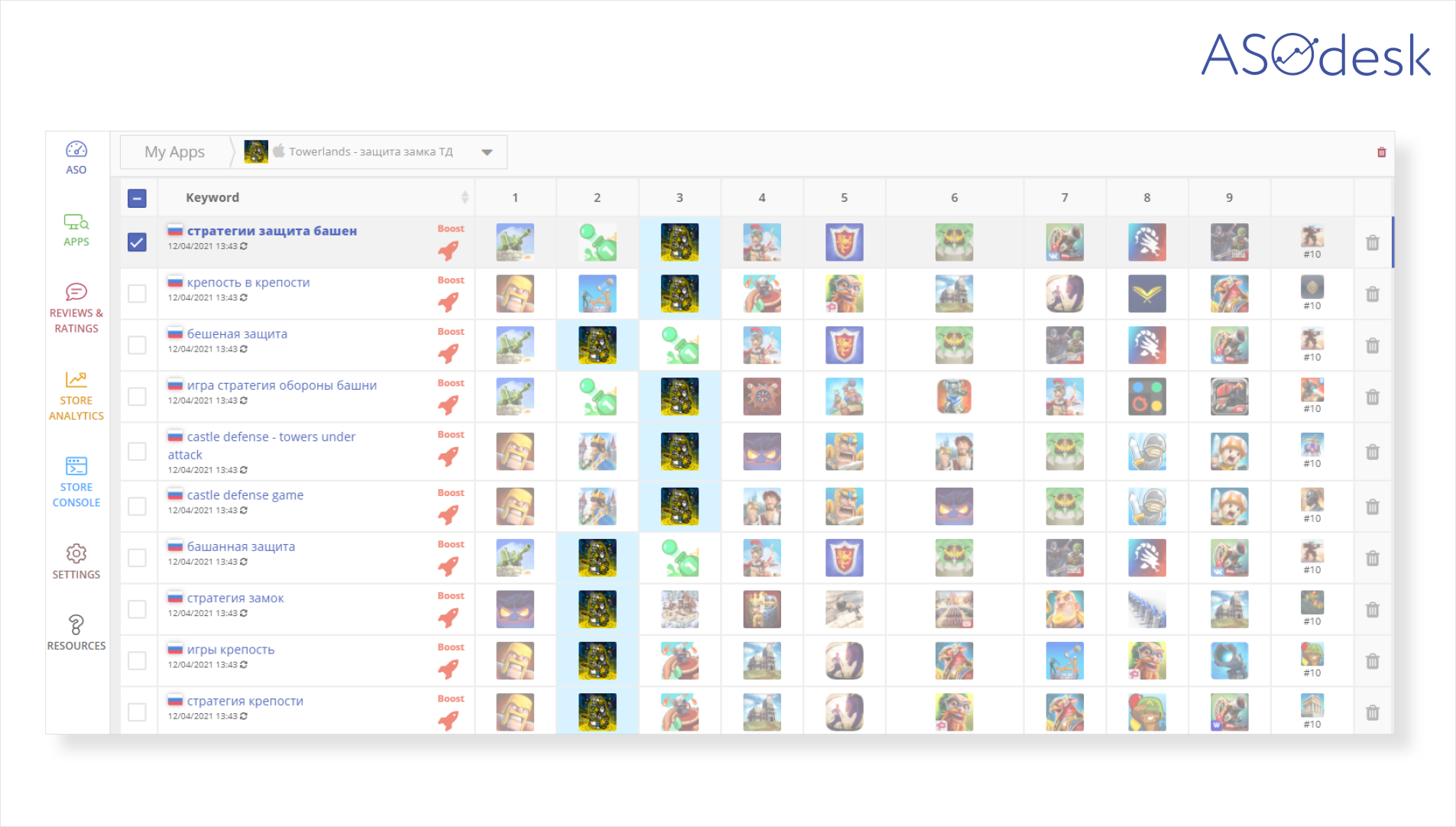
Keyword Chart in ASOdesk will help you to analyze competitors’ icons quickly. In the table, you can see the icons of applications that are at the top of the App Store or Google Play search results for your keywords. This allows you to see the general trends in the design of competitors’ icons.
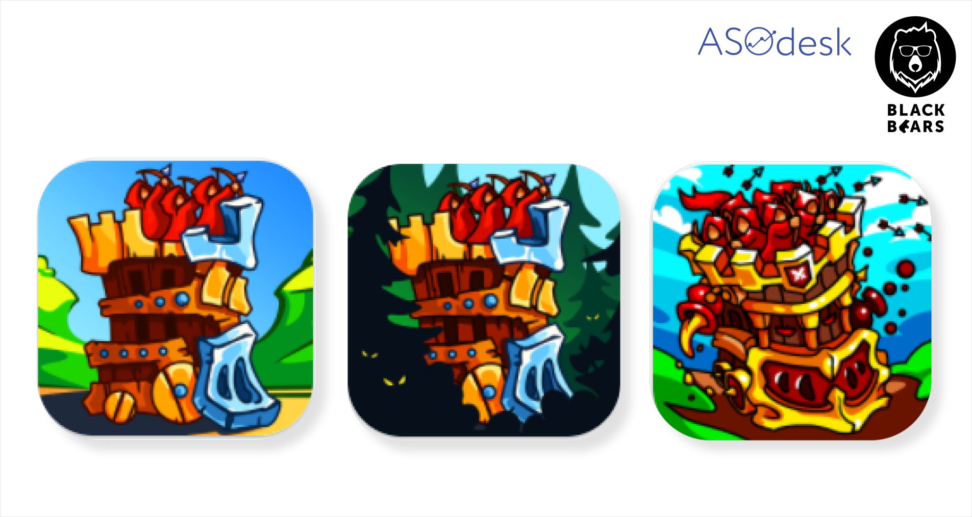
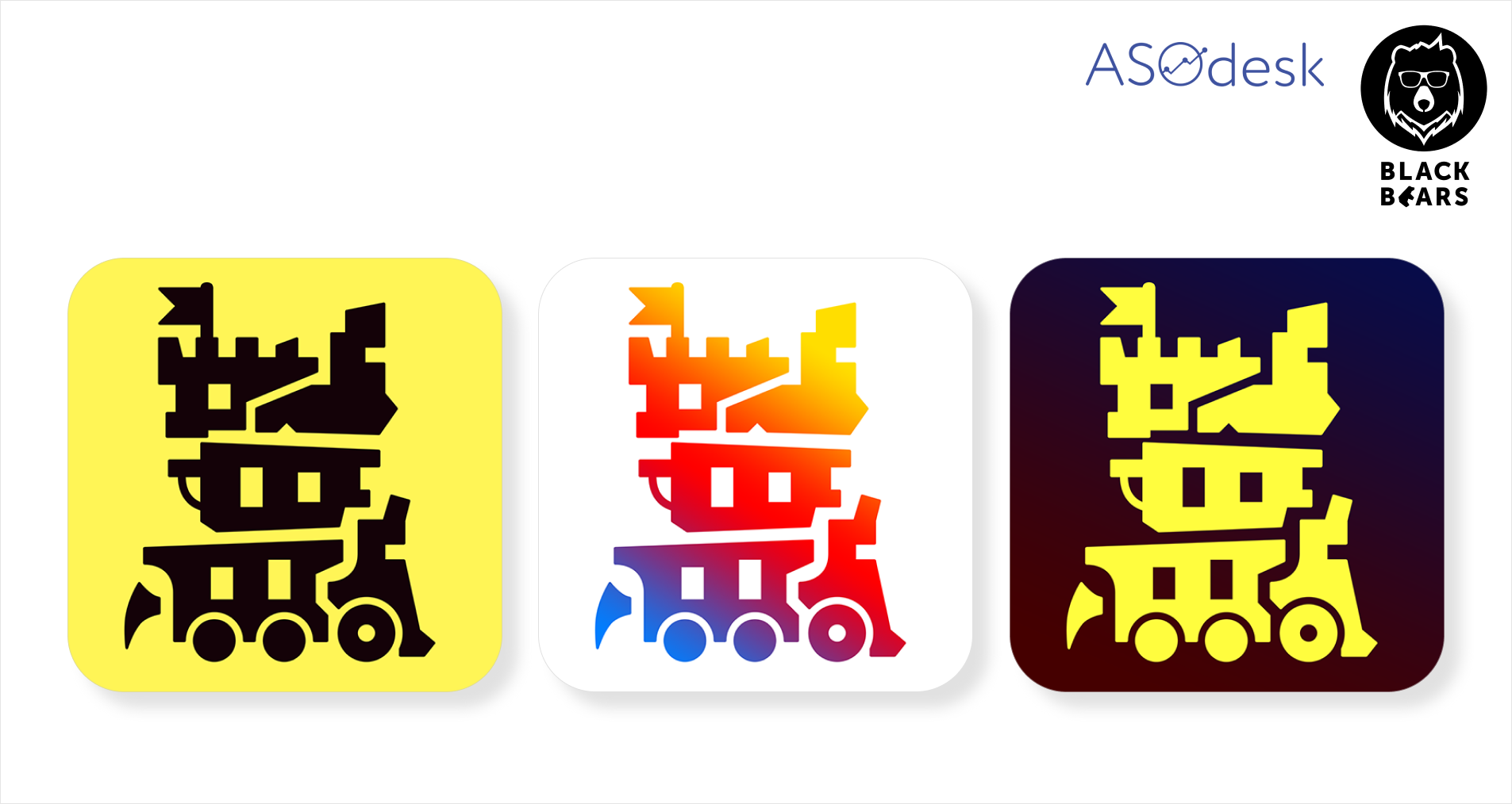
We decided to continue testing to find a more effective option. We added a character to the original icon and made options in day and night light.
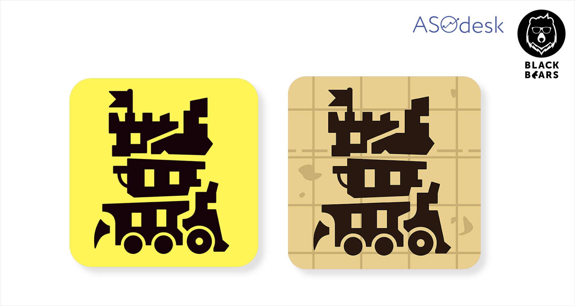
We also tried a flat design. The color of this icon significantly differed from the others while the contrast image should have attracted more attention. In the end, this icon won.

Next, we tried to adapt the icons used earlier to a slightly different style.
We also changed the options that showed good performance in the A/B tests.
None of the ideas gave an unambiguous result, so we decided to stick with the previous icon and test different options in specific countries after the soft launch. At this stage, we found an icon that gave a good result in all countries included in the soft launch.
A/B testing of app icons in the USA
After the global launch, we started testing icons in different countries. In this case, I will tell you about the country with the most interesting A/B testing result — the USA. We started by changing the color scheme for the current icon.
The first icon won the tests. We decided to compare its results with another option. Contrary to expectations, this icon lost and showed an unsatisfactory result.
Then we ran a B/A test and compared the two winning icons. As a result, the old icon on the right won by a large margin.
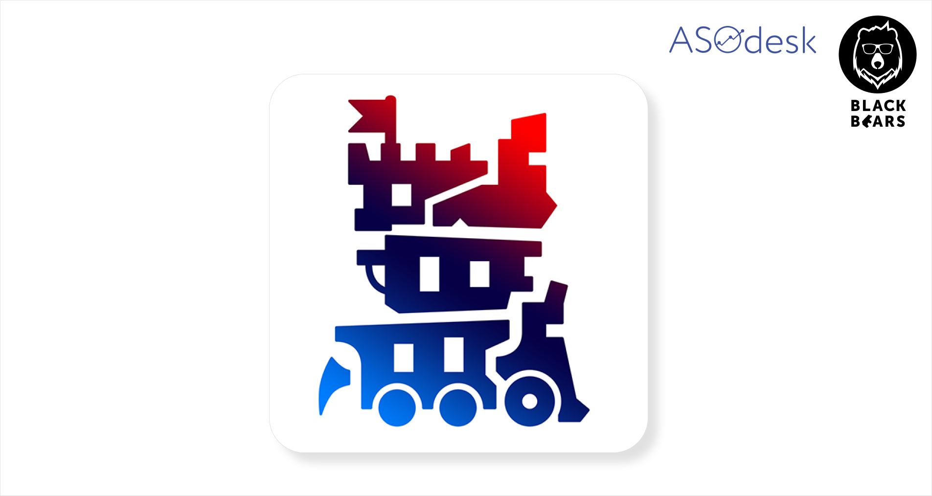
We tried to play around with the brightness and made several versions of icons with red elements. As a result, a brighter, but monochrome version of the original icon (number 4) won.
We also tried changing the background and image colors. The color blue was an unexpected discovery. It turns out that you can increase conversion rate simply by making the image brighter. The icon won in tests and received a significantly higher conversion rate. We left this icon on the game page in Google Play for a while.

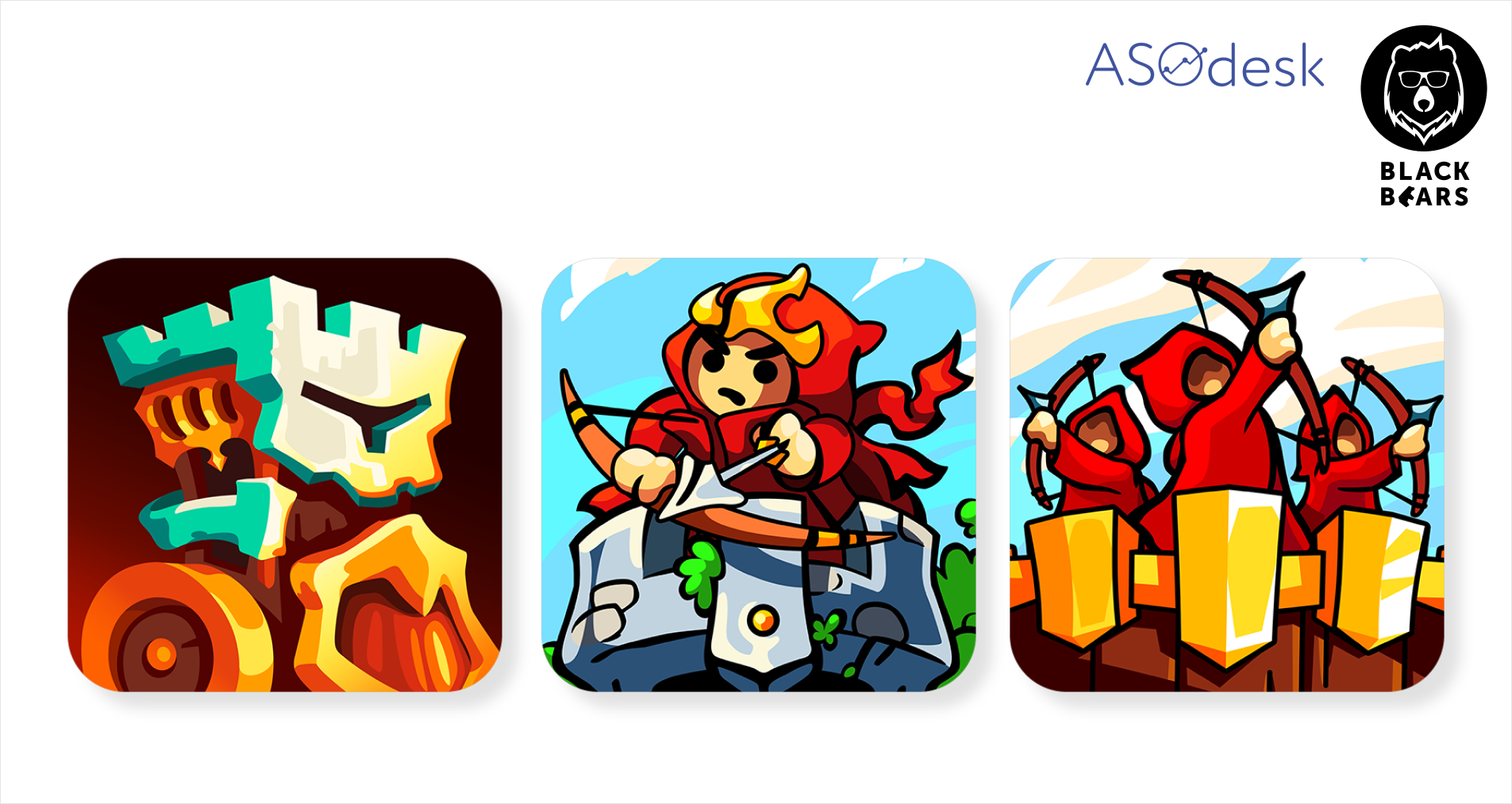
It is important to repeat experiments and try new options, so after a while, we decided to try adding game characters to the icon. During the soft launch, we already tested an icon with a “yelling guy” that was drawn based on one of the characters in the game. However, this idea did not bring success and we decided to try out other characters from the game.
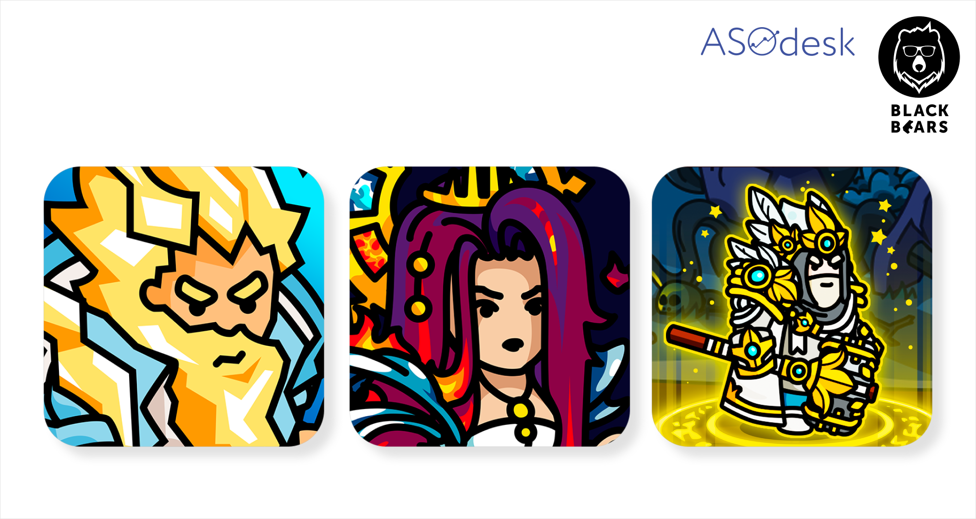
These icons have shown completely different results. Only the paladin on icon 3 had a positive result. The two other characters were less effective. At the moment we are using the bottom icon in the app stores.
7 insights on how to A/B test
1. Test different concepts. There are no clear rules for application page design, so you should always try to seek new solutions. Keep in mind that after a while, users can get tired of icons. Sometimes you can increase conversion simply by replacing the old icon with a new one.
2. Even the smallest change in color, brightness, or detail can lead to a significant increase or decrease in performance.
3. The behavior of users from different countries is unique, so test the icons separately for each country and do not mix them. The conversion rate of the same icon may differ even in culturally similar countries.
4. It’s always worth checking your tests with B/A testing. Determine which of the winning icons will give the best results. Use statistical significance calculators to avoid drawing the wrong conclusions.
5. Analyze your competitors and adapt their ideas for your application. Creative approaches that are common among competitors can work well for your app too. But it’s important for the image to correspond with your gameplay and stand out in the search results. You can read about this year’s trends in the visual optimization of games in this ASOdesk article.
6. Minimalistic icons often work well. Game users get tired of colorful icons in search results. Game developers rarely make icons with simple graphics and muted colors. Therefore, an icon with a flat image in contrasting colors can show surprisingly good results.
7. The “yelling guy” on the icon is not always the best choice. Popular creative approaches might not work well for you. Find a unique icon that will help increase your app conversion rate.