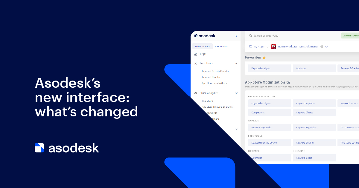
Asodesk’s new interface: what’s changed
We took the first step in comprehensive redesigning of the Asodesk interface, by completely changing the navigation bars in the user’s account — including the header and the menu. Now you can navigate the system faster. Let’s discuss each of our updates.
In June, Asodesk turned 5 years old, and for us, it was a month of changes. We have already conducted a rebranding and updated the site. However, we have not only changed the design but improved functionality. Read on to find out how we enhanced the UX for Asodesk users.
We met two main challenges
1. Scalability. Asodesk is growing and new features are emerging, so it is becoming more difficult for us to add tools while still keeping the navigation simple and easy to use. Therefore, we revised the UX to make the platform more accessible and flexible for all users.
2. Relevance. Let’s face it, Asodesk’s old design is outdated. Modern interfaces look different. We want you to like the product, so we do our best to make it not only more functional but also aesthetically pleasing.
So, it was time for a change. Below we’ll show in detail what we changed in the interface and how to work with it.
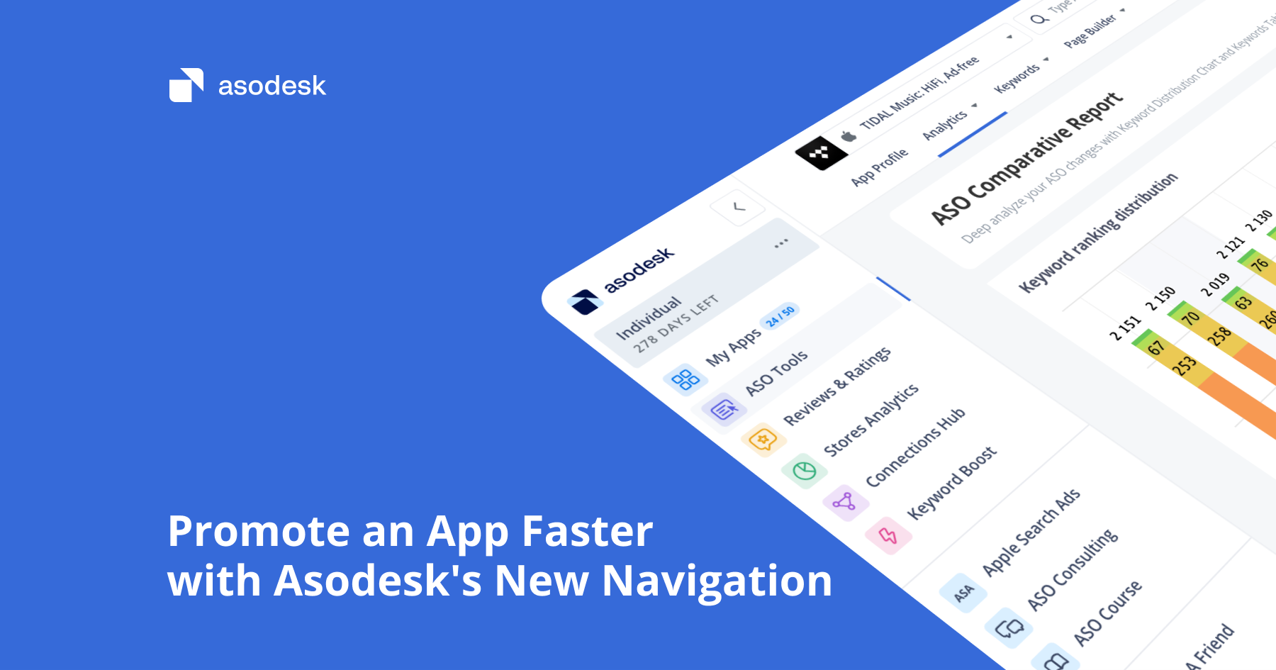
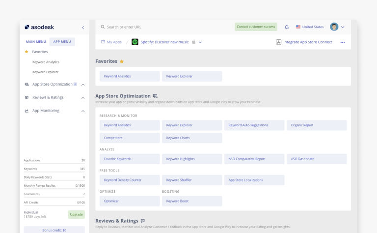
There are now two menus on the left
Don’t be alarmed — we’ve just divided the old menu into 2 categories:
1. Main menu. Default category. Includes the following sections that do not require app selection: Free tools, Store Analytics, and Store Console.

2. App menu. Appears after switching to the application and includes the following sections: App Store Optimization, App Monitoring, and Reviews & Ratings.

We also made the menu lighter and separated the categories and subcategories more clearly.
App menu now has “Favorites”
You can now mark the most frequently used tools from the app menu as “Favorites”. To do this, you need to:
- Hover over the required item in the app menu.
- Click on the star that appears on the left.
The selected item will now be at the very top of the app menu and always in sight. You can also change the order of the tools in your menu simply by dragging them to the desired position.

New header design
One of the core concepts of the new design is more space and light, less visual noise. This is why we changed the design of the header, made it lighter, and removed unnecessary elements.

A new page with a list of all sections
Previously, when navigating to an app, Keyword Analytics would open automatically. We removed this feature. Now you can choose the tool you want to start with. By the way, this page also has “Favorites”.
This update is the first step in redesigning the user’s account. In the future, we will revise in detail all the features and sections, take into account the user feedback and requests and try to implement these suggestions accordingly.
We are very interested in your experience with Asodesk. If you have something to share, please write to vladimir_f@asodesk.com